Introduction
Perfecting your browse abandonment email subject lines can help you recover potentially lost revenue.
But browse abandonment emails are trickier than cart abandonment emails because you don’t know if the customer didn’t purchase because they got distracted or if the product wasn’t a good fit. You need to understand how to present the emails, so they are more customer service than marketing.
Let’s take a look at how you can develop better browse abandonment subject lines so you can get more sales.
What Are Browse Abandonment Emails?
Imagine this…
You’re searching for a rain jacket for your weekend hiking trip. You check out a handful of jackets from different websites where you’ve made similar purchases in the past. There were two or three that you liked, but you got distracted. You’ll come back to decide when you have more time.
Then a couple of hours later, you check your email only to find a message from one of the brands with the subject line, “Were you still looking at this?”. You open the email, and there is one of the jackets you were considering earlier.
That email was a browse abandonment email.
A message sent by companies to remind busy shoppers of the items that they were looking at but didn’t add to their cart or buy.
Sometimes the email contains the exact items you looked at, and other times it includes similar items in a category in case the reason you didn’t purchase was that the product you saw wasn’t quite right.
Browse Abandonment Email Benchmarks
Klaviyo, one of the leading ecommerce email service providers, found that browse abandonment emails performed better than your average marketing email.
In fact, they found that:
- The average open rate was 52.79%.
- The average click rate was 10.87%.
- The revenue per recipient was $2.88.
- That’s quite impressive when considering an average open rate for most emails is between 20-30%.
But to hit those benchmarks, you’ll need to follow a few simple principles when writing your subject lines.
Make it clear
Browse abandonment emails, including subject lines, are not the place to try to flex your creative muscle.
With browse abandonment emails, you’re trying to persuade the customer to return to your site to look and hopefully buy.
The reason you are emailing should be clear to the customer. Your site had something they were looking at, and you want to know if they are still interested. The subject line should give them a hint for the reason you are emailing them, not trick them into opening.
Limit your characters
It’s safe to assume that many of your subscribers are checking their email from their phones. You know that mobile will cut off long subject lines, so you have to communicate your reason for emailing succinctly.
Try to write subject lines that are in the 25-30 character range – no longer than 40 – with the most critical information at the beginning.
That way, your subscriber will see your entire subject line no matter where they are viewing it.
Use punctuation
Punctuation adds clarity and makes your subject line easier to read. But too much punctuation can trigger the spam filter and waste your limited character count.
You want to use commas, periods, question marks, and exclamation marks where they are needed without going overboard. Don’t add three exclamation points (!!!) to the end of your subject line to convert excitement. It appears like attention-grabbing spam.
The Argument for Using Browse Abandonment Emails
Browse abandonment emails aren’t used as often as cart abandonment emails.
Some brands don’t want their customers to feel like they are being watched while they shop. But browse abandonment emails are meant to be helpful, not intrusive.
Any opportunity to help your customers find what they are looking for should be pursued. It’s not just about the extra revenue the emails can generate but the customer service they provide to your shoppers.
It’s the equivalent of a sales assistant walking up to you in the store to ask if they can help you find anything. Except your customer can simply ignore the email if they don’t.
Types of Browse Abandonment Emails
Browse abandonment emails can be triggered by visitors using each part of your website.
The emails can either be general or product-specific, depending on what page(s) your subscriber visited and your strategy.
Homepage
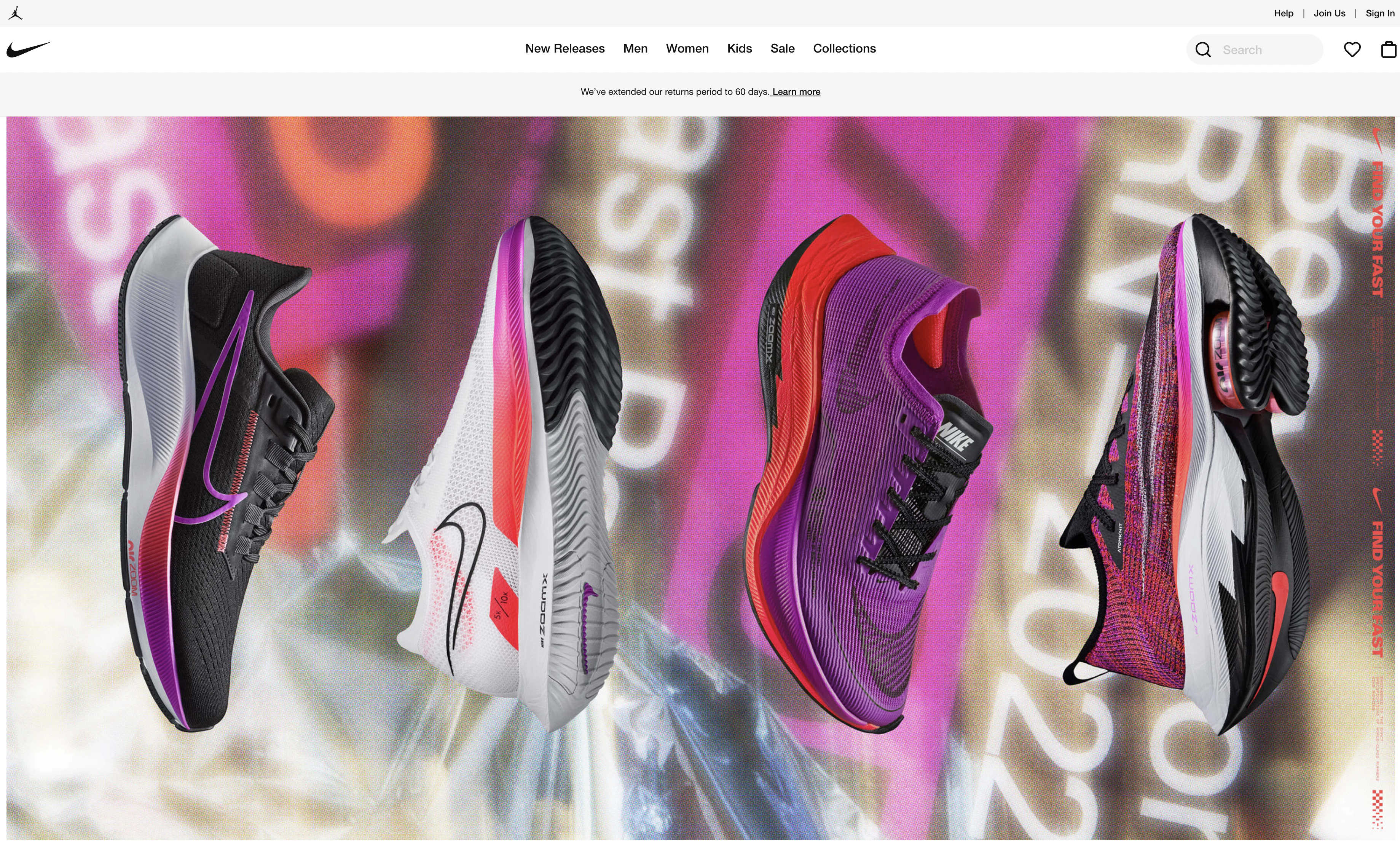
When your browse abandonment emails are triggered by a subscriber visiting your homepage, you don’t have as much information to use.
Your email and subject line will need to cover multiple items that you offer.
Subject lines that may work well are:
“Check out this week’s best sellers.”
“Our picks exclusively for you!”
“Top 10 selling products of the week.”
Category
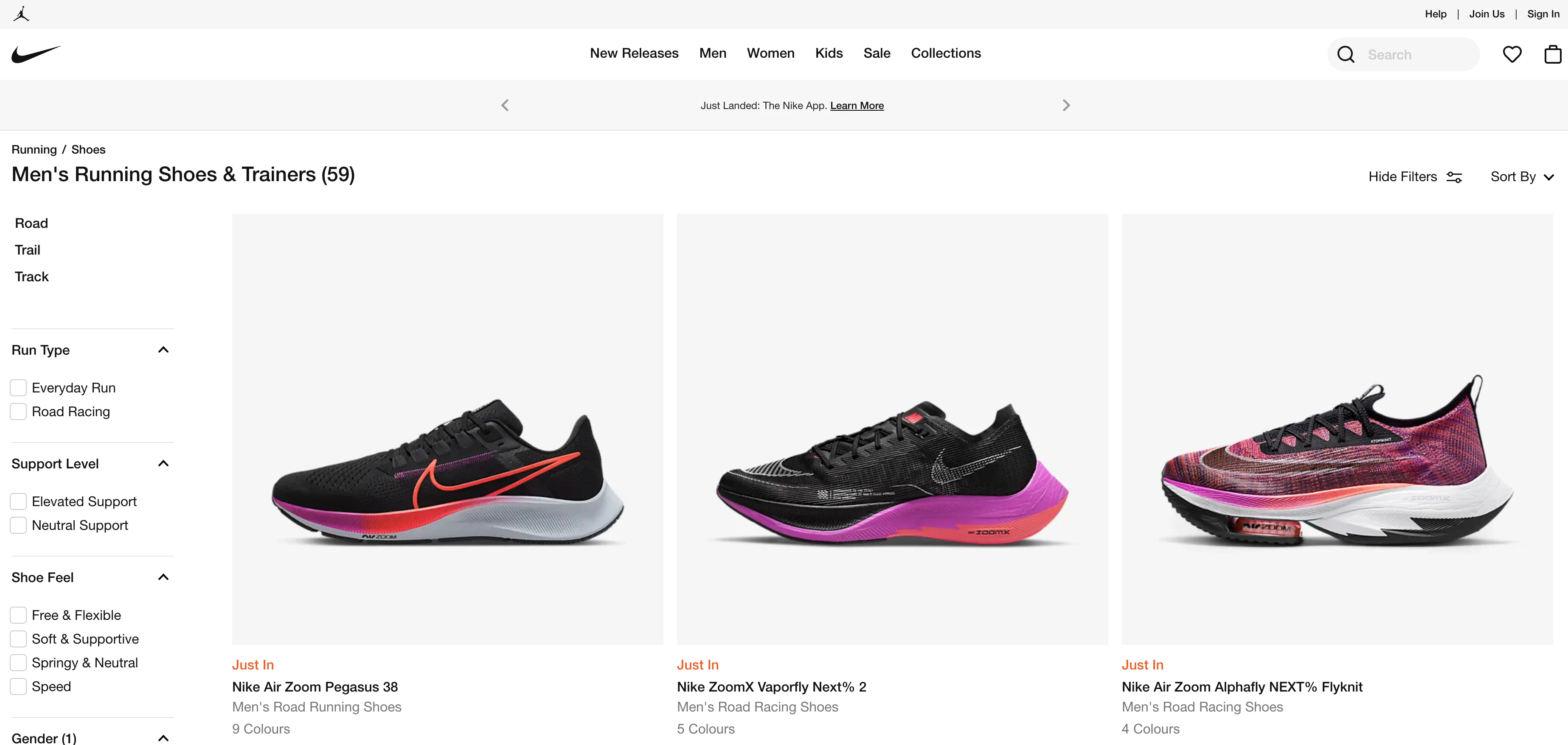
Once your subscribers start browsing a specific category, you have a better idea of what they are looking for.
You should focus your email on the category. You could highlight some of the top-selling products from the category as well.
Some subject lines to try are:
“Check out [category]’s latest products.”
“What’s new in [category]?”
“Best selling products in [category].”
Product page
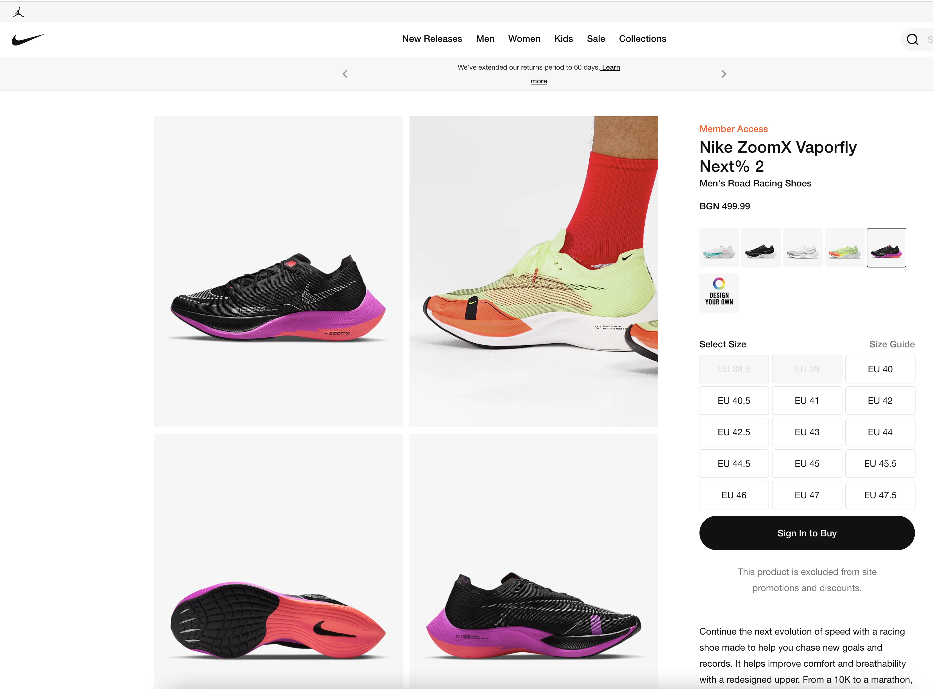
The product page provides you the most insight into your customer’s focus.
You can either send product-specific browse abandonment emails, or you can include the product(s) they viewed with a mix of other similar products available.
A few product page subject line ideas are:
“Need a second look?”
“Still deciding on the right one?”
“Get [product] before it’s gone.”
Site Search

Using browse abandonment emails with the site search function is less common but valuable.
The site search tells you that your customer was looking for something very specific and either couldn’t find it or wanted assistance locating the product quickly. It’s an opportunity to provide superior customer service.
Some subject lines that reflect your availability to help are:
“Can we help you find something?”
“Still searching for [search term]?”
“Here to help you find [search term].”
Plan Your Browse Abandonment Strategy
Choose a strategy for your browse abandonment.
You need to determine when you want to send browse abandonment emails.
Are you going to send an email to every subscriber that visits your homepage that didn’t buy? Or are you going to send browse abandonment emails only to subscribers that look at a specific product page?
You’ll need to decide if you are going to offer an incentive like free shipping or a discount count to push toward the sale gently.
Not to mention, you need a strategy to get more of your website traffic to sign up to your email list so you can send them browse abandonment and other emails.
Set up forms to collect as many emails as you can.
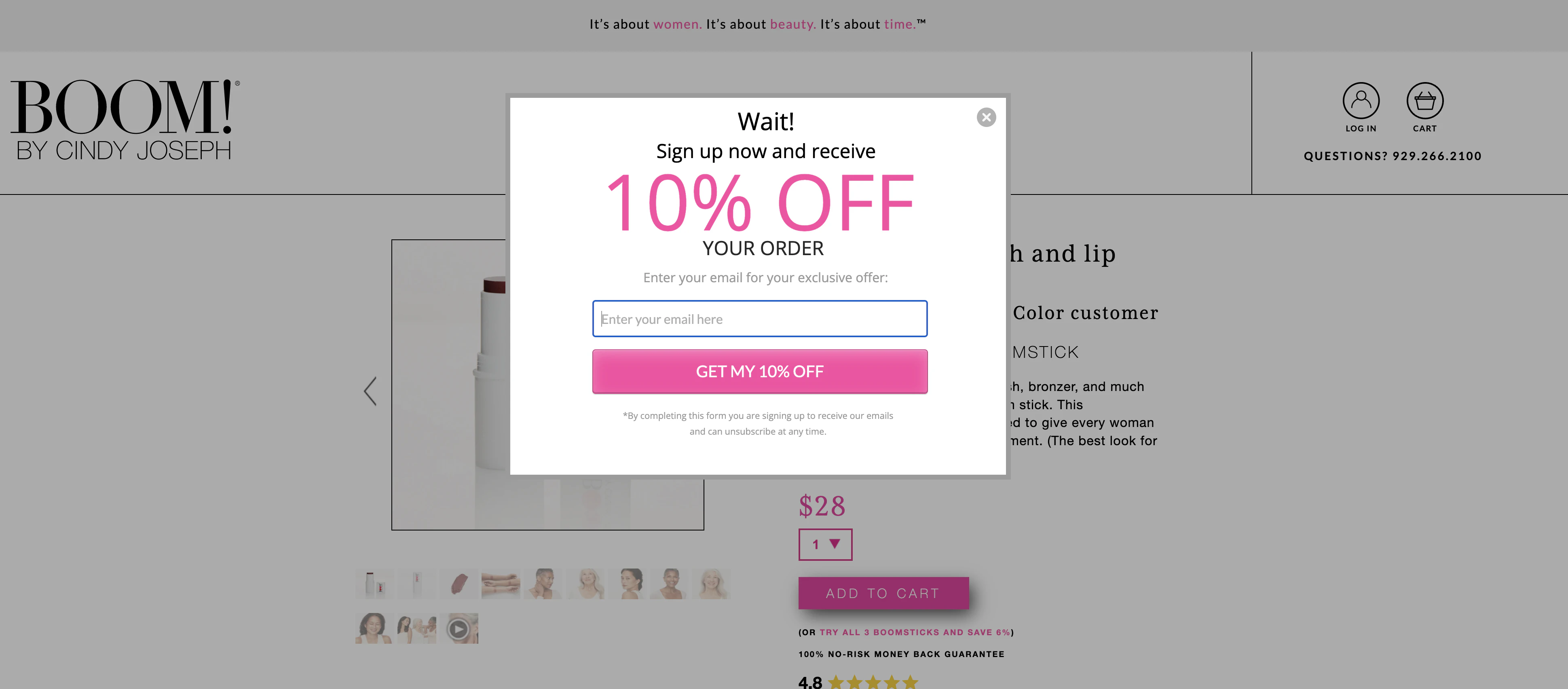
Just like promotional marketing, you can’t send browse abandonment emails if the people browsing your site aren’t subscribers.
You don’t have an email address to send to, and even if you could gain the information, you cannot email them without their consent.
So, how do you plan to capture more emails?
Since these people are already on your site, your best bet is to add a pop-up form.
Your pop-up form can be triggered immediately, but this may cause visitors to close it and move on. Another option is to have your pop-up be product page and/or time triggered. This means the form will only show to site visitors on a product page or who have been on the site for at least X-amount of seconds.
You could also use an exit intent pop-up that only shows if your shopper is about to leave.
Pick one of the options, not all of them. Too many pop-up forms will likely frustrate your customer and make them less likely to sign up.
Choose the right timing and messaging.
Once you’ve successfully captured their email, you have to reach out at the right time.
Too soon, and they might still be distracted. Too long, and they’ve forgotten about you.
Browsing means that the customer isn’t committed to buying your product. You need to gently keep their attention without being pushy.
You want to send your first browse abandonment email within an hour of them visiting your site. The following email should go out the day after. If you choose to send a third email, do so within three days of them browsing.
Anything past three days without a response means that they weren’t ready to purchase yet. You have their email, so you can continue to communicate with them until they’re ready to make a decision.
The message needs to be clear and focused on how purchasing benefits them.
Start friendly and gradually apply urgency or scarcity through your browse abandonment sequence.
Use attention-grabbing subject lines.
For your browse abandonment email to work, your subscriber will need to open it.
The subject line needs to give them an idea of why they are receiving an email while building enough curiosity to convince them to open it.
Remember that the shopper didn’t add anything to their cart, so there is some objection you’ll need to overcome to encourage them to buy. You can try to hint at overcoming the objection in your subject line.
We’ll dive into browse abandonment email subject lines below.
Give it a personal touch.
When it comes to browse abandonment emails, you want to make them personal without making them appear creepy.
Shoppers can feel uncomfortable when you send them emails with each product they looked at, but of course, you want to find a way to include what they showed interest in.
You can personalize your emails by including a product your subscriber looked at within a mix of other products, or you can utilize a tool that makes recommendations based on what other similar shoppers have purchased.
Some of the major ecommerce email service providers have this feature built-in.
Takedown purchasing objections.
As previously stated, shoppers that left without buying have objections that need to be overcome.
The most common objections are:
The product fit isn’t right for them.
They are still evaluating their options.
They aren’t sold on the cost(s).
If you aren’t sure which of the options is the problem for your customers, you can touch each in a separate email.
To overcome the product fit, you need to teach your subscriber about the benefits of owning your product. Your product page should do that, but you should take it a step further in your email by providing additional content if you have it or referencing one of your better product reviews.
More information about the product and testimonials can also help if they are evaluating their options.
When it comes to overcoming cost, you have a few options at your disposal. You could offer a discount, or you could incentivize with something like free shipping.
Test and optimize.
You need to choose a browse abandonment email strategy and put it to the test.
The only way to find out what works best is to get feedback from your audience and tweak as you go.
Browse Abandonment Subject Line Myths
Include the product.
Email marketers assume that if you know the product a subscriber was viewing, you should include the product in the subject line to grab their attention.
However, that may not be the best choice.
Since your subscriber was likely browsing several items and didn’t commit to any, the product in the subject line may actually cause them to become disinterested. You don’t know if they liked the product or not, so use caution with including it.
Offer a discount.

Offering a discount has become the crutch for brands to close the sale.
But because discounts have become so common, they are also easy to ignore.
Go look at your email and see how many marketers include discounts in their subject lines. If you use a discount in your subject line as well, your email might be lost in the crowd.
Depending on how you phrase your discount, it could trigger the spam filter and not even get a chance to be seen by your subscriber.
Make it time-sensitive.
In some instances, applying a timeline for moving forward can make a customer act. But because shoppers who are only browsing and haven’t added to the cart are committed yet, it may scare them off.
With a cart abandonment, it will only be saved for a limited time. That’s a truth that the customers understand and might help persuade them because they don’t want to have to go through and fill their cart again. That doesn’t apply to browse abandonment, so it just seems pushy.
Browse Abandonment Email Subject Line Examples
Are you looking for some ideas to help you get started? Here’s a list of 47 subject lines you can tweak to your brand voice and strategy.
Clear and to the point.
1. How about another look?
2. Recommendations for you.
3. Did you want this?
4. Still trying to decide?
5. Thanks for browsing!
6. Would a second look help?
Make it personal.
1. [Name], want to take another look?
2. [Name] – any questions?
3. We’d love to help, [name].
4. What did you think, [name]?
5. Products we think you’d love, [name]!
6. Still looking at [category/product]?
7. Recommended for you in [category].
Offer a discount.
1. A deal just for you.
2. You liked it, and now it’s even better.
3. 15% off whatever you like.
4. As a thanks for looking...
5. Are you interested? $10 off for you.
6. Everyone loves a deal!
7. Exclusively for you.
8. Shipping is on us!
Sign-up incentive.
1. Get $10 off your 1st order.
2. Thanks for joining! Ship on us!
3. Welcome! Your recommended products inside.
4. Your next order is 15% off.
5. Happy to have you! Bonus inside.
Introduce a little fun.
1. We must say you have a good eye.
2. Well, do you love it?
3. Be our guest!
4. Could it be your new favorite thing?
5. Did this catch your eye?
6. We knew we liked you...
7. We’re worth a second look...
8. We caught you checking us out!
9. There’s nothing wrong with just looking.
10. We knew you had good taste.
Be supportive.
1. Thanks for visiting! Can we help?
2. Would you like a recommendation?
3. Sorry, we missed you before.
4. Didn’t want you to miss out on this.
Invite them back.
1. We noticed you’re missing out.
2. We found this for you.
3. Were you looking for something?
4. Want to visit us again?
5. Were you looking for something?
6. Don’t be a stranger!
7. You’re welcome anytime.
Optimize Your Browse Abandonment Subject Lines
Your browse abandonment emails can recover a significant amount of otherwise lost revenue if they’re done correctly. It’s worth it to spend the time to get them as finely tuned as you can.
The only way sure to find out what works with your subscribers is to test.
You can either test across all subscribers or narrow it down and perform tests for smaller segments. Keep in mind; it’s better to test small segments of defined customers if your website serves different audiences.
Some of the areas you should look at testing are:
- Test based on demographic data.
- Test based on product data.
- Test based on metrics from other emails.
- Test urgency versus scarcity.
- Test discounts.
- Test complementing or replacing your browse abandonment emails with SMS.
The most significant opportunity with email marketing is the data you can gather about your customer base. That data can help drive every marketing decision you make.
Email gives you the opportunity to learn and optimize your strategy and messaging in a way that other marketing doesn’t because it 1) is owned by you and 2) is based on your audience, not some audience that looks similar to yours.
Browse abandonment emails, among many other types of email marketing, should not be done halfway. It takes time and knowledge to do well, but you don’t have to do it on your own if you aren’t up to it. We can help you develop a strategy, set up email flows, and optimize them through testing.
Final Thoughts
Hopefully, if you aren’t using browse abandonment emails, this article has encouraged you to add them to your email marketing strategy.
Think of the emails as an extension of your customer support and frame the subject lines with that in mind.
Browse abandonment email subject lines are unique from other marketing emails, but if you master them, you’ll increase your revenue and provide a better customer experience.




.webp)

.webp)


.webp)





.webp)


