Introduction
Shopping cart abandonment rates vary but typically fall somewhere between 50 and 80%.
But what if you could reduce the number of shoppers who abandon their carts even marginally?The effort put into helping more customers complete their purchase could turn into significant revenue over time.
You can start improving your cart abandonment rate by determining what elements of your checkout process may be the issue, then learning how to remedy them.
What Is Shopping Cart Abandonment?
Shopping cart abandonment is the term used when a customer adds a product or multiple products to their cart (or bag) then leaves the site without completing the purchase.
It may happen because your customer got distracted or wasn’t actually ready to buy yet. But it could also happen because your website and checkout experience are lacking.
Reasons For Shopping Cart Abandonment
If you can get your customers to the checkout process, you need to do everything you can to get them to complete the purchase. Let’s look at some common reasons that shoppers abandon their carts.
1. Your customers don’t trust your website.
Unless you are a well-known brand, you need to focus on creating trust with your customers on every page of your site.
Trust comes from your website looking professional, using high-resolution photos, not having mistakes in your copy, and following UX principles.
Of course, you can do more to build trust with customers, but nothing else you do will matter if your site looks amateur and underdeveloped.
2. Your website is difficult to navigate.
Shopping should be an enjoyable experience for your customers. If they have to struggle to navigate your site, they will give up and look elsewhere.
You may want your site to be unique, but you should stick with the norm to remove any extra friction when it comes to navigation.
This site header below looks attractive at first glance. They use high-quality images and design to draw you in. But the navigation on a desktop is awful.
The navigation is a drop-down menu that isn’t immediately obvious, and it only includes the categories to shop. Then to make things worse, there is no scrolling bar and I could only move down the page using the arrows on my keyboard.
Frustrating your customers is not the way to get them to complete their purchases.

3. Your checkout has too many steps.
Some checkout steps are required for a reason. You need to have billing and shipping information to deliver the product to the customer.
But beyond what you have to have, be careful when adding steps to the process.
For example, don’t offer multiple upsells to the customer once they have started the checkout process.
4. Your checkout requires an account setup.
One of the most unnecessary steps in the checkout is forced account creation. Having to set yet another password we have to remember is not a pleasant experience.
If your shopper is a first-time customer or a customer that purchases once every blue moon, they probably won’t remember their account details anyway.
5. You have surprise shipping charges.
Thanks to the large marketplaces, customers expect shipping to be a nominal cost. Or for there to be no additional cost at all.
When the checkout is almost complete, and they see a shipping cost attached that can sometimes cost near the price of the product, they suddenly back out. It was a cost they weren’t prepared for.
You never want to wait for the customer to be in the checkout process before having at least a general idea of the shipping fees.
6. Your customers incur unexpected fees during checkout.
Your shipping cost is likely the most common fee that pops up during checkout, but depending on your product, you could have other fees as well.
If your product requires any added fees for the warranty or maintenance of the product, those fees should be clearly listed on the product page. The better choice may be to raise the product’s price to absorb extra fees as part of the overall price.
7. Your return policy isn’t listed.
Your return policy shouldn’t be a well-kept secret. You should make your return policy easy to find, especially if your return policy is generous to your customers.
A visible return policy helps boost confidence in your product, whereas a hidden return policy signals that your brand doesn’t stand behind what they sell.
8. You don’t have enough payment options.
There is no shortage of payment options you can activate to make purchasing easy for your customer.
When you only provide one or two options, you could be alienating customers.
Some customers don’t want to enter their credit card details on a site they haven’t purchased from before. They might feel better using an alternate payment gateway like PayPal or ApplePay.
9. Your checkout security isn’t right.
Customers need to know that you are making every effort to keep their information secure. One of the bigger fears of online shoppers is that a data breach will occur, and they will have to fight fraudulent charges.
Aside from offering payment options from third parties that your customers trust, you should be displaying trust badges for the software your site uses to protect customer data.
10. Your customers can’t find the shopping cart.

The above image is an example of a checkout process that will confuse your customers. There is a cart, checkout, and a shopping bag in the corner. Where will they need to go when they are ready to checkout?
Your shopping cart or bag shouldn’t have to be searched for. Your customers don’t want to add an item to their cart and then not be able to locate it when it’s time to check out.
The search will cause an unnecessary point of friction. Don’t try to get creative with what you call it or where you place it on your site.
11. Your discount codes are flawed.
Coupon codes can cause more of a struggle than they are worth. Yes, they incentivize your customers, but they can also get mistyped or used after they expire.
Not to mention, they can be picked up by mass coupon sites which only compounds the problem.
Your customers come to your site excited to make a purchase, thinking they will be getting a deal, only to run into issues and leave annoyed.
12. You don’t offer customer support during checkout.
Speaking of checkout struggles, if you don’t offer an option for customers to get support at checkout, you should.
Too many ecommerce brands spend all of their efforts getting people to their stores, but then the effort stops. Getting the customer to the product page is only half of the battle. You’re wasting resources if that’s all you do.
13. Your checkout is lackluster.
You don’t want your checkout process to be the same bland, semi-confusing checkout that all of your competitors use.
There is only so much you can do with the checkout process without confusing your customers, but the little things you can do matter. You want your checkout to reflect your brand’s personality and provide a clear path for your customers.
14. Your end price didn’t reflect the value.
When your customers get to the last step of the checkout and see the final price, it becomes real to them. They start thinking about what they are getting for their money.
You need to have built up the value of your product so once they are at this point, they are confident in their choice.
15. You provide no reassurance.
Another thing your check out might be missing? A way to overcome those last-minute jitters.
If you offer any sort of guide to using your product or a money-back guarantee, remind your customers of it when they are about to submit payment.
17 Ways to Reduce Shopping Cart Abandonment
We’ve looked at why customers leave their carts, but now let’s look at what you can do about them.
Create Trust
You need to start trust-building before the customer begins the checkout process. Your customers must have confidence in your products to even get them to add them to their cart. Plus, it creates a higher perceived value.
1. Display product reviews.
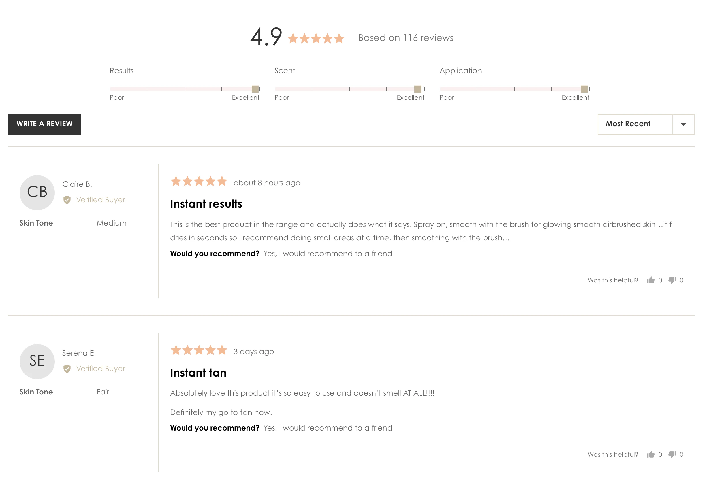
You need to have a strategy to get customers to review your products, and then you need to display them as prominently as you can on your product pages. Especially if your reviews are almost all five-star or if your products have a lot of reviews.
The reviews tell your customers that the product is popular with other people and leads them to have high hopes for it.
2. Show verification symbols from recognizable brands.
Have your products received a shout-out from a well-known influencer or brand? You should present the logos or names of those brands or people throughout your site.
You can add a logo bar on your homepage and your product pages.
3. Build trust with your shoppers through transparency.
You should share the stories of your product’s production with your customers. Talk about materials/ingredients, processes, how it was developed, and any stories about how it was started.
Transparency shows that there are people behind the product. Customers are more likely to feel like a brand is trustworthy when they can tell it’s run by people who care.
Improve Usability
Customers have to be able to get around your site without issues. If it’s hard to find what they need or it takes too long, they will leave.
1. Develop a responsive site.
You know that people are at least just as likely to shop on a mobile device as they are on a desktop. Your site has to be responsive so that your customers can use whatever is convenient for them without losing any core functionality.
2. Keep your site simple.
Simple is always better than fancy when it comes to ecommerce sites. You can add design elements and branding, but they need to be added without making the site too busy or complicated.
3. Make your menu impossible to miss.
Most customers are going to navigate your site through your menu. You need to make your menu easy to find and easy to use.
Ensure the area around your menu isn’t too cluttered and that the menu itself is organized and clear.
4. Test and tweak for optimal speed.
Ecommerce sites need to include high-resolution images, but they can take too long to show up if they aren’t uploaded properly. Product videos can be an even bigger issue.
Plus, if you are using an ecommerce platform like Shopify, you’ll be using apps that could be slowing down your site.
You need to test your site speed and work on making it as fast as possible to keep users from bouncing because they don’t have the patience to wait for it to load.
5. Focus on improving your calls to action.
The call to action you use on your homepage doesn’t need to be the same call to action you use for checkout. On your home page, you can use CTA’s that inject more of your brand or product, whereas once the customer gets to your cart, you need to be very clear.
Once your customer is in the checkout, test using button copy that says more than “next.” For example, you could use “continue shipping info” on a button to tell the customer exactly what to expect on the next page.
Streamline Your Checkout
Your checkout isn’t the place to make things complicated for the customer.
Each section of your checkout should match the section before, and you should request only the information you have to have to fulfill the customer’s order.
Keep your checkout requirements consistent with what customers are used to submitting and collecting any other information you’re hoping to get in some other way.
Limit Steps in Checkout
Do not make your customers create an account to complete their purchase. It is not necessary and inconveniences your customer.
You should also make it possible for your customer to mark their shipping address the same as the billing address, so they don’t have to re-enter that data.
Little things like this can make the checkout experience less work for your customer and more likely to complete the transaction.
Optimize Your Return Policy

When you are shopping online, your return policy is a big deal. You need to establish the best return policy you can afford to have to help incentivize your customers.
1. Make it clear.
Your return policy should be clear without confusing caveats and minute details. If your return policy varies because you sell different types of products, create separate policies and display them directly on the product page.
2. Include free return shipping.
Another risk-reducer that helps your customers buy is free return shipping. It lets the customer know that they will truly not be out any money for trying it if they receive the product and don’t like it. You will need to calculate your return product rate and include it in the product costs.
3. Provide a generous return window
If you can, offer a 60 or 90-day return policy. It’s one more thing that can help a new customer decide to give your product a try.
4. Shout it out.
Once you’ve set your return policy, you should display it across your site. Of course, you don’t want your entire return policy everywhere, but something like “unconditional 60-day returns” can catch your customers’ attention on your home page. You also want to provide a link to your full return policy on your product pages and in your footer.
Activate Additional Payment Options
You need to activate at least a couple of alternate payment options on your site. Paypal is a popular choice, but so are Apple Pay and Google Pay. Opening up the option to pay with your Amazon account is another solid choice. All of these payment options give customers a sense of security and mean they don’t have to enter their details over and over.
If you have a higher-priced item, choices like AfterPay that allow your customer to pay for their purchase in four small installments has been shown to increase conversions and even average order value for some brands.
Add Trust Seals
Trust seals in the footer of your site and at the point of purchase may make your customer feel less anxious about providing their personal data.
Some popular trust seals used are:
- Google Trusted Store
- TRUSTe
- SiteLock
- Trust Guard
- Better Business Bureau
For the trust seal to be effective, it has to be from a recognized and respected brand.
Make Your Cart Easy to Find
Your shopping cart should be one of the most visible pieces of your site. Customers want to be able to find it when they are ready to check out quickly.
1. Place it in the upper right-hand corner.
It is the norm for shopping carts to be placed in the upper right corner of your site. Don’t try to be unique and move it because it will only throw people off. You want your checkout process to feel natural.
2. Use design to make your cart stand out.
Use plenty of white space around your cart, so it doesn’t get overlooked. You can even make your cart a contrasting color to draw attention to it.
3. Have the shopping cart be accessible throughout the site.
Your cart needs to stick with the customer everywhere they go. Even if you have a blog or other non-product pages on your site, the cart should be accessible no matter where your customer goes.
4. Use common words like “shopping cart,” “bag,” and/or their recognizable icons.
It’s either a shopping cart or bag, nothing else. You need your customer to know exactly what you are talking about when they are adding a product.
You can use a cart or bag icon in their place, but that is the only exception.
Eliminate Codes
Discount codes can be a pain to set up and monitor. There are better ways to help your customers access your deals.
1. Get rid of coupons.

If you are running a deal on a product, make the discount apply once the item is added to the cart sans code. This way, you aren’t worried about customers mistyping or trying to use a discount code after it expired because they didn’t read the details.
2. Hide the discount code box.
To prevent customers from even trying to find a code, you should remove the box from your checkout completely. If there isn’t an option to enter a code, your customers won’t think to look for it.
3. Use other incentives instead of coupons.
There are more ways to incentivize your customers than coupon codes. You can offer free shipping or gifts with purchase. Or you can run promotions like buy one, get one that doesn’t require a coupon.
Offer Support at Checkout
You need a way for your customers to contact you if they run into trouble at checkout quickly.
The two best ways to do this are 1) provide a phone number that displays or 2) have live chat set up.
Either way, you need someone to be available to respond. If you can’t have someone available at all times, provide hours of when a person would be available, along with a general turnaround time for an expected response.
Announce Shipping Fees
Standard shipping costs should be known before the customer starts to checkout.
When you use variable shipping, this can be difficult. That’s why adopting a flat rate model might be your best bet.
When you have a flat shipping rate, you can tell your customer in advance the amount they should expect to be added during checkout.
Make Checkout Enjoyable
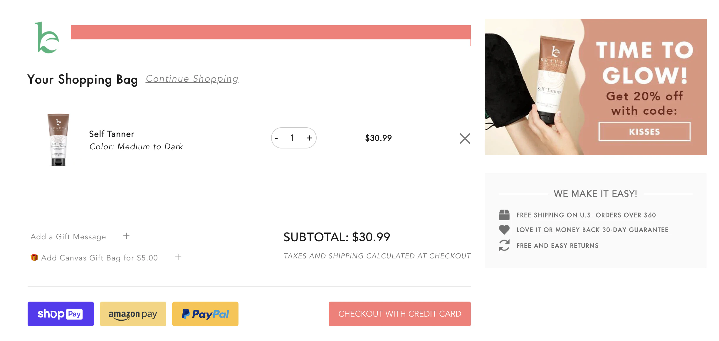
One of your goals should be to make checkout feel more like something they want to do and less of a chore. This isn’t an easy thing to do, but there are a few things that can help.
You can try to:
- Use friendly copy.
- Utilize white space.
- Create an experience with color.
- Include images.
- Prefill information when possible.
The overall message here is to keep things quick, simple, and inviting for your customers.
Utilize a Progress Indicator
Completing the checkout process isn’t known to be particularly fun. The process indicator lets your customer know there is an end in sight.
Progress bars help your customers visualize the process and let them feel a level of achievement after each step making it slightly less daunting.
Display Thumbnail Images of Products in the Cart
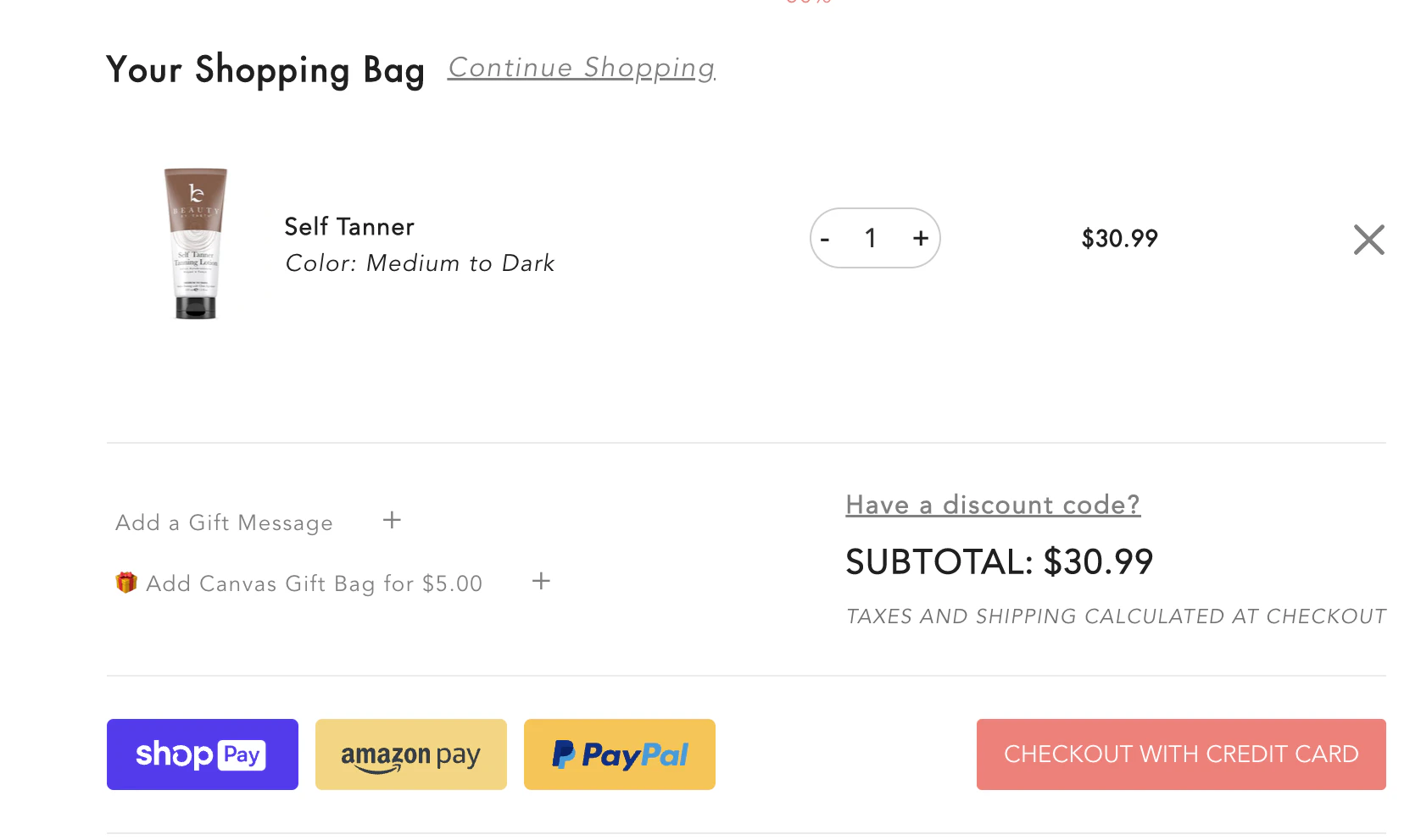
By including an image of the product, you’re reminding your customer what they will be rewarded with at the end of the process.
Assuming they really want the item they’re buying, it’s an excellent motivator to continue through the point of conversion.
Use a Call to Action at Point of Purchase
When your customer reaches the last step of your checkout, and they’re looking at the total, you want to have a CTA that pushes them through.
The CTA has to be clear enough that the customer knows that it will submit for payment but encouraging enough to keep the customer from backing out.
You want to test your copy, but you could try something along the lines of “Submit Payment and Get Excited for [Product]!” above your payment button or even on your button.
Run A/B tests
There are pieces of your website and checkout that need to be split tested. What works well to help with cart abandonment in one industry may not work in another.
Generally, making your website clean and easy to use on any device works across the board.
But things like policies, copy, and payment options will depend on your customer base.
Implement Remarketing Campaigns
Even with the perfect website and checkout process, there would still be times when customers have something come up and leave before completing the purchase.
This is where remarketing comes in. You can use remarketing ad campaigns on search and/or social to remind your customers what they almost purchase. Cart abandonment emails are another option if you have the customer’s contact information.
Remarketing to Cart Abandoners
Improving your checkout process is only part of the equation if you really want to recover as much revenue from cart abandonment as possible.
Remarketing will help you get your products in front of your customers to encourage them to come back to your site and complete their purchase.
We are a full-service agency that can help you reach your customers through remarketing on search, social, and email marketing strategy to make sure no customers fall through the cracks. When you are ready to learn more, let us help you develop a custom marketing plan to find additional revenue you might be missing.
Final Thoughts
Now that you know what causes customers to bounce, it’s time to go through your checkout process and look for red flags.
Implement and test minor tweaks until you’ve improved your shopping cart abandonment rate and increased your bottom line.
Confidentially partner with an Email Marketing Agency that has generated over $1,649,692 in attributable revenue for their clients.


.webp)


.webp)


.webp)





.webp)


