Introduction
Are you looking for browse abandonment email examples to spark your motivation?
In this article, we’ll cover the different types of browse abandonment emails you can set up, then evaluate some examples.
You’ll also learn about browse abandonment best practices and tips for refining your strategy to see the best results.
What Are Browse Abandonment Emails?
You’re likely familiar with browse abandonment emails, even if you didn’t immediately recognize the term.
They are the emails brands send to their subscribers after viewing an item (or several items) on their site but didn’t purchase. The emails come with specific product recommendations or incentives for purchasing a product that you had been considering recently.
Some browse abandonment emails will come right out and tell you why you are receiving it, but other emails are more coy and don’t explicitly tell you that your recent shopping triggered the email.
Browse Abandonment vs. Cart Abandonment Emails
Browse abandonment emails and cart abandonment emails are similar because they are both triggered by an uncompleted conversion.
However, cart abandonment shows a higher purchasing intent than browse abandonment, and because of this, it should be treated differently. Cart abandonment emails can get away with being more sales-focused than browse abandonment emails.
Items in a cart are only saved for a small amount of time, and using this urgency is a legitimate incentive for customers. If they still want the items they were at least semi-committed to without having to go through the hassle of finding them and putting them back in the cart, they need to follow through soon. But pushing that same level of urgent action required in a browse abandonment series may only agitate your customer if they know the item is readily available.
Think of browse abandonment emails as more of a guide to finding the right product than sales.
4 Kinds of Browse Abandonment Emails
1. Homepage Abandonment

Homepage abandonment emails are the broadest. They are sent to anyone who lands on your homepage and is on your email list or signs up for your email list at that time. You may want to set up a time-specific trigger to only send to people who stay on the site for at least 60 seconds. Be sure your emails include a sampling of the products you offer.
2. Category Abandonment
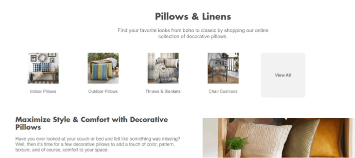
Category browse abandonment emails will send after a shopper clicks to look at one of the categories on the site. The emails should contain a range of available products within the category.
3. Product Page Abandonment
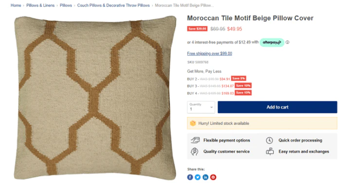
Product page browse abandonment emails are triggered by a customer looking at a specific product. Some brands choose only to send browse abandonment emails if a customer looks at a product more than once or if they are on the page for a specific amount of time.
4. Site Search Abandonment

Site search abandonment is triggered when a shopper enters a term in your site’s search feature. Site search abandonment is the least common function used to trigger browse abandonment emails.
Why You Should Send Browse Abandonment Emails
Browse abandonment emails have higher open and click-through rates than your standard email campaigns.
Typically, a solid open rate for an email campaign falls somewhere between 20-30% depending on your industry. But Klaviyo found that browse abandonment emails have a much higher average open rate at 52.79%. That’s almost twice the opens!
You don’t want to miss the opportunity to communicate with your customers, especially not at a point where they may be looking for assistance and are more primed to open and engage.
Browse abandonment emails are meant to gain more sales, but they can do more than that when done right. They can improve your brand relationship with your potential and current customers.

Browse Abandonment Best Practices
Let’s talk about some browse abandonment best practices to help you get started. Keep in mind that all best practices should be always be tested with your audience.
1. Act quickly.
When a person is browsing your store then disappears without purchasing, you don’t know if they weren’t sold on the product or if they got distracted.
You send a browse email under the assumption that the shopper may still be interested but just needs to be reminded to give the item a second look.
You should send the first email within an hour of the shopper looking at your product. That way, if your customer didn’t buy because they were pulled away, the product will still be fresh in their mind. If you wait too long, you risk your potential customer changing their mind about needing your product or spending their money elsewhere.
Even if they don’t look at the email within that hour, the email will be there waiting for them when they return.
2. Don’t overdo it.
While you want to act quickly, you don’t want to overwhelm your shopper by sending a barrage of emails. Remember, they only looked at the item. They weren’t committed enough to add it to their cart or purchase.
Keep your browse abandonment email sequence limited to two or three emails maximum. If you email more than that, it can come off as too pushy and drive the customer away.
Test sending the first email quickly, the second email within 12 hours, and the third email, if you use a third email, at 24 hours. Don’t extend your browse abandonment emails any longer than 48 hours.
Plus, if this person just signed up to your email list for the first time, they are also getting any welcome emails you send over the next couple of days. That can add up to a lot of emails in a very short timeframe.
3. Test subject lines.
Browse abandonment subject lines should be clear and crisp. You need to keep your subject lines short enough that they won’t be cut off on mobile. Ideally, your subject lines will be 30 characters or less.
You want to use punctuation in your subject lines, but only when it is needed. Don’t add unnecessary punctuation like extra exclamation marks or asterisks around words. Extra punctuation uses up your limited character count, and it is more likely to get your email sent to spam.
You might think you should add the product in the subject line, but if your customer wasn’t sold on the product, they probably won’t open it. Instead, use a subject line that piques their curiosity. For instance, something like “We’ve got just the thing for you.” lets them know that the email will likely contain a product recommendation but leaves room for them to wonder what it is.
4. Test from names.
Suppose the shopper did only sign up to your email list when they were browsing. In that case, they might not immediately recognize your emails in their inbox, especially if you send your emails from a specific person in your company.
You’ll want to test the “from” name of your browse abandonment emails to determine what sender name gets the best response.
Start by testing the brand name by itself, then move to testing a person’s first name but add the brand name after so they can make the connection.
Unless an instantly recognizable name represents your brand, avoid sending emails from just a name without any brand association. It may get opened, but it may also be misleading to the customer and reported as spam.
5. Go easy on personalization.
Personalized emails (specifically using the subscriber’s first name) are generally well-received. Still, you don’t want your browse abandonment emails to get too personal, or it may make your customer uncomfortable.
Some shoppers don’t like browse abandonment emails because they feel like they are being followed around the internet.
When you start calling them out by name in multiple places, like the subject line and at the beginning of the email, it can begin to feel even more intrusive.
When you use their name, use only their first name and no other details you may have about them, and only use it in one place. Pick either the subject line or in the body of the email.
You could also consider showing multiple products within the category they were browsing instead of highlighting just one to help put them at ease.
6. Don’t immediately offer a discount.
By offering a discount to your shoppers right after they browse your products, you train them only to purchase when they have a discount code.
You have to decide if that’s the message you want to send to customers or not. If you have high profit margins that allow you to run discounts regularly, this may be part of your strategy. Otherwise, give them a chance to buy before you jump to discounting.
Wait until the second or third email to give a discount code, if you choose to give one at all.
You can try other incentives like trial-sized products or a free educational ebook to motivate a customer without normalizing discounts.
7. Incentivize through urgency.
Urgency is an excellent incentive to use in browse abandonment emails, but only if the urgency is authentic.
For example, if you sell one-off or limited-quantity items, you can use urgency to encourage the customer to buy because if someone else beats them to it, the item will be unavailable. Or, if you are going to raise your prices soon, you can create urgency around that.
Urgency is not going to be a great incentive for your brand if you are a retailer of a product sold in other places.
8. Offer other options.
Think about what you are doing when you are browsing. You’re looking for an item or at least a category, but you don’t know the exact item you want to purchase.
In your browse abandonment emails, you should offer another experience to browse your products. You want to include a range of similar products, including the product your customer was looking at, to give them an idea of what your brand has to offer.
Try to include alternate products that are highly rated by your other customers.
9. Offer assistance.
Ultimately, browse abandonment emails should act more like customer service and less as sales.
You are trying to help your customer find the right product to meet their needs, not force them to purchase something rather they need it or not. Your browse abandonment emails should be a helpful guide to buying.
If you choose to frame one or more of your browse abandonment emails as customer support, you should start with a helpful subject line. Then the email itself should contain not just product recommendations but also answer questions about the product, provide reviews, or contact where the customer can quickly get information.
Whatever you do, don’t start off as customer support and then switch to pushing sales within the email.
10. Target the right customers.
You might find that your browse abandonment emails aren’t worth sending to everyone.
Browse abandonment emails too often trigger the spam filter, and you don’t want to drag down your deliverability by sending browse abandonment emails to people who don’t open any of your other emails.
By sending browse abandonment emails to only customers who fit specific criteria, you improve your odds of converting and the chances of your emails being opened and engaged with to improve your overall metrics even if your subscriber doesn’t purchase.
There are a number of behavioral triggers you could segment to send your browse abandonment emails to. For instance, you could send only to customers who have purchased from you in the past year. Or you could send only to subscribers who are considered active (meaning they open and at least occasionally click-through on your campaigns).
11. Match your retargeting campaigns.
All of your marketing should provide a cohesive customer experience. You don’t want the messaging in your emails to be vastly different than the messaging in your retargeting social ads, for example.
When you are developing your browse abandonment emails, consider what other remarketing you are using. You’ll want to adapt the nuances of your campaigns to the platform, but overall, the branding needs to remain consistent.
If you’ve found user-generated content to perform well in your retargeting ads, consider adding testimonials or reviews in your browse abandonment emails. You could try using carousel ads with alternate products, then use the most clicked-on products in your email as recommended products.
Use the data from one type of retargeting to inform another.
12. Pair with SMS.
Many brands are seeing success with SMS campaigns. If you haven’t tried SMS marketing yet, it’s worth setting up.
How you get started will depend on where you are with your email subscriber base.
If you have a small or inactive subscriber base, you may want to change your sign-up form to include a phone number instead of an email. Asking for both an email and phone number can be too much in one form.
On the other hand, if you have engaged subscribers and want to use SMS marketing combined with email, you can start by offering an incentive to your most engaged subscribers to provide their phone number.
Your most engaged subscribers are the ideal group to test SMS marketing because they are your perfect customer avatar and will give you the best data on your efforts that you can use long-term.
10 Browse Abandonment Email Examples
Let’s take a look at some examples of browse abandonment emails currently being sent to customers.
1. Target
Target doesn’t always send an immediate browse abandonment email. They wait for the item to be included in some type of sale instead. Target is a mega-company that can afford to operate on discounts and has almost every item included in a sale frequently.
The problem with waiting for a discount is that your customer may have already purchased the item from a competitor.
Target does a good job of offering similar products and even a link to “all hair accessories” if the customer is browsing for various products.
2. Ashley Homestore
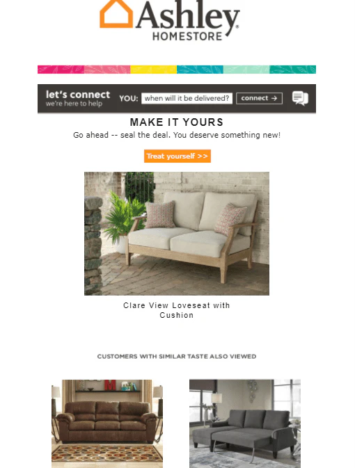
Ashely Homestore sends emails relatively quickly after you have browsed an item on their site. They actually send two browse abandonment follow-ups after your visit.
In the email, they place the product you viewed front and center in their email and invite you to purchase it. Their approach pushes the sale more than a browse abandonment email maybe should.
Also, the other product recommendations they include are off. They are likely based on some sort of algorithm, but they aren’t related to the same product enough. A shopper looking for outdoor furniture should be shown other outdoor furniture options, not products from another category.
3. Vistaprint
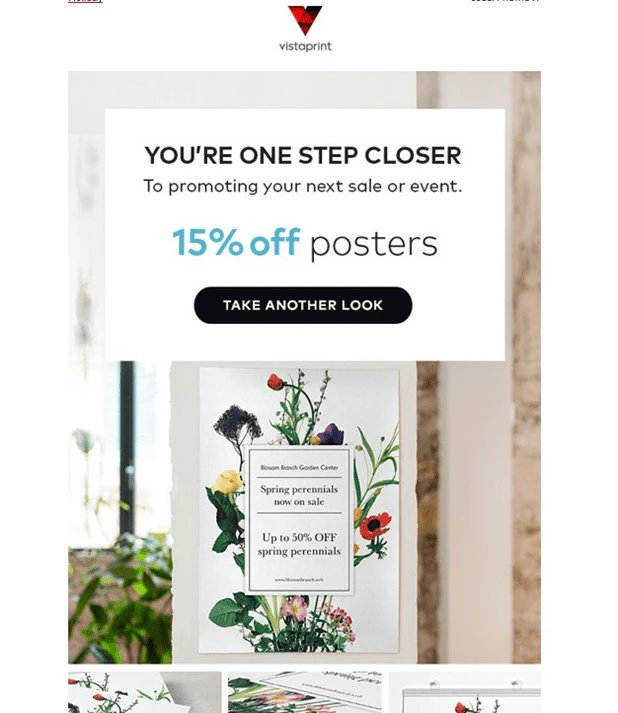
Vistaprint is another major brand that counts on its customers wanting a deal. This email feels more like a cart abandonment email based on it showcasing only one product and utilizing the discount.
Vistaprint’s browse abandonment email could try showing various signage the customer might be interested in.
Or at least showing the versatility of its posters by displaying a range of sizes and designs instead of the singular focus on the one poster that may not have broad appeal (floral print). It’d be interesting to know if Vistaprint segments their emails based on demographic data.
4. Wayfair

Wayfair’s browse abandonment email does several things well. First, it was delivered timely. It wasn’t received within an hour, but it wasn’t a day or two later either.
They also do a solid job of introducing similar options to the product being browsed. Including the ratings is a nice touch and adds another element of customer service.
The problem is, the email almost wasn’t opened. Wayfair used the subject line “Spotted: Shawnee Computer Desk.” Based on what’s in the email, they should try something along the lines of “Care for a recommendation?”.
5. Boom

Boom! By Cindy Joseph makes email marketing a priority. Their target audience is older women that likely prefer email to something like SMS.
Boom! does the best job of all of the examples on all the critical pieces of a browse abandonment email.
The email comes right out and lets you know why you are receiving it. The subject line “Thinking about Boom? Here’s another look.” lets you know what to expect as well.
They show you not only the product you were looking at, but related recommendations you might be interested in.
And, on top of that, they found a way to introduce true urgency while still coming off as friendly and offering support by letting you casually know the product may sell out without telling you to “buy it now!”
6. Alya Skin

Honestly, with this example from Alya Skin, it’s not clear if it’s a browse abandonment email or another email that offers a discount (they run frequent discounts).
The skincare bundle was recently browsed, but aside from the “claim offer now!” copy on the button, the email doesn’t feel targeted.
To gain the benefits of a browse abandonment email, it could help to make it feel more targeted to the subscriber rather than just another sale email blast. The subject line “Get 30% off the Glow-Getter Bundle!” could easily get lost in the inbox, not to mention it triggered the spam filter.
7. Columbia
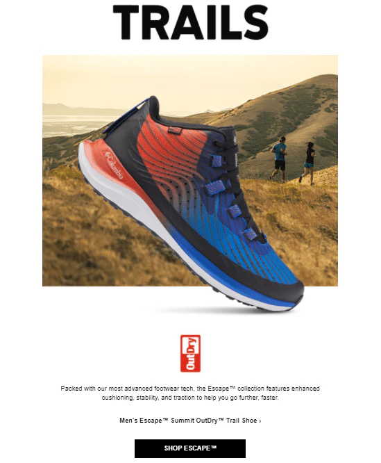
Columbia chooses to take a subtle approach to browse abandonment emails. If a person forgets for a moment that they recently looked at a specific product or category of products, they may not realize this was a triggered email at all.
Columbia doesn’t come out and display the item you were browsing. Instead, they encourage you to browse broad categories based on the interests you’ve shown. They don’t include any personalization, incentive, or urgency.
While Columbia’s laid-back browse abandonment emails feel helpful and not pushy, they could use a little more direction. For instance, the email may work better to drive sales if they at least displayed a sample of available products within the category.
8. Animebae

This browse abandonment email example from Animebae takes a different approach to appeal to their customers. They add their brand personality instead of a discount.
A product image is included as a visual reminder, but nothing about the email is pushy.
The email is an excellent example of making a browse abandonment email feel like a friendly reminder versus a sales pitch.
9. COCOSOLIS

COCOSOLIS opens a conversation with their customer in their browse abandonment email. They recognize that their product is designed to make the customer feel luxurious, and the browse abandonment email reflects that.
They invite the customer to indulge and add the right touch of urgency through the “Hurry, while stocks last.” copy at the bottom.
10. Kanso Designs

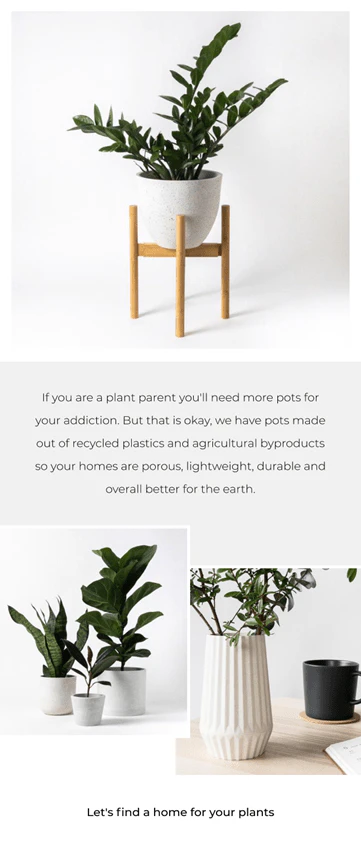
KansoDesigns knows that their customers may already have lots of pots for their indoor plants, so they focus on showcasing why their pots are better than other options.
Sometimes all your customer needs is a good reason to give themselves permission to make a purchase.
4 Steps to Refine Your Browse Abandonment Strategy
Once your browse abandonment emails are running, you’ll need to refine them. You can accomplish this in four steps.
1. Optimize your timing.
Stop sending emails at the wrong times. You want to catch your audience when they are the least distracted. Some email service providers will tell you the best time to send, but others will require testing on your part.
Start by writing down what your ideal customer’s schedule looks like. Highlight when they are least likely to interact with emails, like in the middle of the night, and when they are most likely, like after they’ve put the kids to bed and have some free time.
Send emails when you suspect your customers to be available and test what times get the higher open and engagement rates.
2. A/B test your subject lines.
Subject lines might be the most valuable thing you can perfect in email marketing. The subject line either gets the email opened, or it doesn’t. It does the most critical job.
Subject lines shouldn’t be an afterthought right before sending.
You need to be consistently testing your subject lines within the same audience. The results will help you create formulas you can use to make crafting subject lines easier over time.
3. Segment your subscribers.
People like to feel like they are important to the brands they give their money to.
By segmenting your subscribers, you can create email variations that target that specific subset of subscribers. This gives your email marketing a personal touch versus blasting out the same generic email to everyone.
Segmented emails can increase revenue by up to 760%, according to HubSpot.
Even if segmenting your emails generates a fraction of that increase, it’s still a hefty bump in revenue.
4. Improve your deliverability.
Your deliverability is determined by several factors, including open rates and spam complaints.
Deliverability is the key to getting your emails in your subscriber’s inbox instead of the junk folder. Every email marketing decision you make should take into consideration how it could affect your deliverability.
For instance, sending browse abandonment emails to any subscriber who visits your site, whether they even look at a product, could result in those emails not getting open and lowering your overall open rate. This could hurt the deliverability of your other email campaigns.
Remember, you need to clean your list of inactive subscribers regularly, and don’t be afraid to pull the plug on a flow that is doing more harm than good.
Email marketing has remained a reliable source of revenue for brands, even as other marketing methods have grown in popularity.
When you are ready to get results from not only your browse abandonment emails but across all of your email marketing, we can help.
Final Thoughts
Final Thoughts
Browse abandonment emails are too valuable to ignore because you aren’t sure how to develop the best strategy.
Start with the best practices and build your browse abandonment strategy from there.
Even if you send only one browse abandonment email, you can create a more supportive customer experience and get sales you may have lost.




.webp)

.webp)


.webp)





.webp)


