82 Call to Action Examples You Should Learn From in 2022


Introduction
Every button or link you click on a website or in an email is a call to action.
You interact with countless calls to action on any given day, but you may not have given it much thought until now.
In this article, we’ll look at various calls to action to help you better understand what works and what doesn’t.
Article content
What is a Call to Action?
A call-to-action (CTA) is the piece of copy or icon that encourages the reader to move to the next step.
CTAs are most often buttons or links that have been optimized to get the reader to click. They are typically supported by surrounding copy and design elements.
What are Common CTAs in Marketing?
When you are browsing, you may notice some common CTAs that start to pop up. Some of the most used CTAs are:
Sign up
Free Trial
Subscribe
Get started
Learn more
Discover
Explore
Shop
Popular CTAs change over time. Once one has been overused, marketers will move on to the next. But CTAs do not have to be kept in a box. Don’t be afraid to try different CTA styles that speak directly to your audience.
Why You Need a Strong Call to Action
Without a compelling CTA, what will motivate your reader to take the next step? Chances are, your reader doesn’t know exactly what they should even do next.
A strong CTA helps to guide your reader to the next logical step toward becoming a customer.
People need to be motivated to take action, especially anything that might be work on their part. You have to figure out what words provide that or risk losing your leads.
Keep notes on all your tests so that you can apply what you’ve learned to future tests.
How Do You Write a Call to Action?
So, how do you come up with a good CTA?
The first step is knowing exactly what you want your reader to do next and what benefit you are providing.
You aren’t trying to move them through your entire funnel with one CTA. You need to develop a series of small steps that you can build around. Start with your end goal and reverse engineer CTAs from there.
What Makes a Good CTA?
You can’t have a good CTA in a bubble. Both the phrase you use to get the reader to take action and all the elements around it need to work together.
You will need to:
Make the benefit to the reader completely obvious.
Craft your CTA, so it is low-risk.
Create urgency around the action.
If you can develop a CTA that checks all three boxes, you will help more leads turn into customers.
82 Call to Action Examples You Should Learn
from in 2022
Now that you know what a good call to action consists of let’s look at CTAs from popular sites.
1. Purple

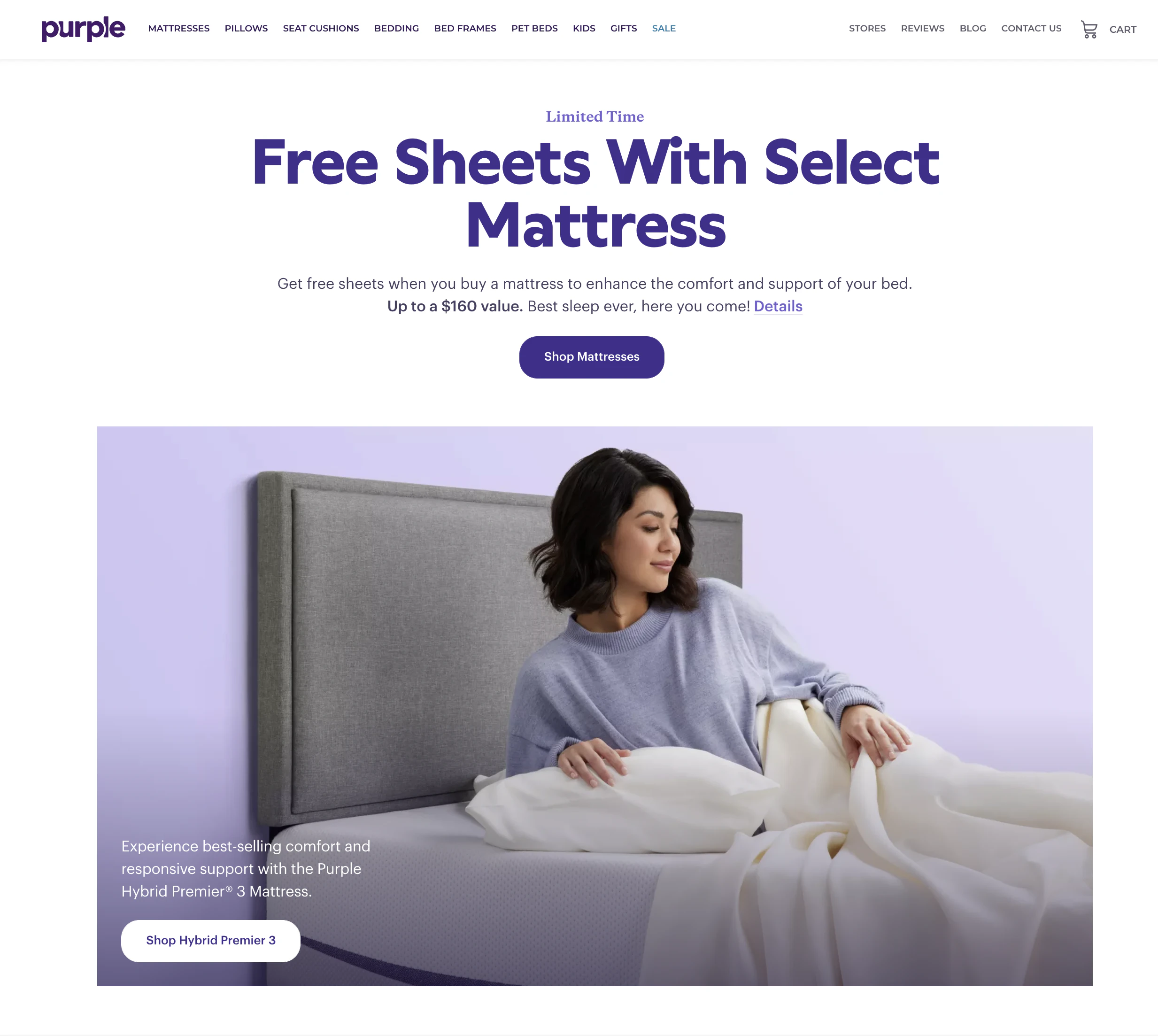
This CTA from Purple is way down the home page under a bunch of “Shop” and “Shop Mattresses” CTAs. But why would a person choose to pay more for a Purple Mattress if they don’t understand the benefits?
I’d move this block and CTA up the page to make it more likely to get clicked by readers trying to decide if they want to buy and need more information.
2. Crazy Egg

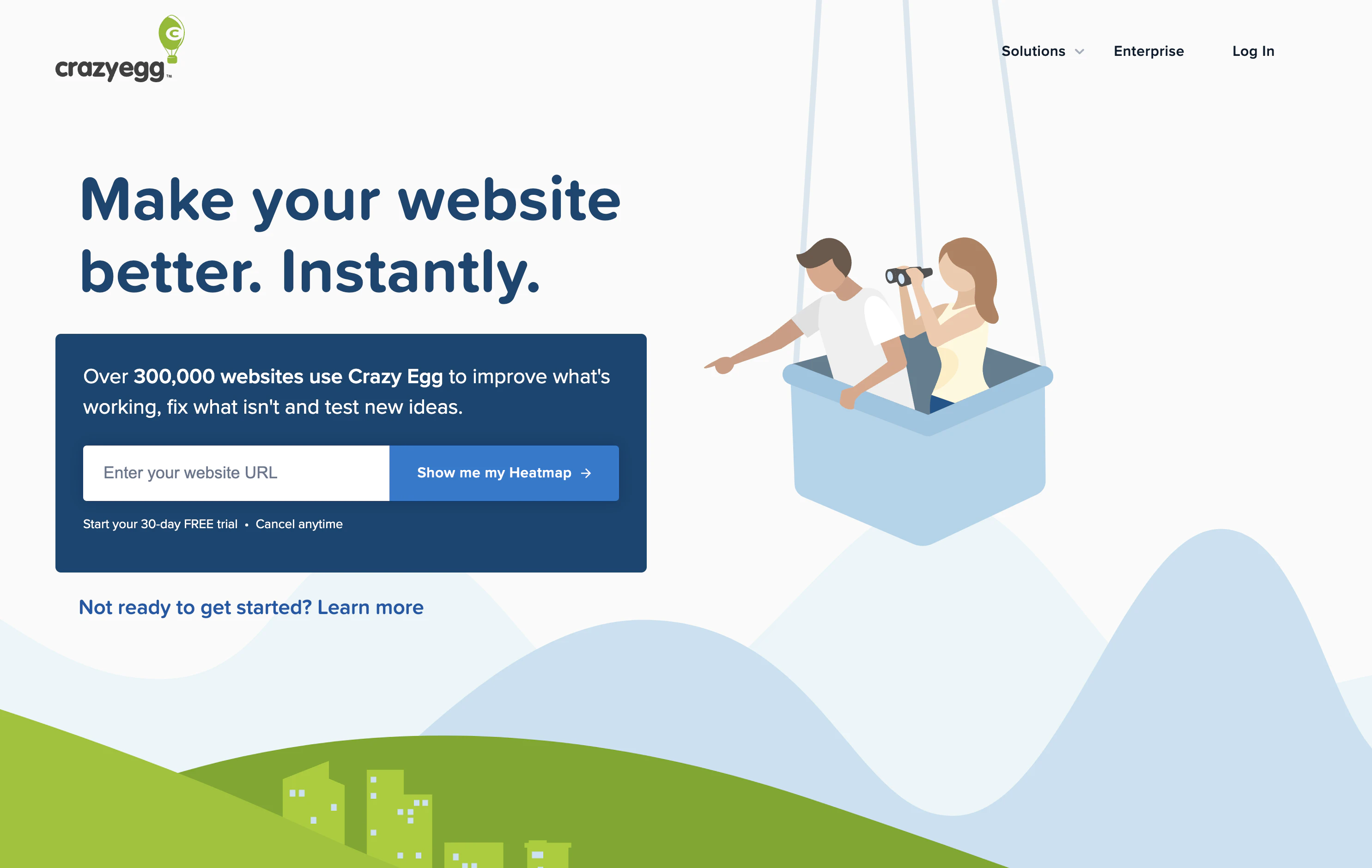
Crazy Egg does a great job of making their CTA feel personal by writing their call in the first person.
They are not signing up to see a demo of a heatmap; they are entering their URL to see their heatmap. It implies an immediate benefit to them upon clicking, and it tells them exactly what happens next.
3. Animoto


The CTA in the header is “sign up free,” but the “use this template” just slightly lower on the page prompts users to act. It helps your reader choose their first video template easily.
Any call-to-action that helps your reader take the first step (or at least feel like they have) will help make them more committed to seeing the task through.
4. CanvasPop


CanvasPop makes sure their reader knows that when they click the CTA, they will be taken to the page that will allow them to create their canvas. This is a better choice than “shop canvases” that takes away from the personal nature of photos.
Using the word “you” or “your” is another tactic used to help make CTAs feel directed solely at the reader.
5. GiftRocket

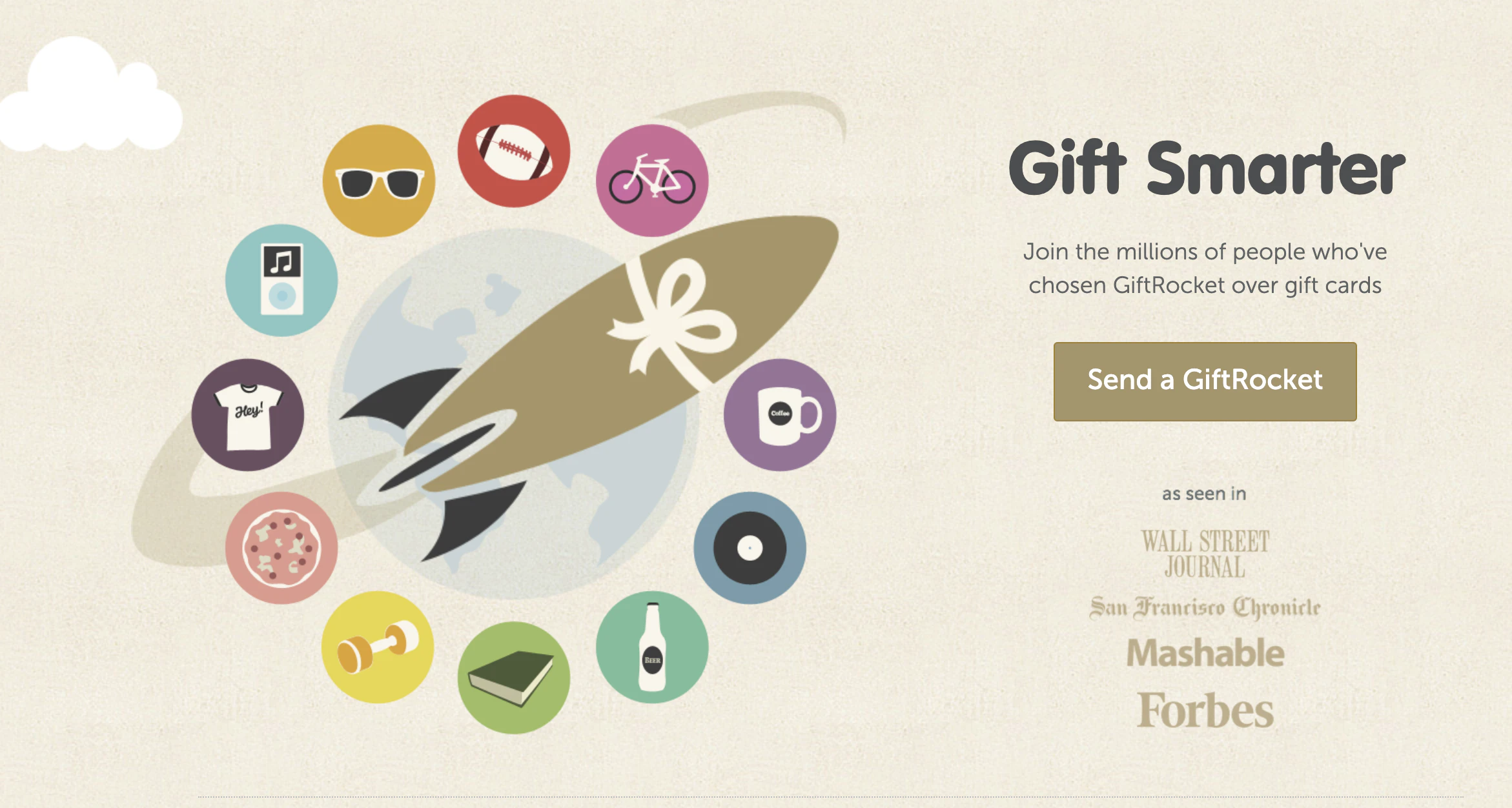
GiftRocket is all about gifting better than a standard gift card, but what is a GiftRocket?
That’s the question readers are left thinking about when they see this CTA.
A product-specific CTA is only helpful once your reader knows exactly what your product is. This isn’t the best CTA for a header image unless most of the traffic they are driving to their homepage is very aware of what they offer.
6. Shopify

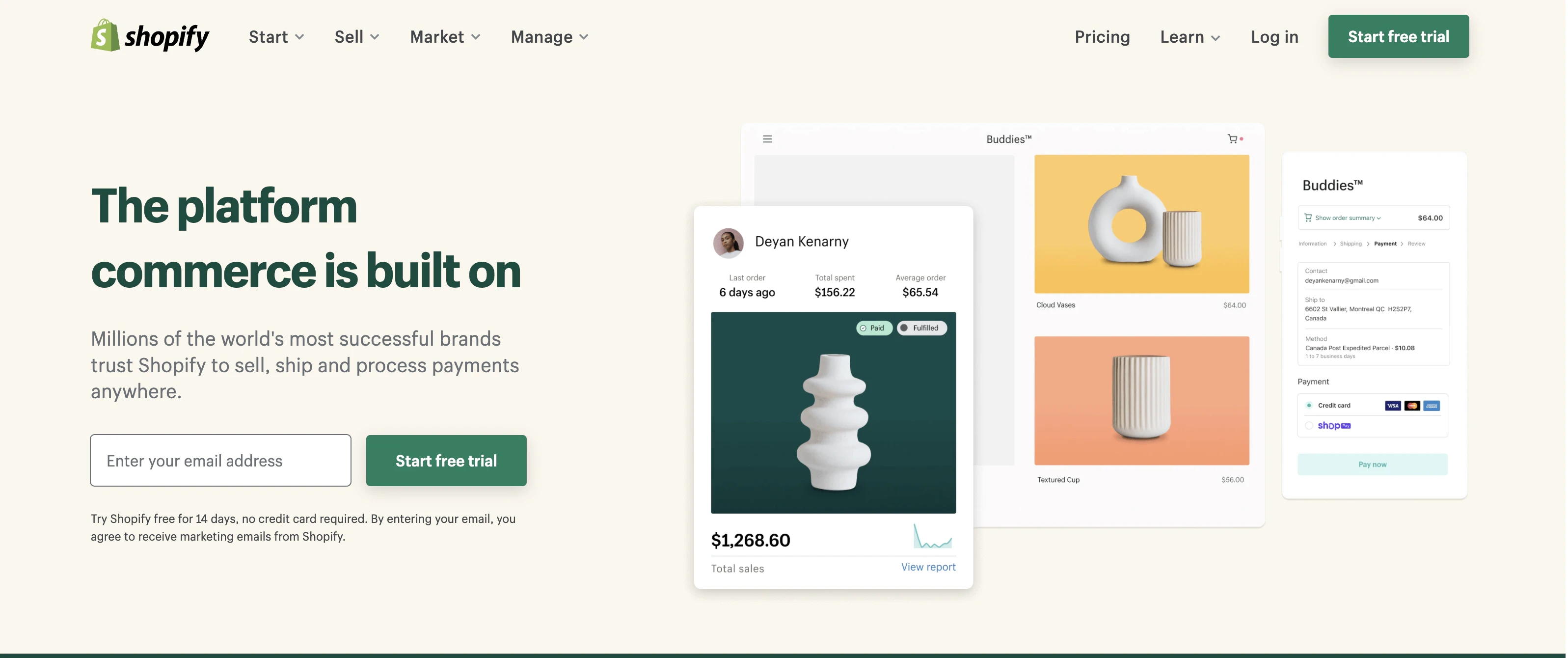
Shopify peppers the reader with lots of small CTAs down their homepage. A common start to their CTAs is “explore.”
“Explore” is a word that doesn’t imply a high level of work or commitment and is perfect for someone who is considering starting a Shopify store but isn’t ready to commit.
7. Brandless

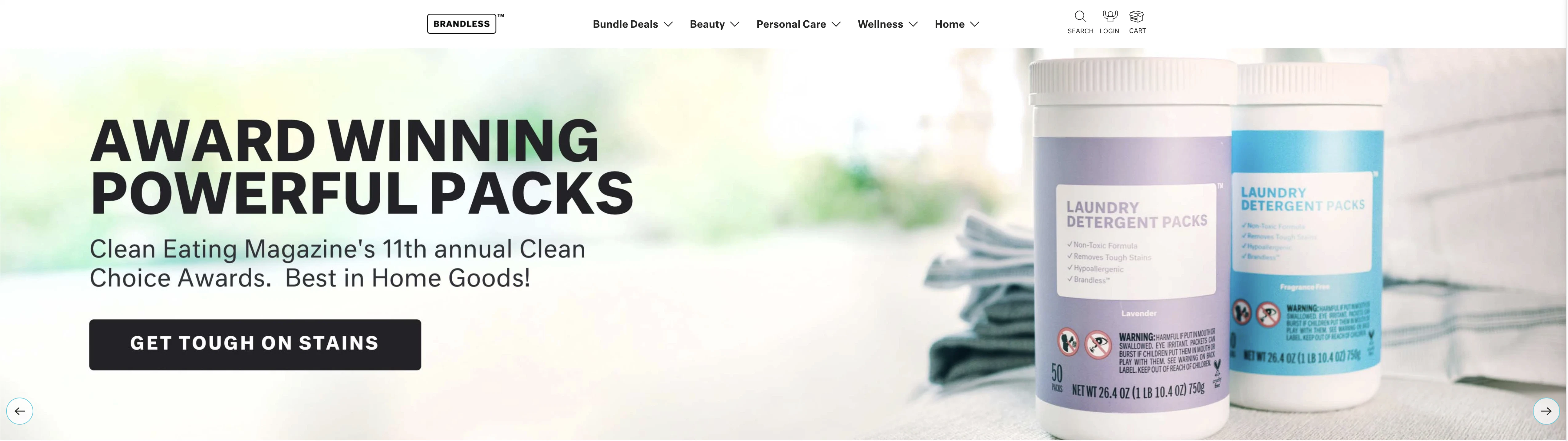
Brandless continues to focus on its value proposition in its hero section CTA.
Something like “Find Your Clean Routine” might also perform well and help differentiate the CTA from the standard “shop” that can trigger anxiety in people just checking out a product for the first time.
8. Lyft


Lyft is appealing to both riders and drivers with their hero CTAs. The CTAs are clear and direct for both audiences. You can tell that finding drivers is the primary mission of their website, though, as the “Apply to drive” is given visual hierarchy.
9. Airbnb


Airbnb is a massive platform that can get away with using a standard CTA like “Learn what’s new,” but it isn’t particularly enticing to the reader to click.
If you are going to place a throwaway type of CTA in your hero section, consider not using a CTA there at all. Not every section of your website has to have a CTA. It’s fine to focus on your value proposition and leave the CTAs for further down the page.
10. Less Accounting

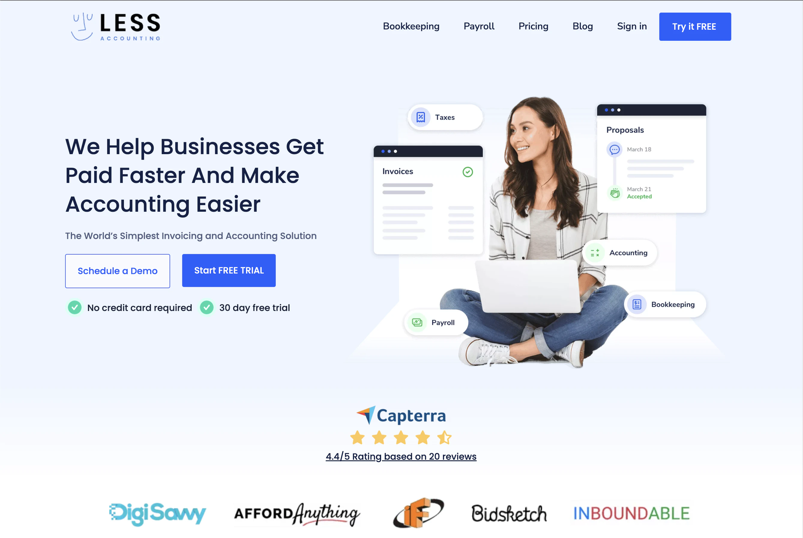
Less Accounting wastes no time with their CTA. Booking a consultation, even a free one, is a big ask.
I’d argue that this CTA should be reserved for readers that further down the customer journey and are at the point of purchasing decision.
11. Yeti

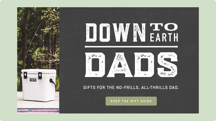
Yeti’s CTA, while pretty standard, works here. It’s June, and anyone who clicks on this image to shop for a Father’s Day gift is ready to act. As a general rule, the more urgent your reader is to take action, the more direct your CTA should be.
12. Hulu

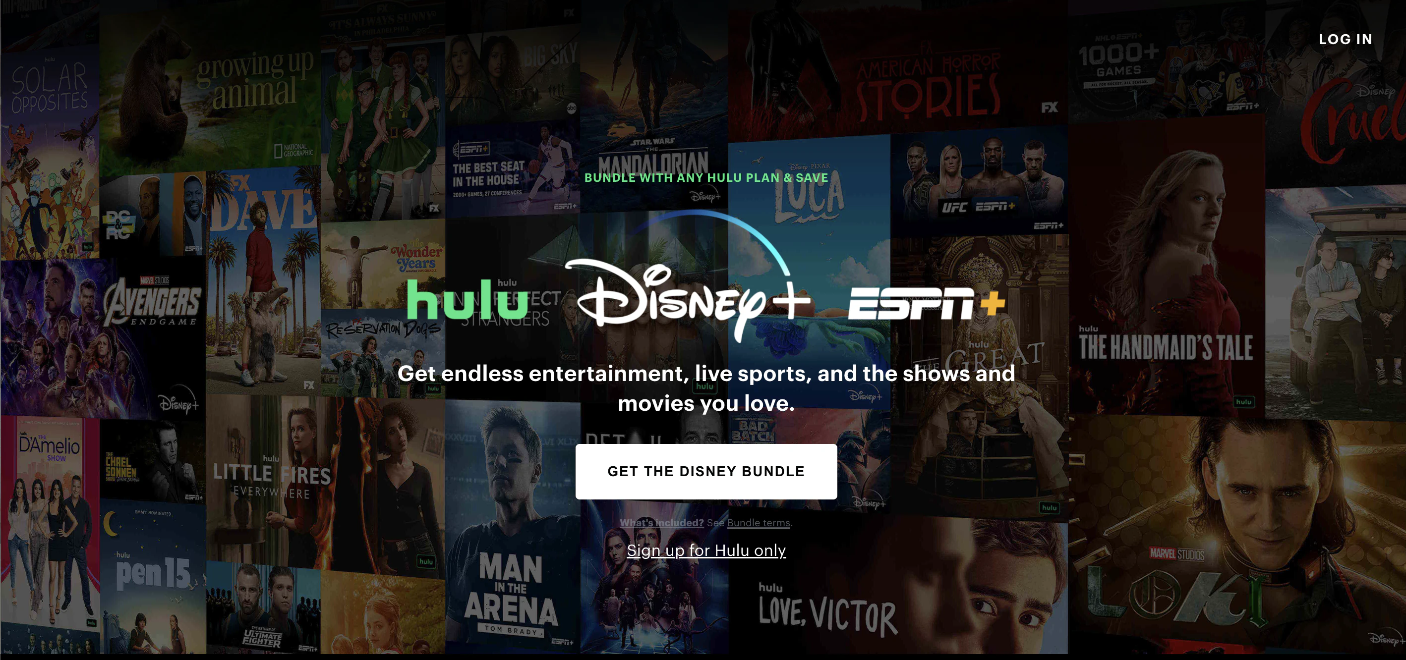
Hulu has two CTAs at the top of its homepage. The main one – start your free trial – is targeted at newcomers. The other – get bundle – speaks to current customers.
I’d argue that the free trial fits the bill because it implies a clear benefit, but the bundle CTA needs to be more specific. How much will it save you exactly?
Don’t be afraid to be ultra-specific with your button copy, especially when it's targeted to people who are already buying from you and more likely to buy more if you can make the benefit obvious to them.
13. Instagram

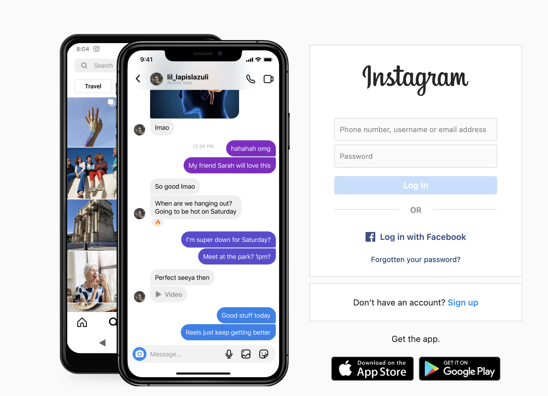
You probably didn’t think of “log in” when you thought of CTAs, but it absolutely is.
This example is included on this list to draw attention to the point that when it comes to specific actions, don’t try to get creative. If your reader is used to seeing log in, then fall in line and use the same CTA for your product.
There’s a time to make your CTAs stand out and a time to make taking action feel effortless and familiar to your reader.
14. Contently

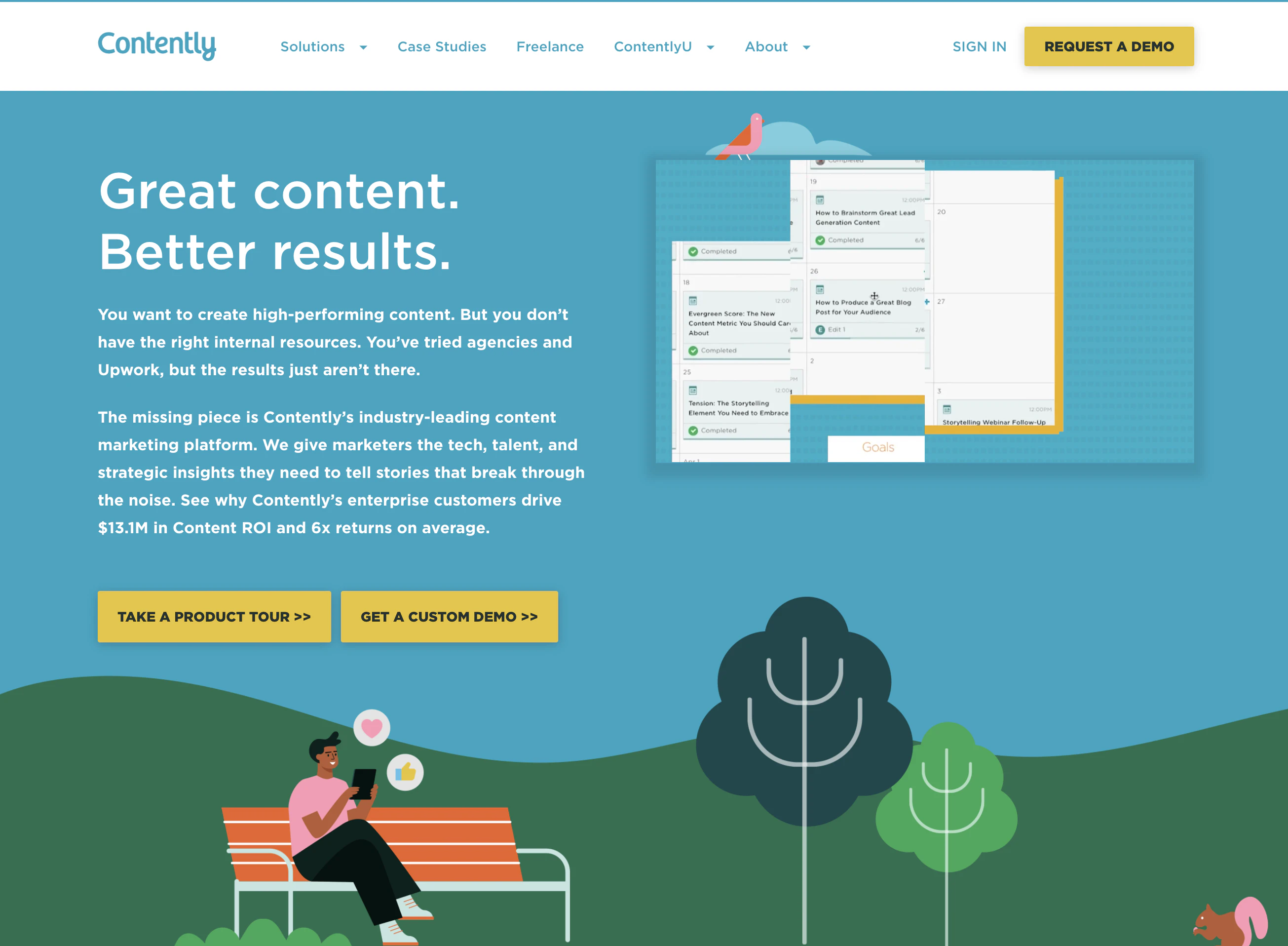
Contently knows that readers don’t have to pay for a tool to create content. But if you want your content to be incredible, then you need Contently.
The CTA targets the reader’s need to create content better than what’s already out there to generate more traffic and leads for their businesses. The simple addition of the word “incredible” changes the entire message.
15. Starbucks

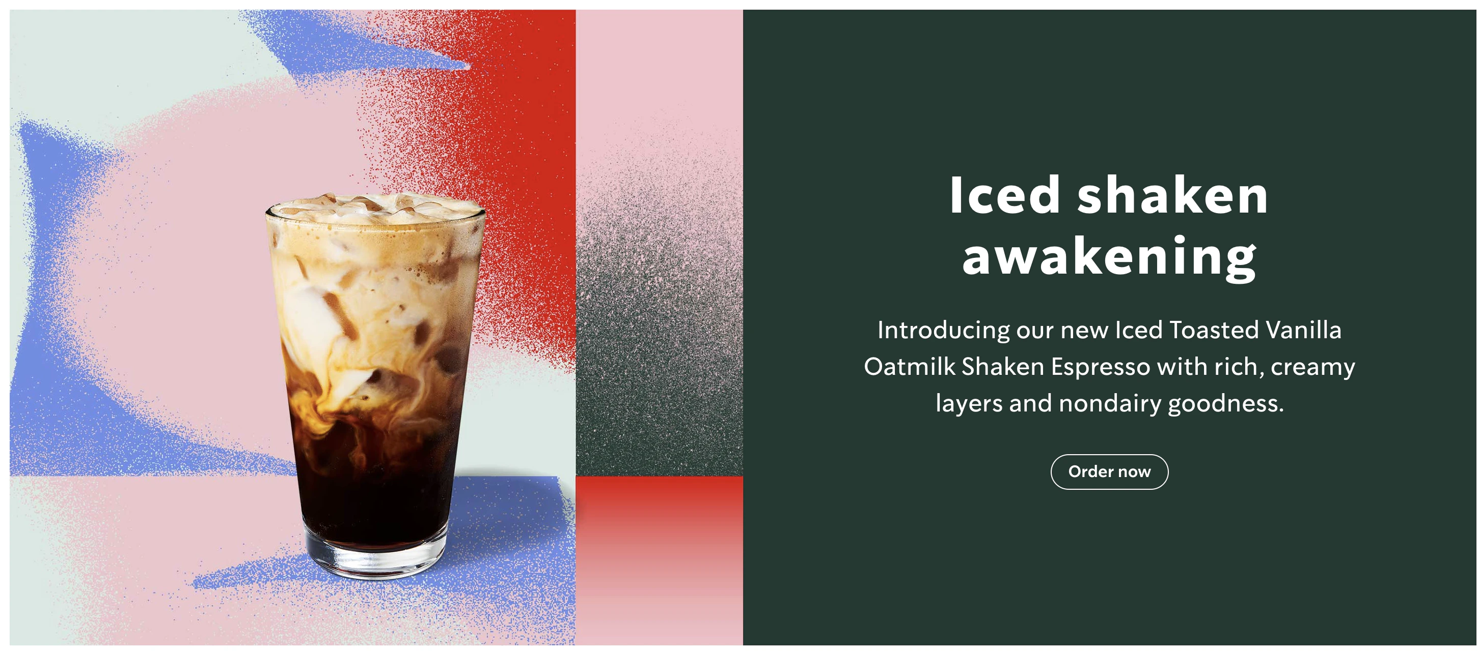
Starbucks doesn’t just use its homepage to teach about its offerings. They use it to encourage people to go ahead and order.
The homepage shows several groups of offerings and focuses their CTAs to be product type-specific.
16. Spotify
Like UsabilityHub, UserTesting allows you to test your content with real customers. You can pick the type of people you want for your test and get feedback within hours.

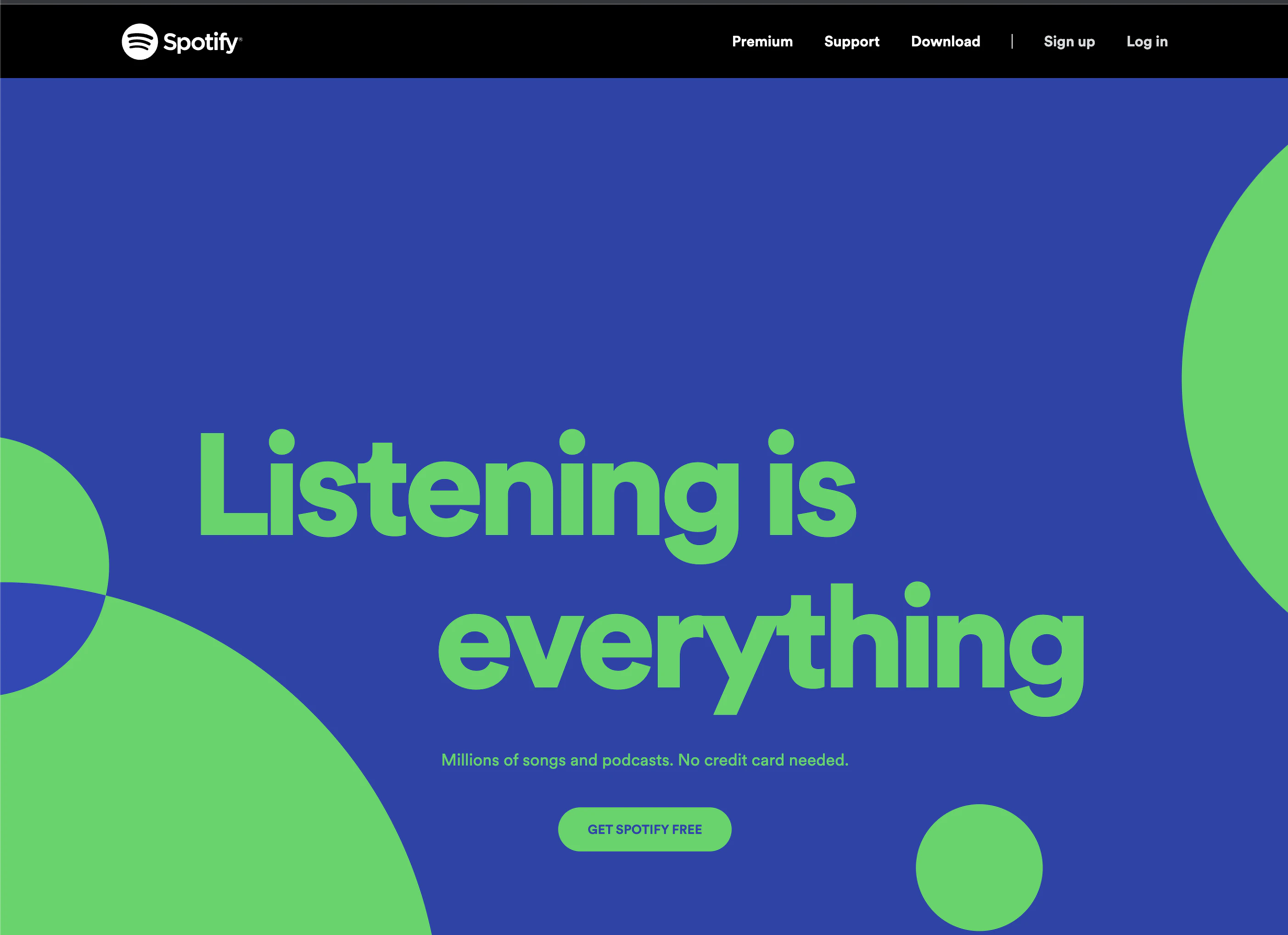
Spotify’s CTA matches its headline, which is smart. If the headline caught the reader’s attention, then there’s reason to believe that they would click the CTA with the same benefit.
Not to mention the risk-reducing copy in between that makes taking action feel like a no-brainer choice. Well done.
17. Dollar Shave Club

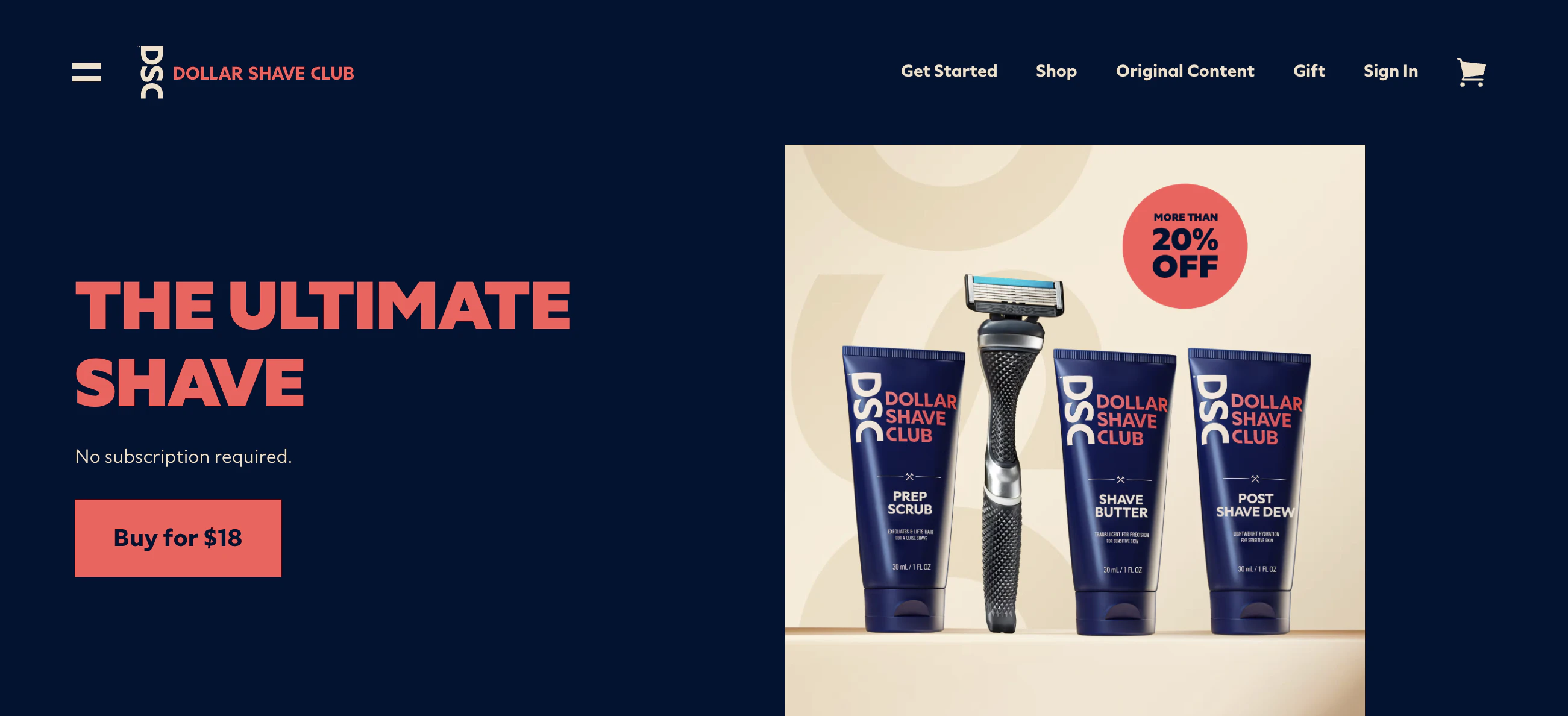
Dollar Shave Club is capitalizing on the quiz/survey trend that tailors product recommendations based on responses.
The button copy makes the action clear but could better reflect the benefit or provide a time estimate near the button, so the reader has more information about what to expect.
Note that button copy doesn’t always have to be two or three words, test using slightly longer button copy that delivers more value and see what happens.
18. Square
Contentsquare provides you with digital insights designed to drive revenue for your business. It helps you understand customer behaviors so that you can make more informed hypotheses for your A/B tests.

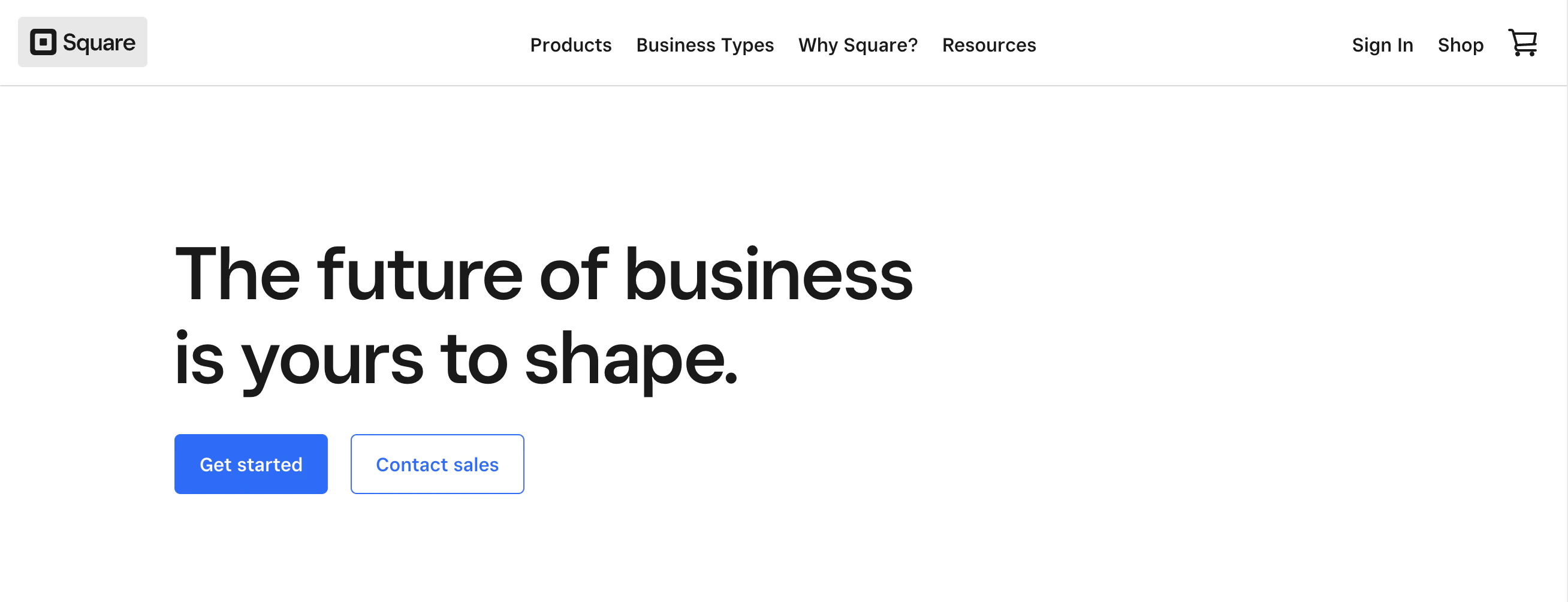
This CTA from Square is a CTA you want to avoid. It’s in the header, which implies it is essential, but it isn’t optimized at all. It is out of proportion and looks like a throwaway CTA that was added because someone thought it had to be.
The CTAs on the rest of the page would have been just fine. Again, don’t toss in CTAs thoughtlessly where they aren’t needed.
19. Whistle

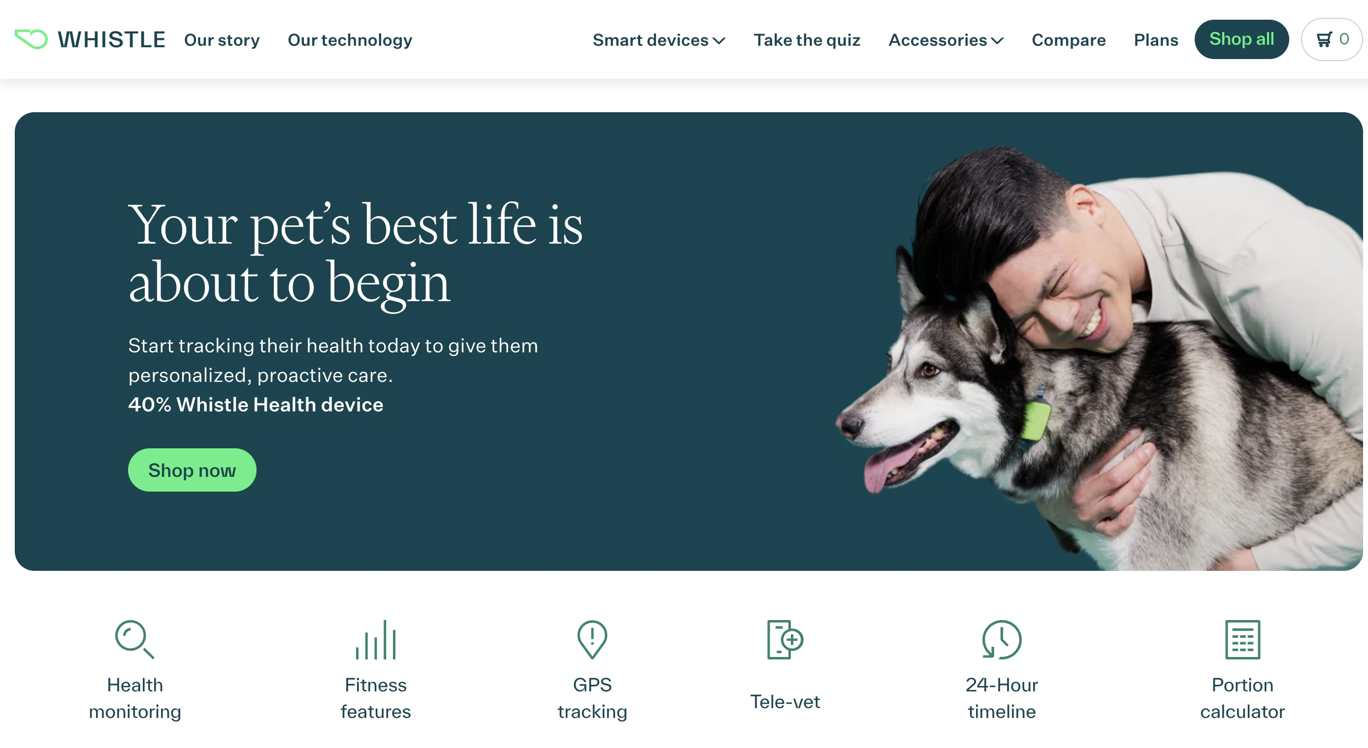
Whistle is targeting a market with a deep emotional connection to its product. Anyone who is purchasing from them loves their pet, but the emotional benefit of the product isn’t well reflected in their CTAs. Whistle is missing an opportunity by using the standard “shop” CTA.
20. De Beers

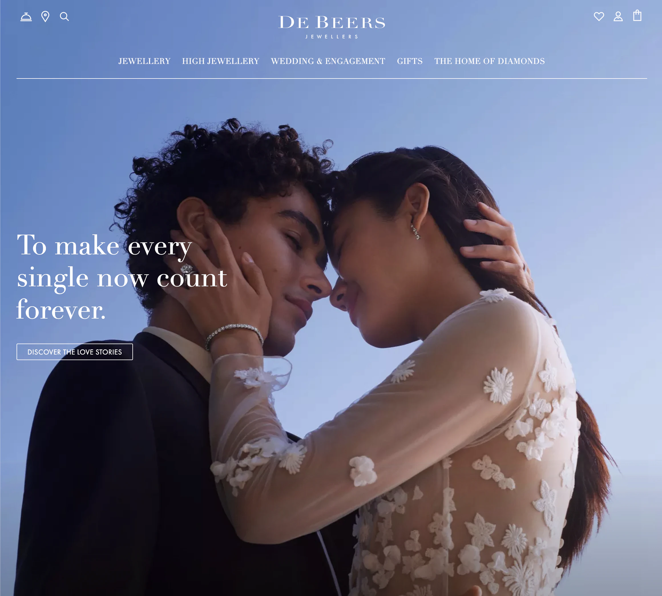
A page can have too many CTA’s, and De Beers homepage is an example of this.
The CTAs are overwhelming and not in a good way. Words like “learn,” “discover,” and “browse” that are barely legible on the images are weak attempts to drive action.
21. Bed Bath & Beyond

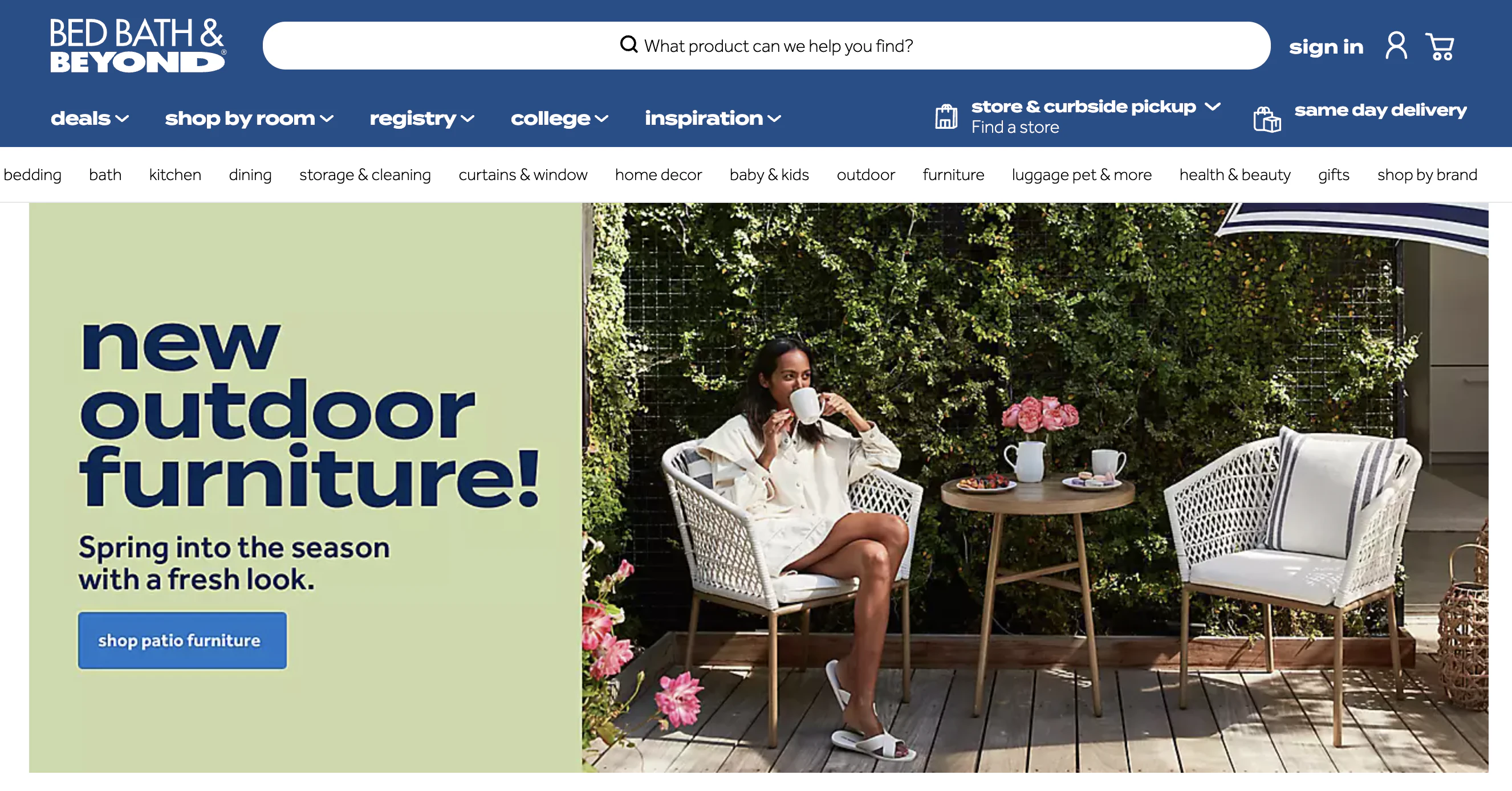
The CTA used here from Bed, Bath & Beyond is fairly standard, but the copy that surrounds the button and pushes the reader to click is what works. Specifically, the phrases like “prep, from $3” shows they know their reader is looking for new kitchen tools they will love that are affordably priced. The key is to always think about your audience.
22. Birchbox

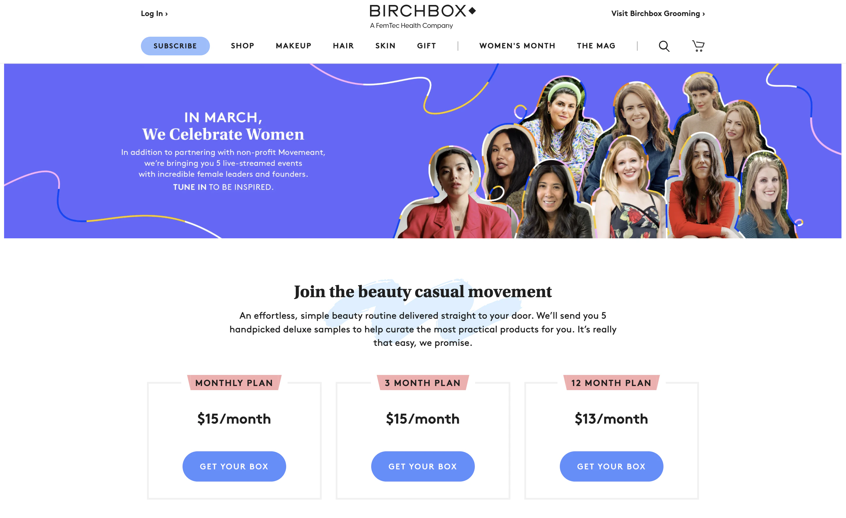
Instead of using a CTA like “sign up” or “shop,” Birchbox chooses to go product-focused with “get your box.” The word “get” has a lower commitment feel to it, making the CTA less intimidating.
They support their CTAs by including the lowest breakdown of the product’s price by what it costs monthly instead of overall costs.
23. Plated

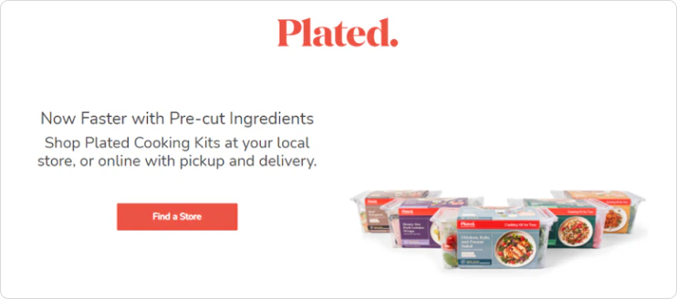
Plated could revamp its entire hero section, but especially its CTA.
“Find a store” is not the CTA you should place front and center on your website unless you only have a physical location. If you offer online ordering and delivery, why should the action be locating a store?
24. Monster

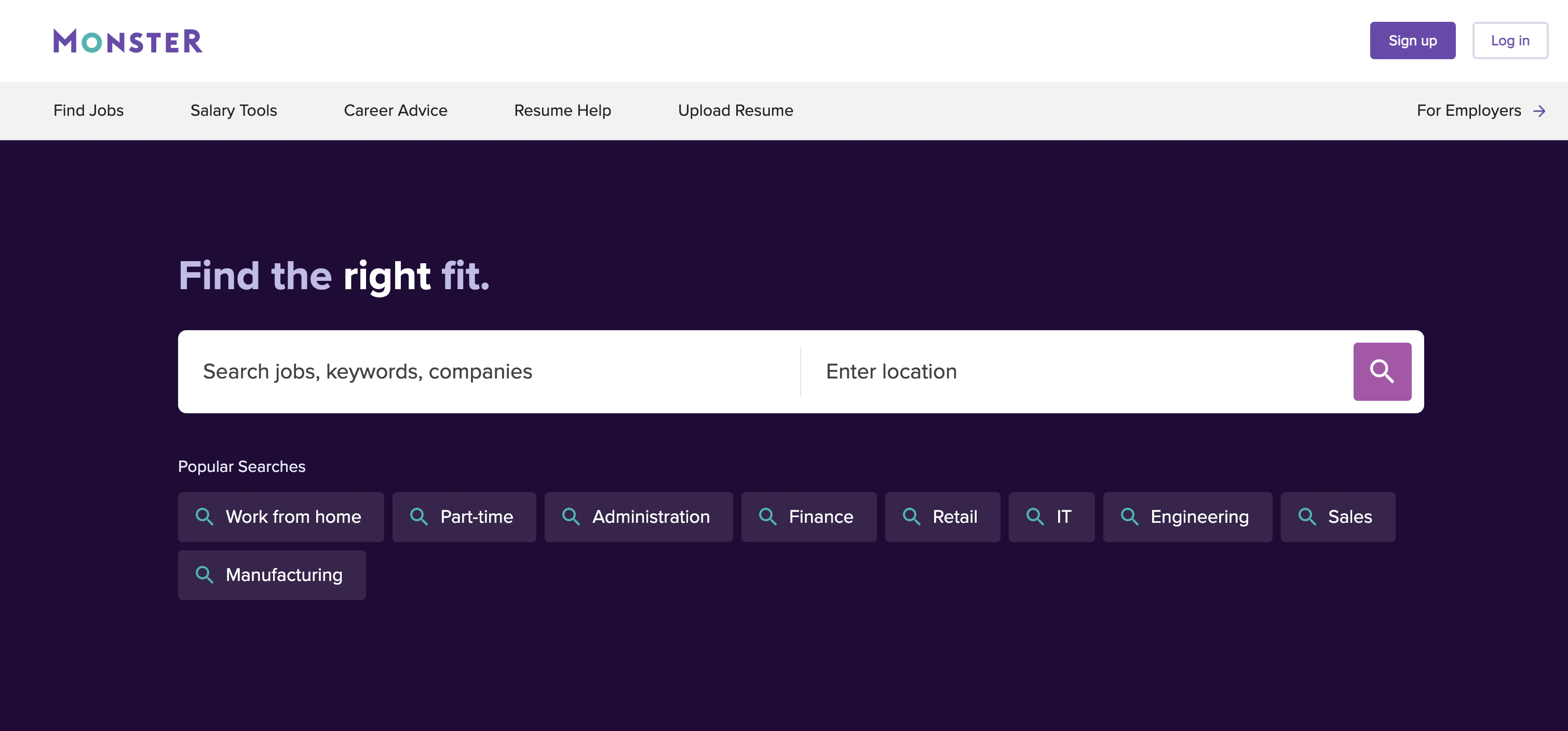
In this example from Monster, the search icon (or the many options underneath) is actually the click but “find the right fit” is the CTA. This is a clever setup for a search-based CTA.
25. Truist

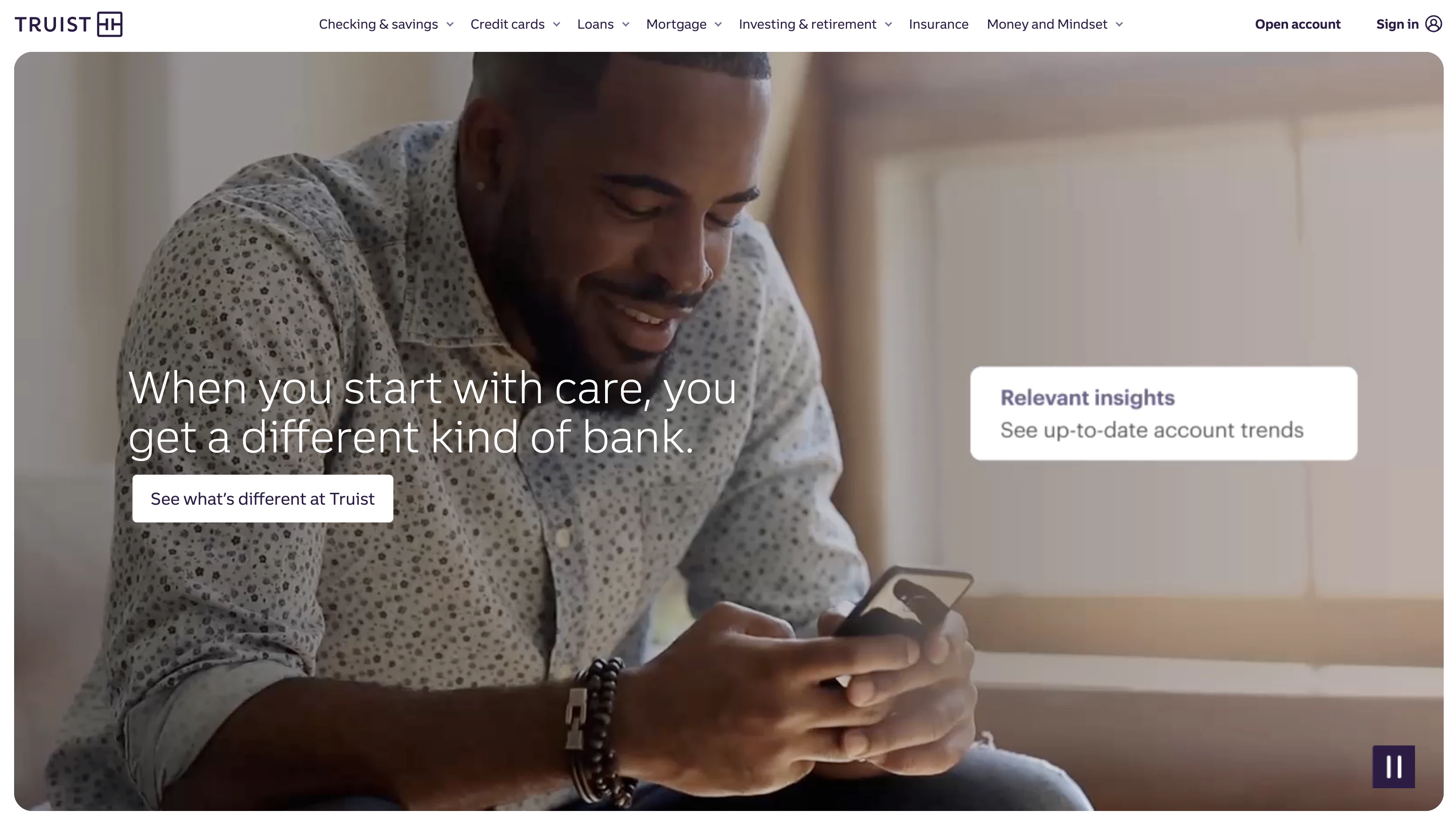
“Open an account” is at the top and the number one CTA for Truist. The CTA capitalizes on using standard banking terminology and is designed for readers that are most ready to take action.
26. Mint

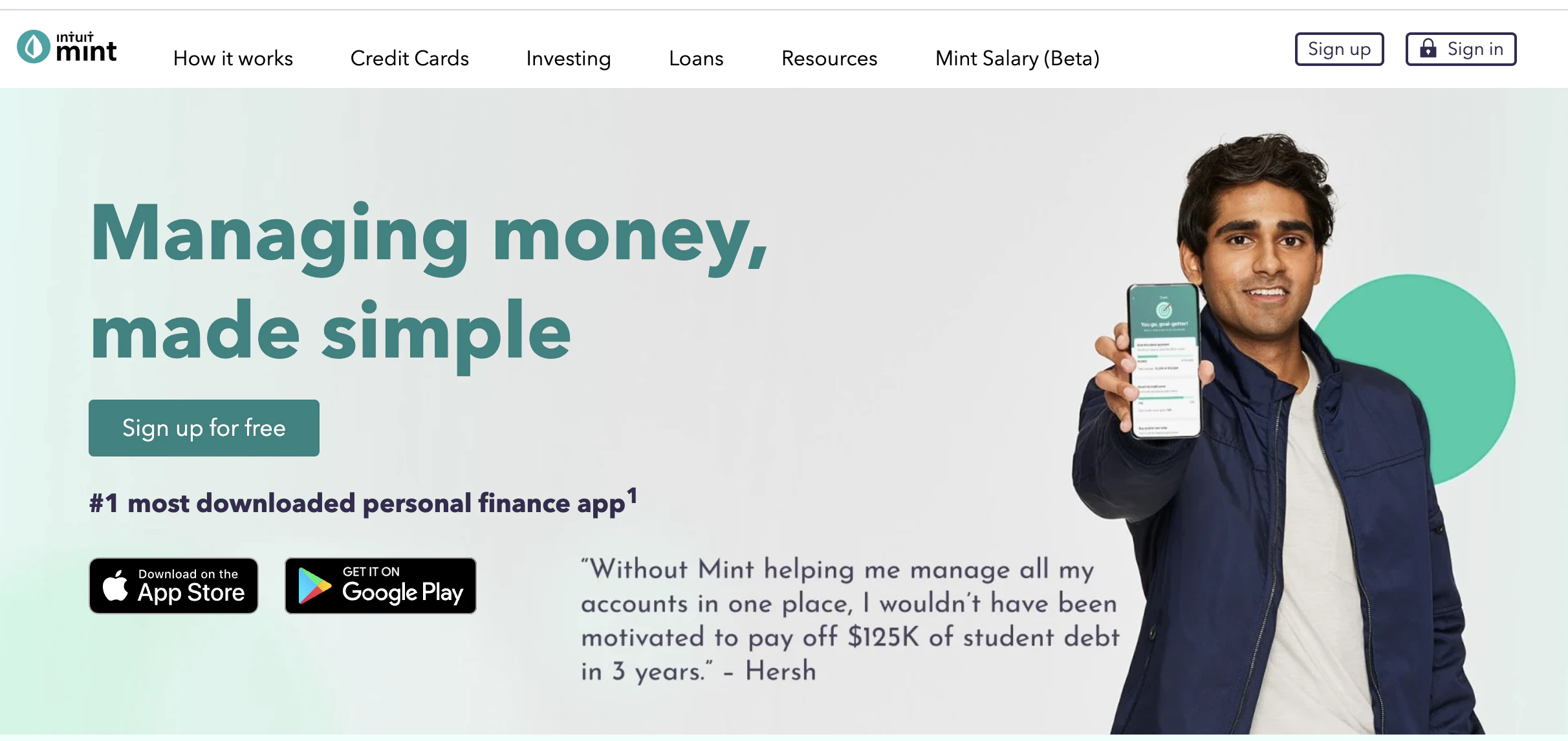
This CTA from Mint could be improved by replacing the brand name with a benefit. Mint could try something along the lines of, “Sign up for better money management” or even “Manage my money better.” Yes, it’s long, and yes, it’s not the exact copy you see across all the competitor sites, but that’s the point. In a crowded space, make your CTAs stand out.
27. T-Mobile

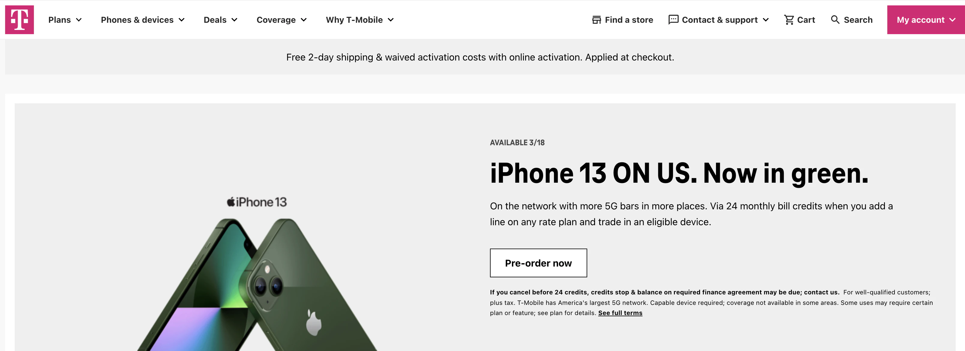
T-Mobile makes a couple of flaws here with their CTAs.
The first is that they have three CTAs that are all near each other, and the second is that two of the CTAs are too visually similar. Do they want me to shop now or call more?
If you are going to use multiple CTAs, at least make one a clear priority. Too many options lead to nothing happening.
28. TurboTax

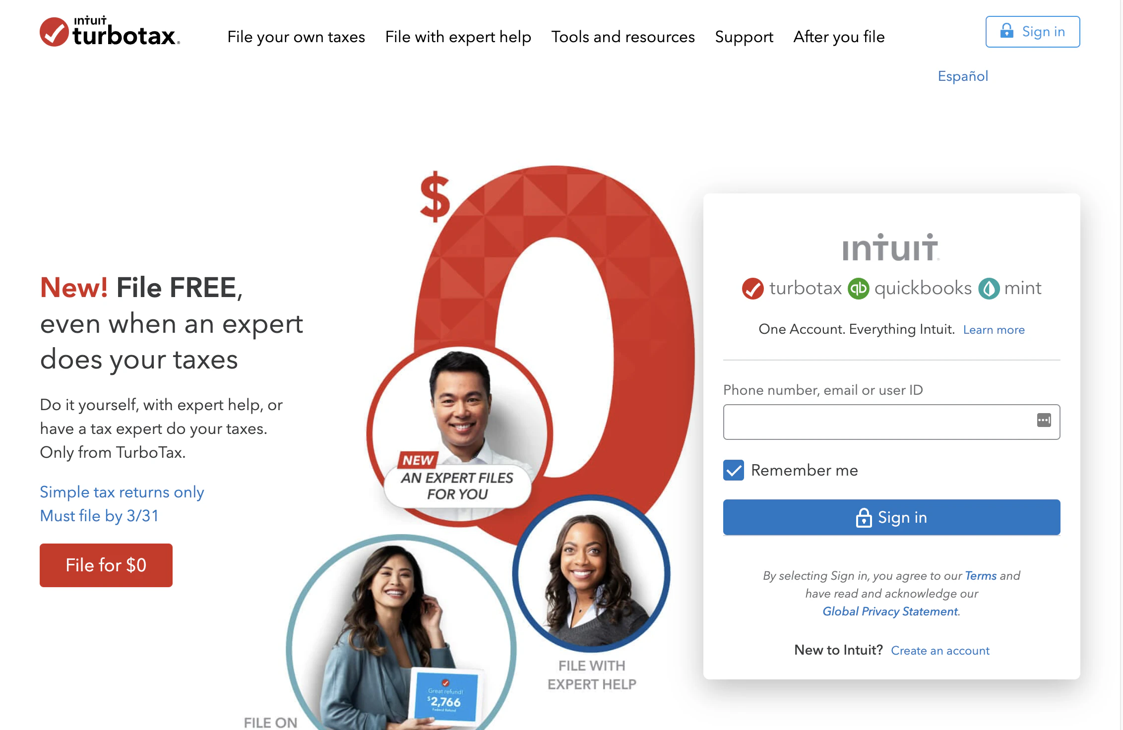
TurboTax’s CTA’s on the left is an excellent example of how to use more than one CTA near one another. They are visually distinct and give a straightforward explanation of what happens next with either step.
However, the sign-up on the right side of the screen makes it all seem a little crowded. It may be better off to have the sign-in option as a single button in the upper right-hand corner like many other sites use and focus on acquiring new customers in the hero section.
29. Freshbooks

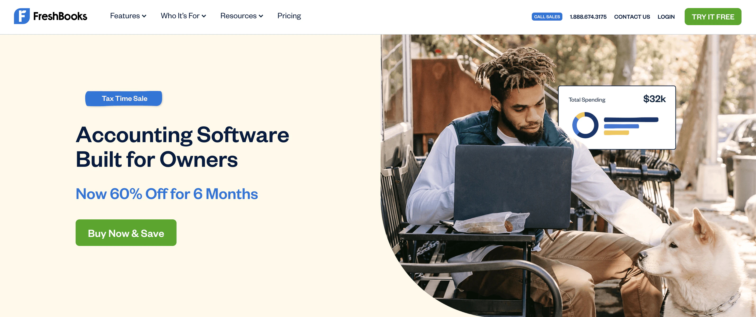
Freshbooks CTA “buy now and save” utilizes two popular copy principles. The word “now” implies urgency, and the word “save” triggers our desire to get the best deal. It’s a smart combination as an offer for business owners focused on their bottom line.
30. Toms

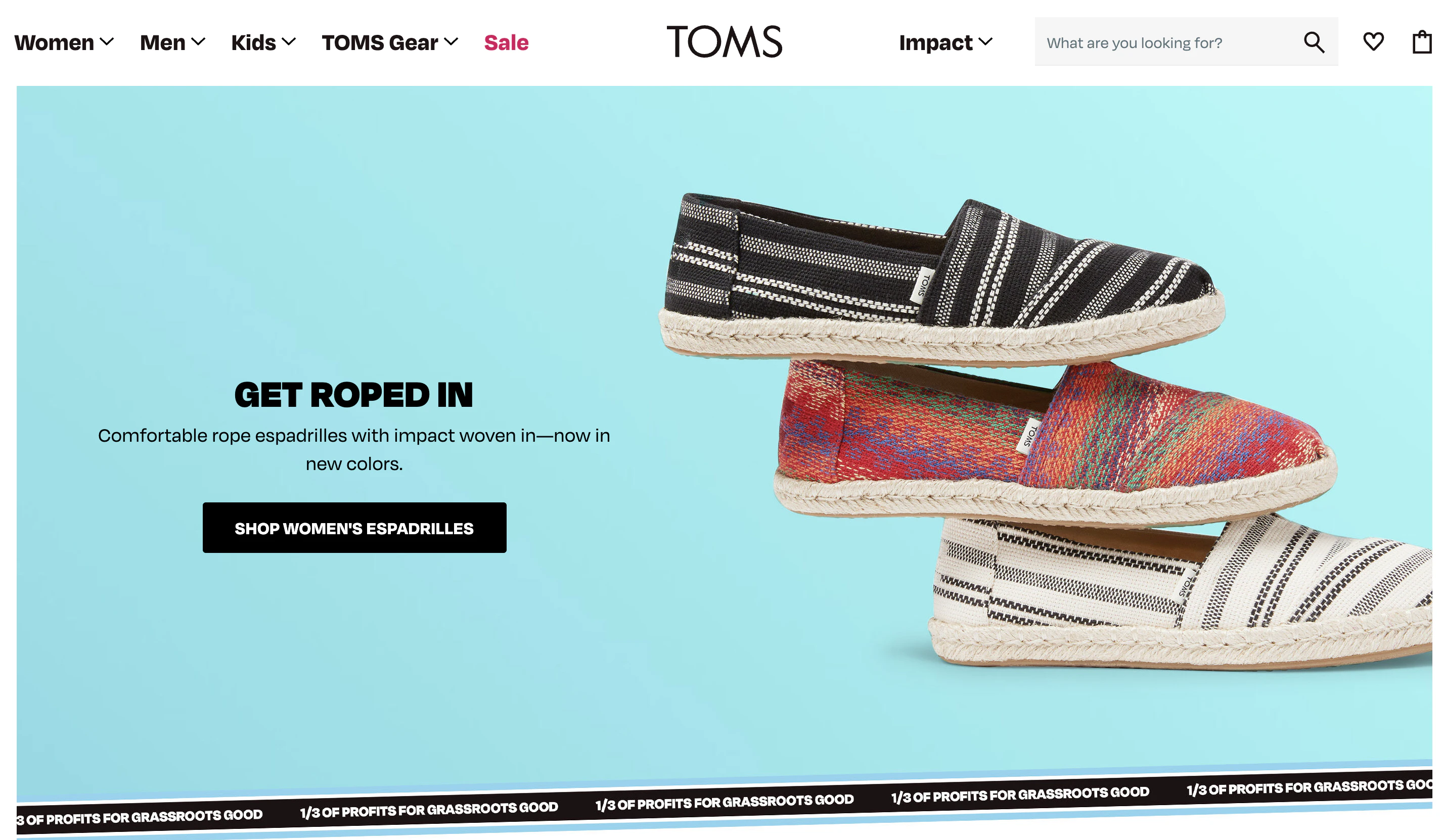
Tom’s breaks up the typical shop CTAs with specific collection call-outs. This makes each CTA feel unique and purposeful.
31. Shakr

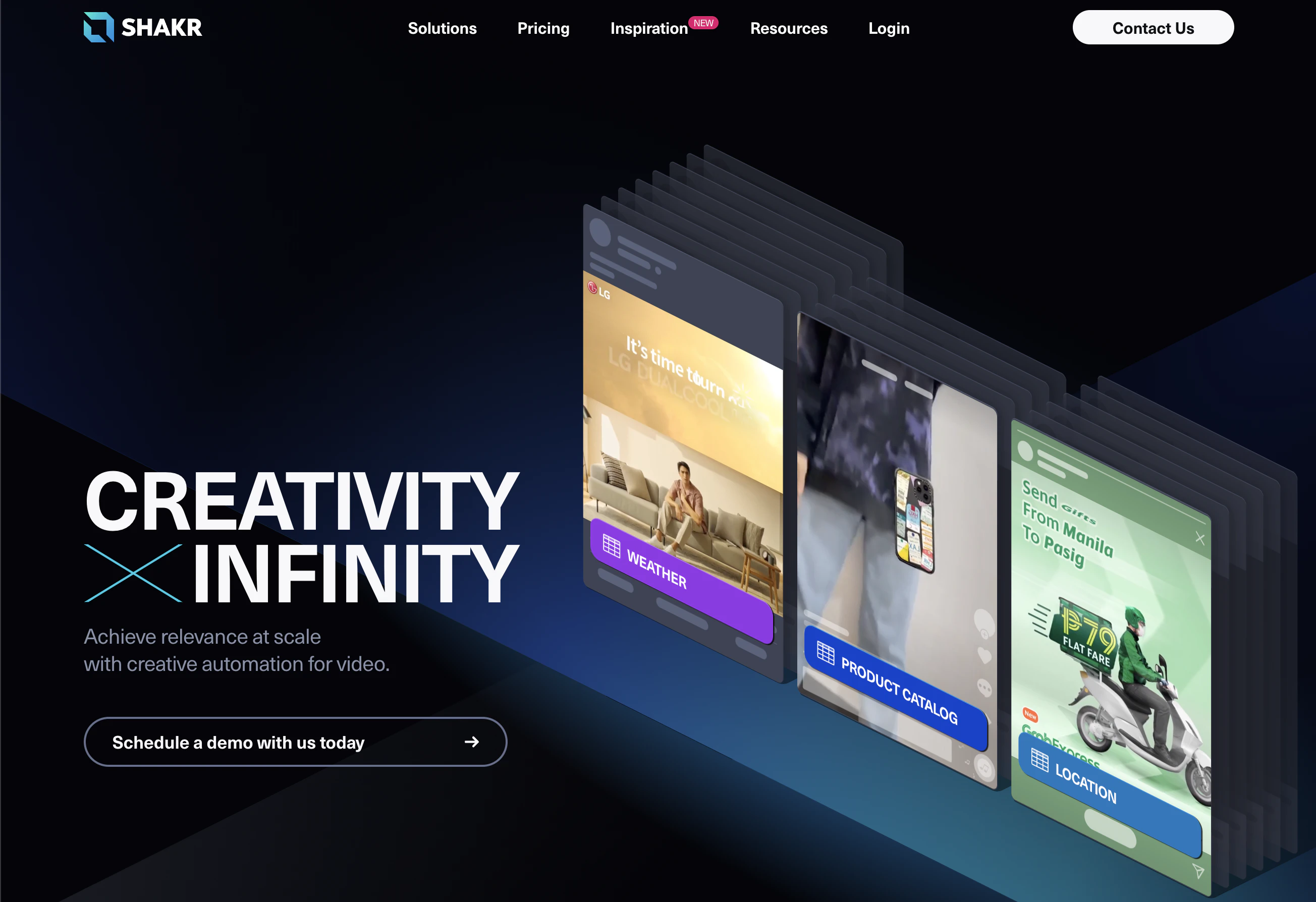
Shakr offers a demo as their next step, but their CTA isn’t just “get a demo.” They make it longer, and it gives it a friendly feel overall.
32. Backlinko

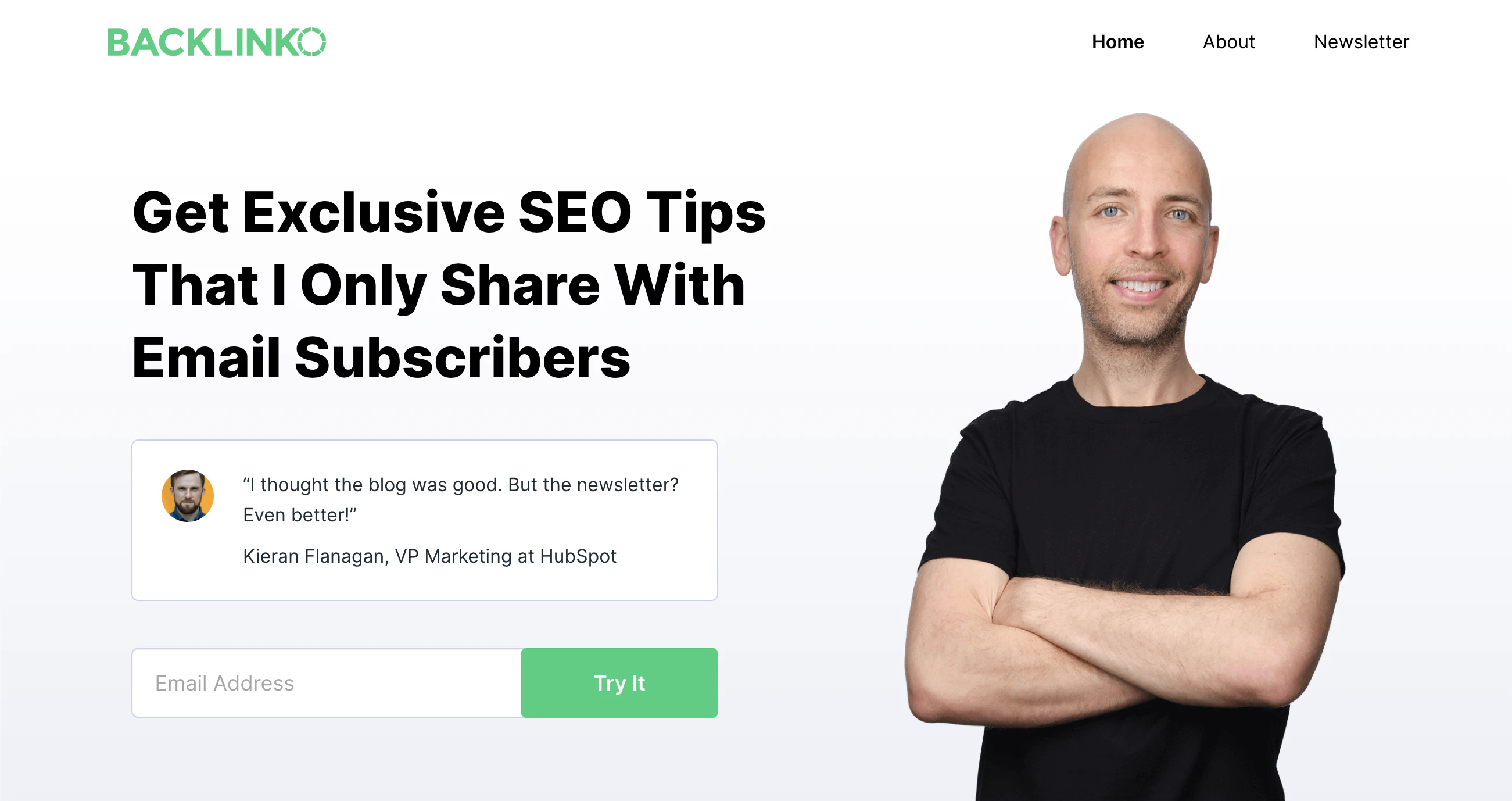
Backlinko is all about optimization, so this CTA has likely been tested and perfected. “Try it’ is a simple task that implies little commitment. If you try something and don’t like it, no big deal, right?
33. Netflix

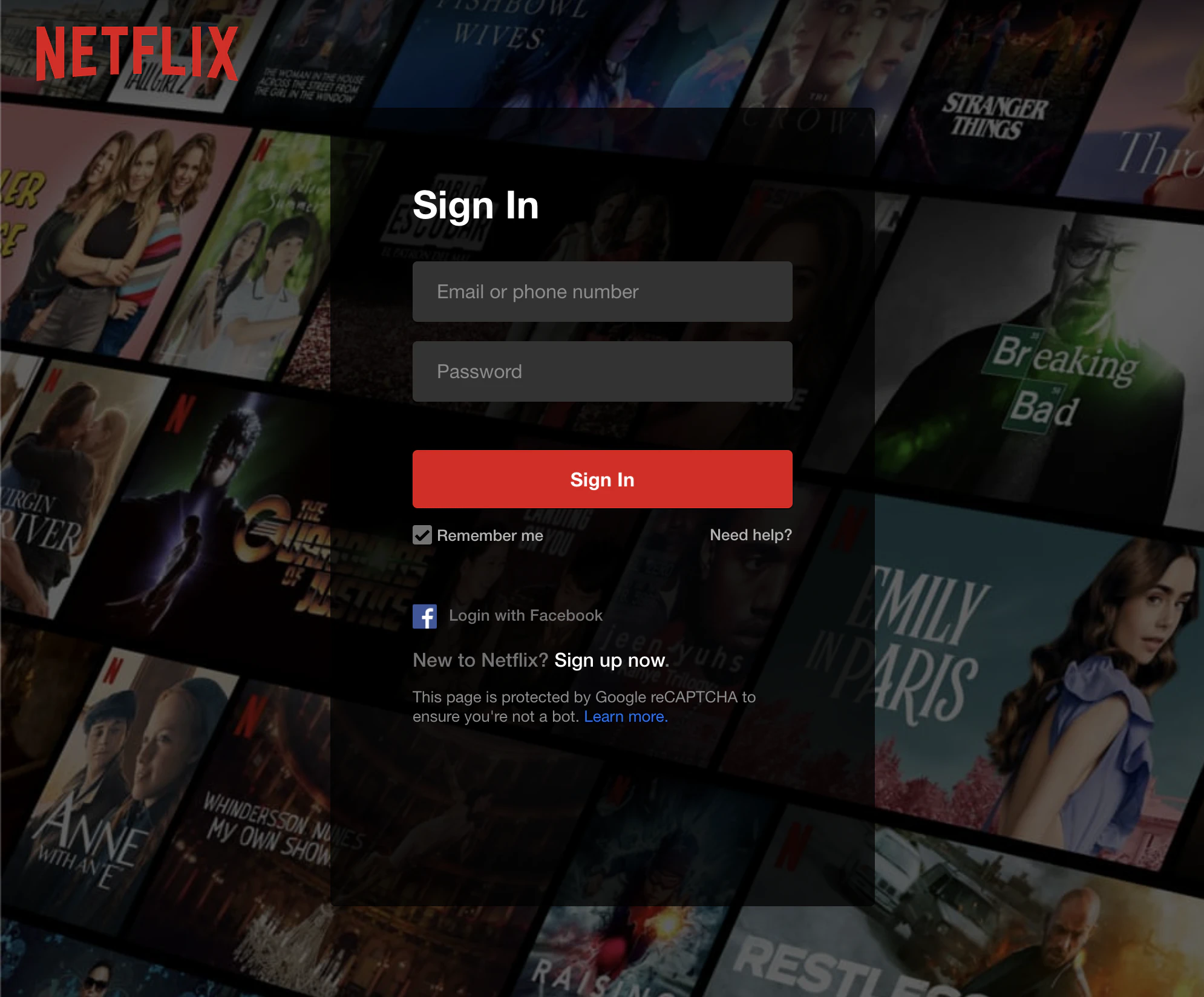
Netflix is the most established streaming service, so they don’t offer a free trial. Instead, their CTA is to “get started.” They even mention a simple way to restart your membership by just entering your email. There isn’t much friction in the steps between lead and customer for Netflix, so all of their CTAs are to the point.
34. WordPress

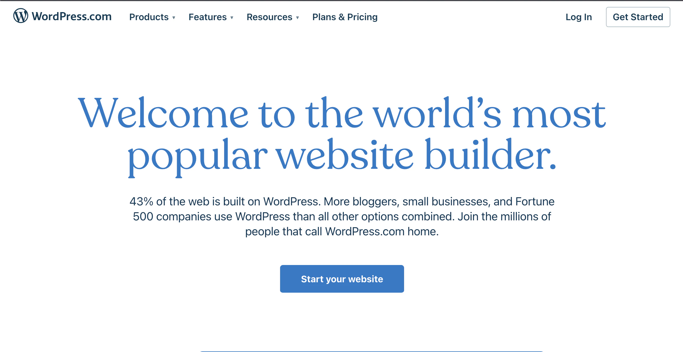
Readers go to WordPress when they are ready to set up their own website easily. WordPress is well aware of that; hence the very straightforward CTA backed up by the stat that a staggering 41% of sites are WordPress sites.
35. Snappa

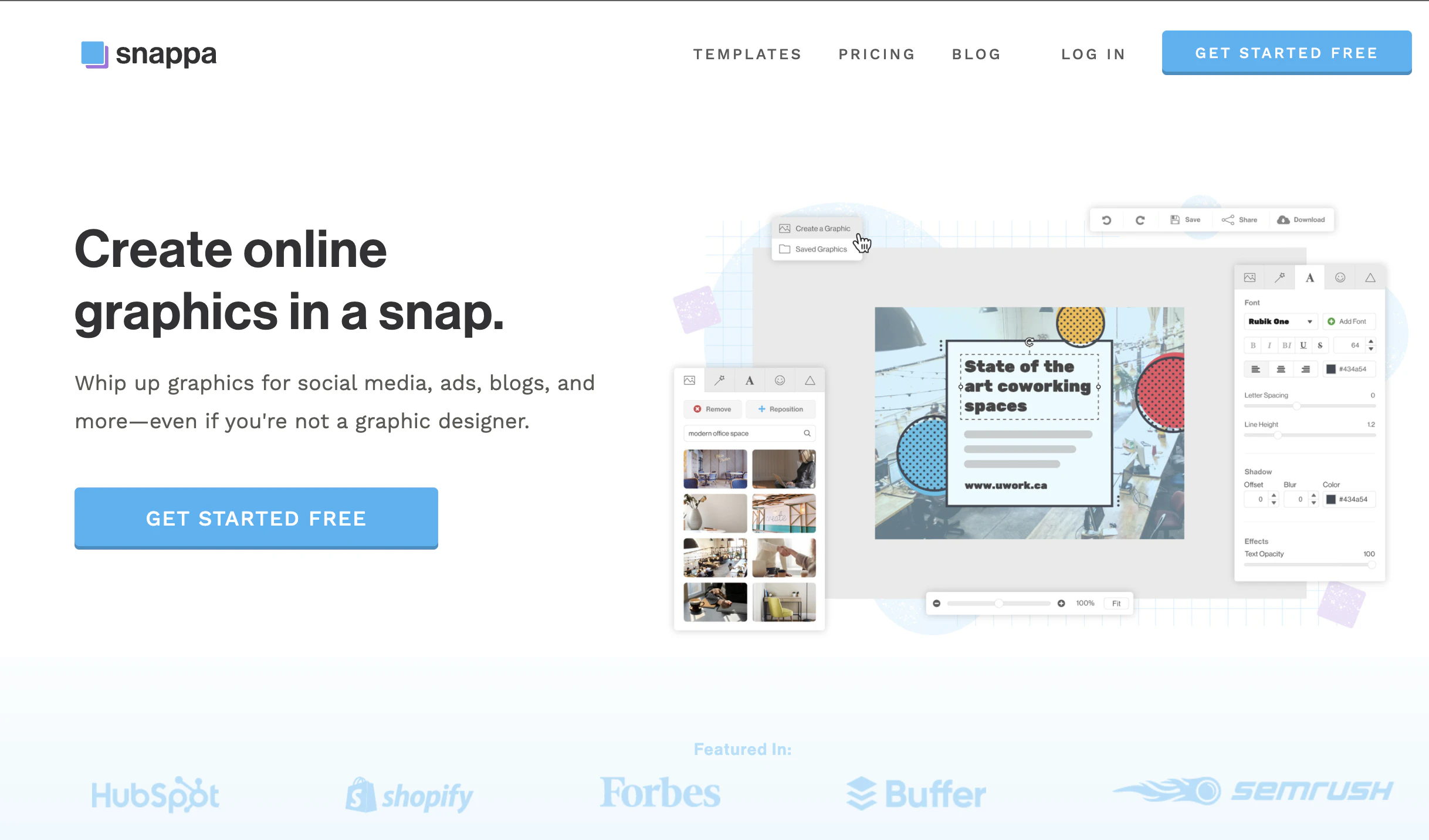
The word “free” is often tossed into CTAs because it's heralded as a power word, but it isn’t always the right choice.
There are a lot of graphic design tools on the market with a free option, so in this case, Snappa might be better served by highlighting what makes them different versus that you can get started for free.
36. Allstate

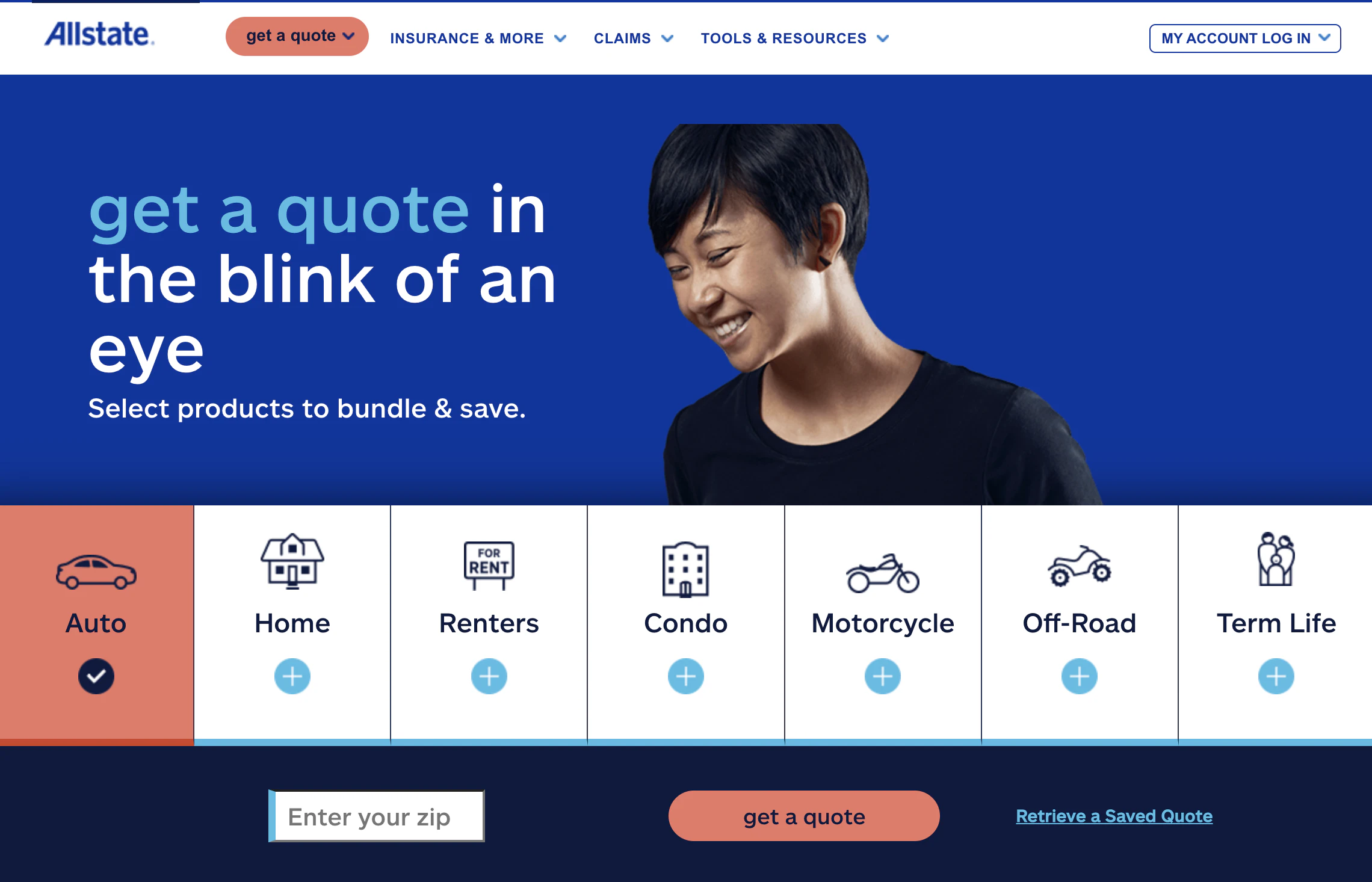
Allstate’s CTA to “bundle & save” is followed up by letting you select all that apply to you. Another great instance of separating the CTA from the click.
37. VoiceNation

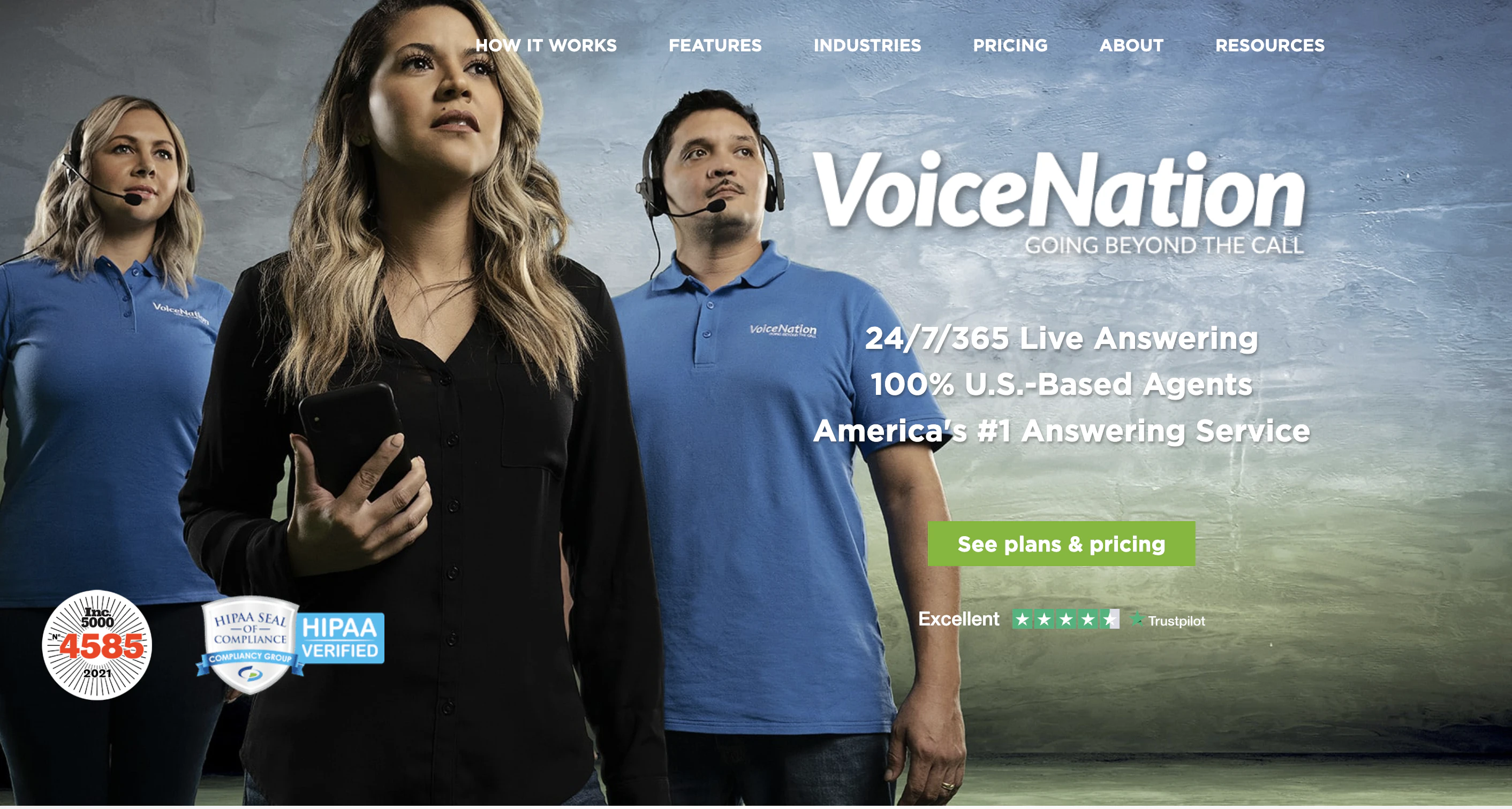
VoiceNation’s CTA moves the reader to the next stage of the customer journey without wasting any time.
Instead of getting you to sign up to a list or create an account, they take you immediately to pricing.
38. Bigstock

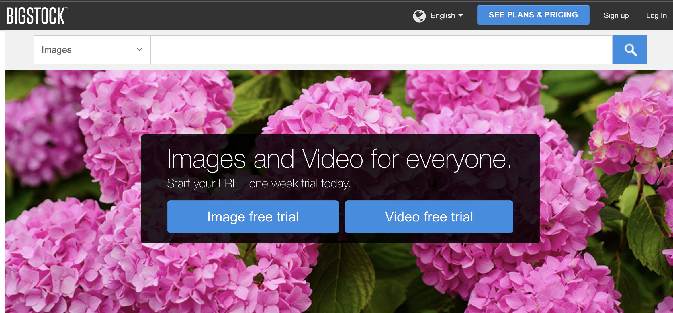
In case you weren’t aware, Bigstock places a lot of focus on its “free trial.” They have three CTAs all grouped together to give you plenty of opportunities to click one. This is a clear case of CTA overkill.
39. Rothy’s

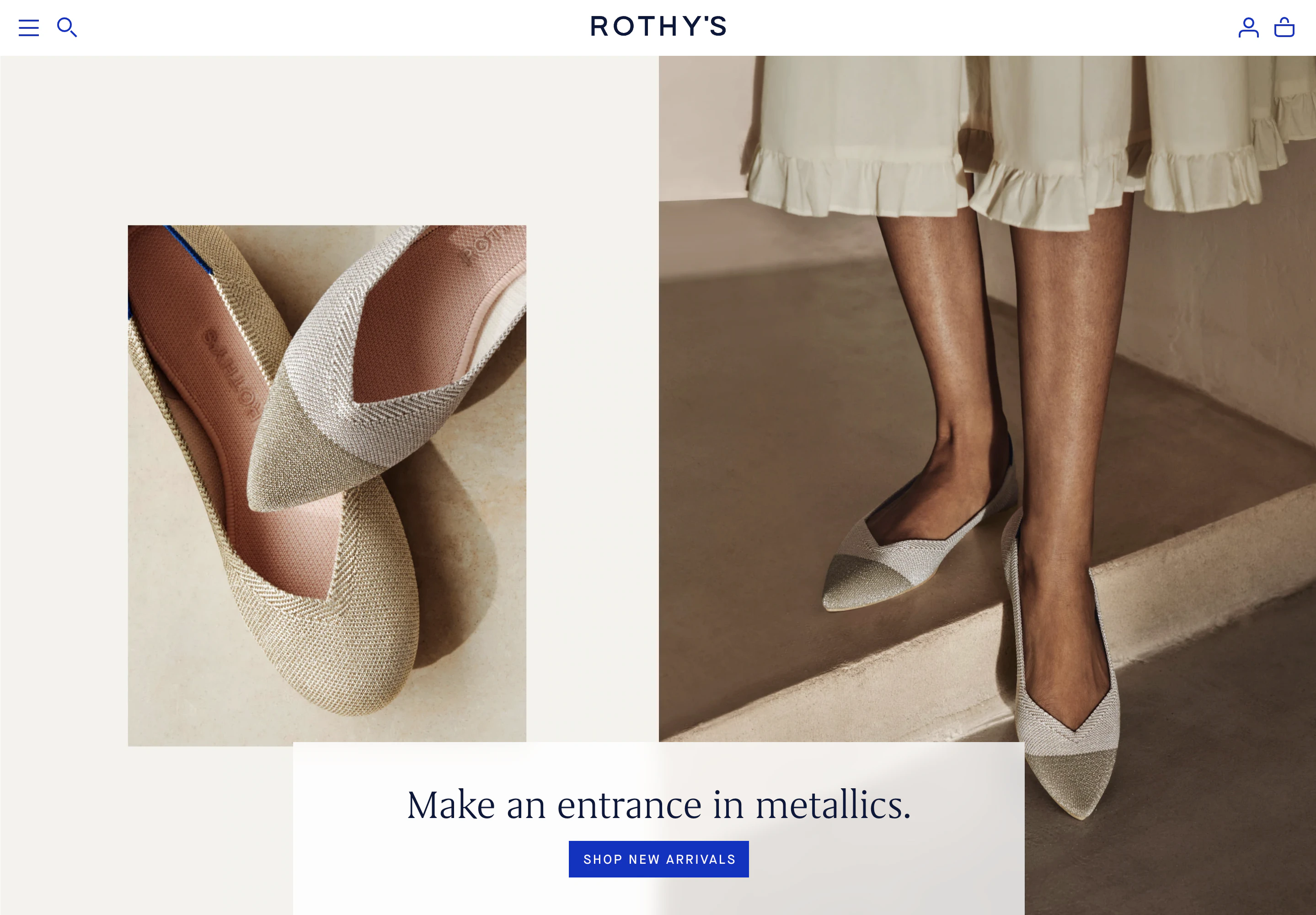
Rothy’s uses its CTAs to help direct its customers. The supporting copy could be more informative about the product, though.
40. Vanguard


This CTA from Vanguard is so close to being great. It just needs to be slightly more specific. Maybe more personal, like, “make your dreams happen.”
41. Salesforce

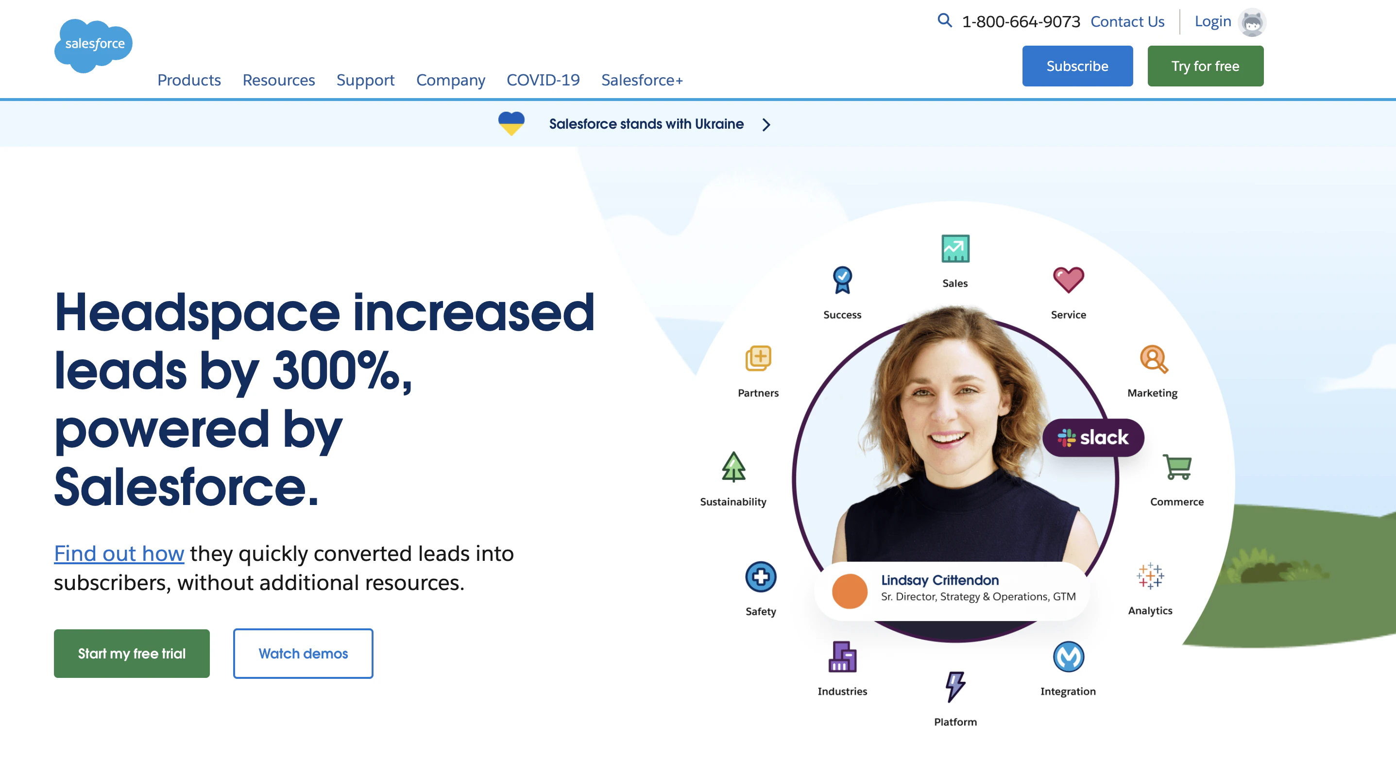
Salesforce puts a priority on its free trial CTA over its demos, but it makes sure to provide another choice for readers not quite ready for the first step to being a customer.
42. Daily Look


The CTAs used in the Daily Look video are confusing. Does clicking “start now” lead to the video or something else. Using one or the other would prevent reader frustration.
43. KISSmetrics

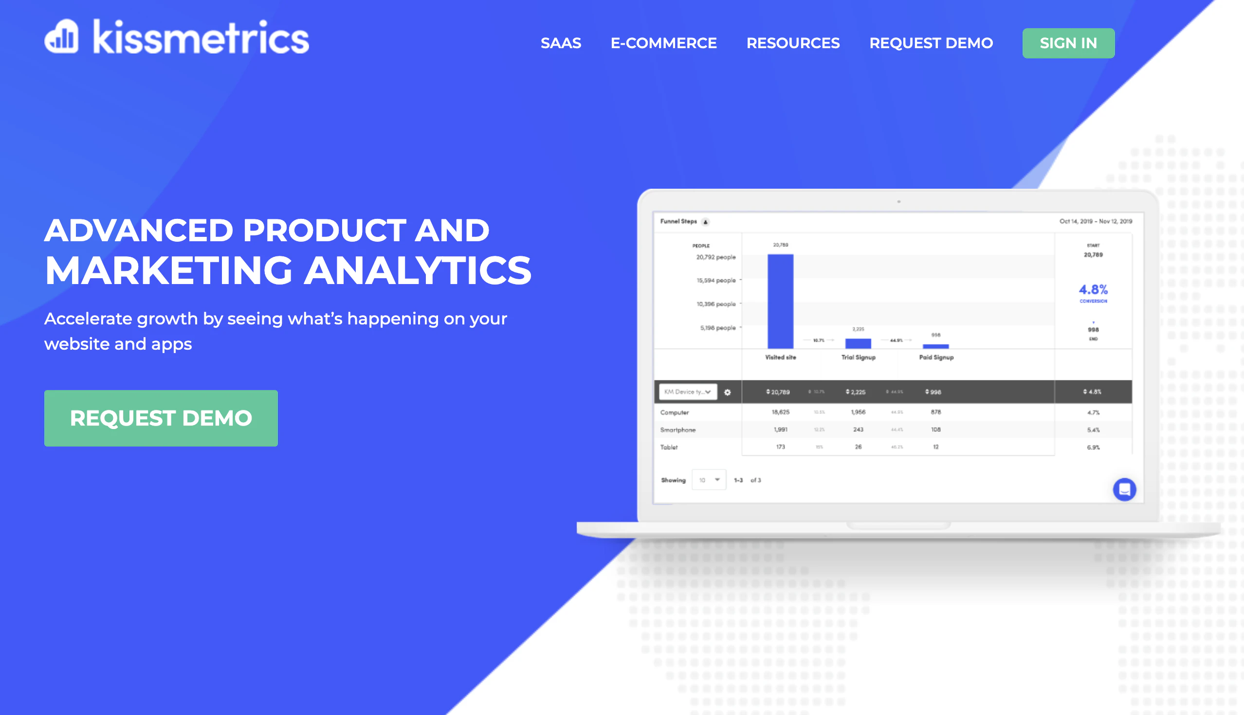
KISSmetrics doesn’t go the free trial route. They instead choose to make getting a demo the first step. If they added product benefits or risk reducers around the CTA, it might give it a boost.
44. Williams Sonoma

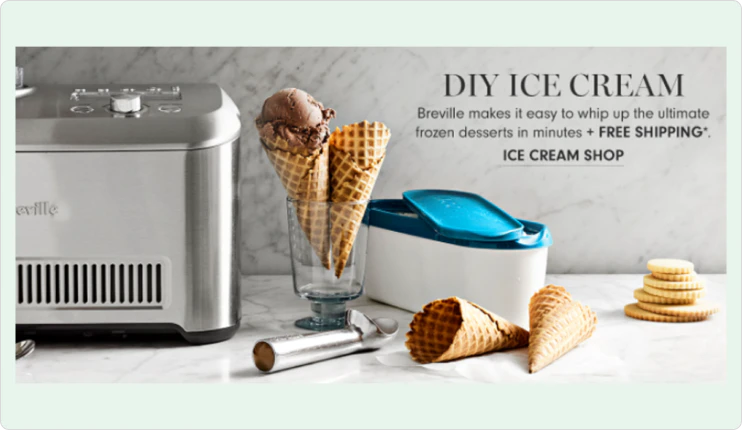
Williams-Sonoma breaks up its CTAs based on product categories. They also smartly add “free shipping” as an incentive right before the CTA they want readers to click.
45. The Great Courses Plus


We’ve seen lots of CTAs for free trials, but the inclusion of “your” here and the supporting copy underneath the CTA add immensely to this button.
46. Houzz

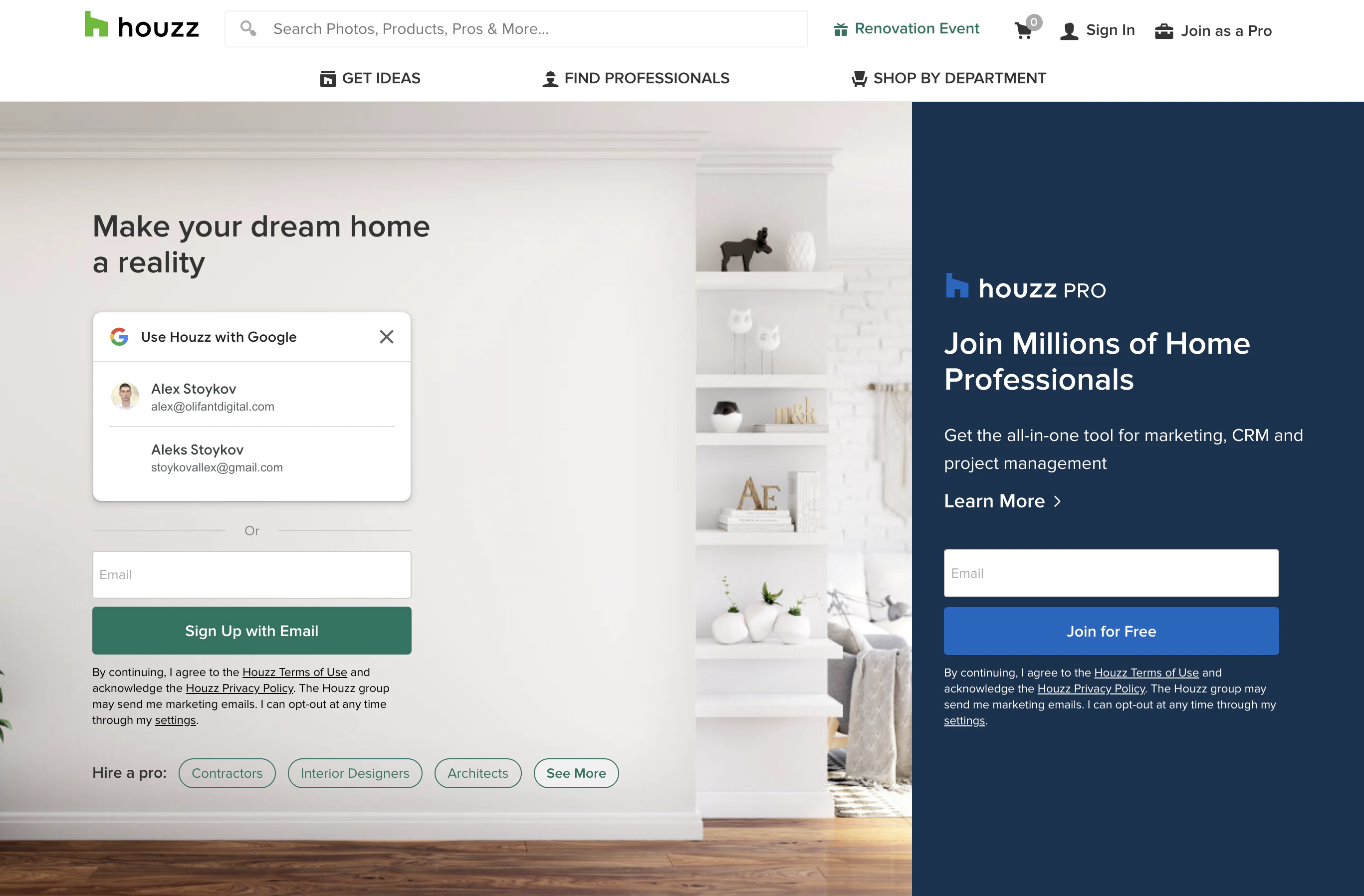
I’d argue that the hire a pro with buttons should be the CTA on the Houzz homepage. Then the reader can be prompted to set up an account before seeing actual contractor names.
47. Basecamp

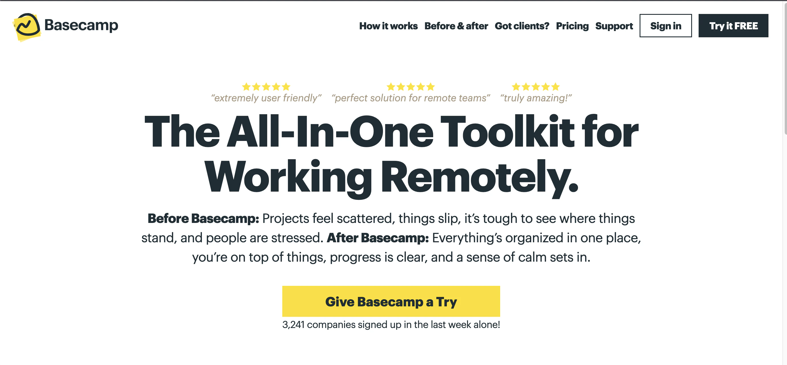
Basecamp is truly a leader in strategy and copy. The CTA is casual and precise, which is all it needs to be because every piece surrounding it provides benefits and social proof.
48. My Perfect Resume

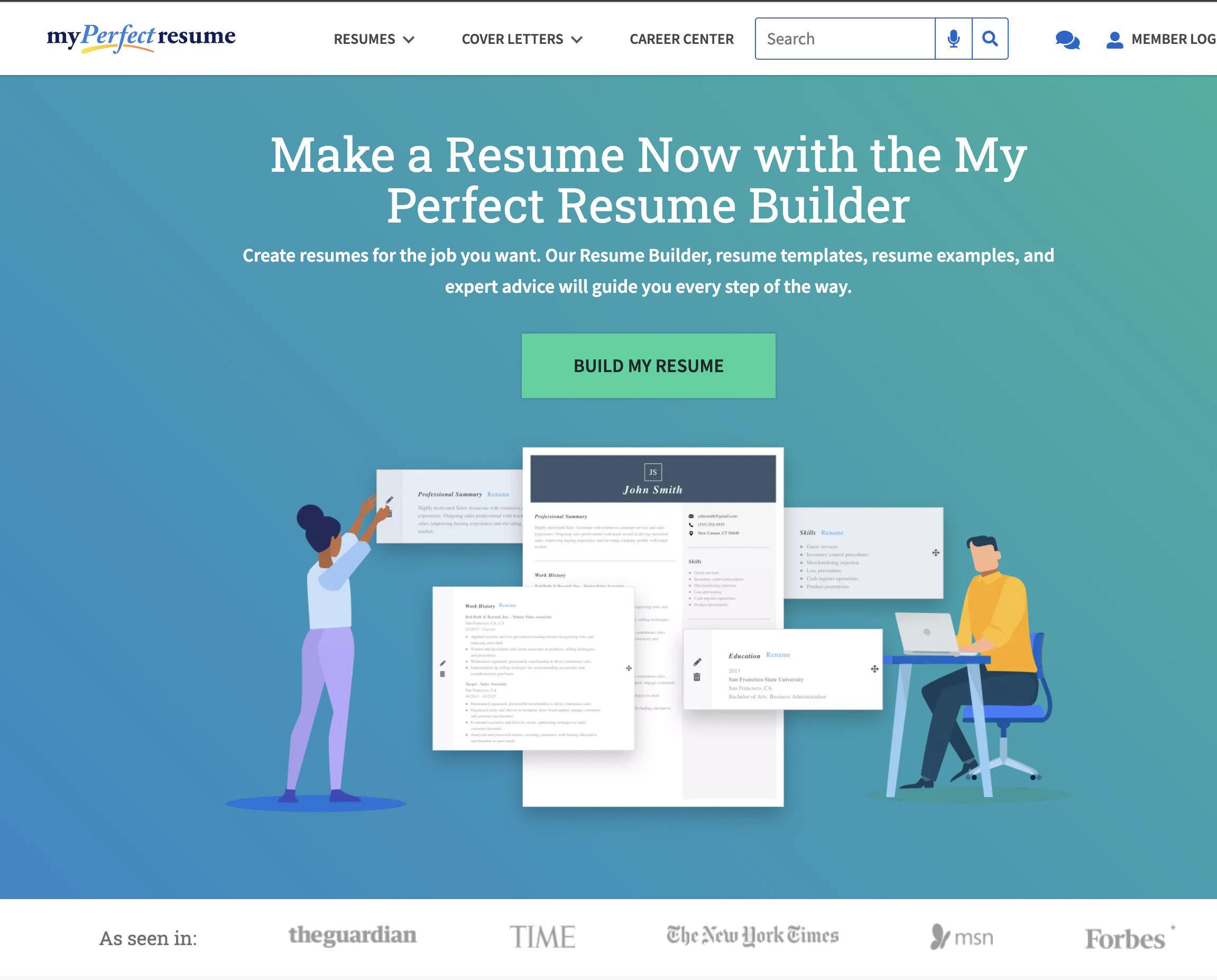
“Build my resume” is exactly what readers came to do. Don’t complicate your CTA or put it in a box when it doesn’t need to be.
49. MOO

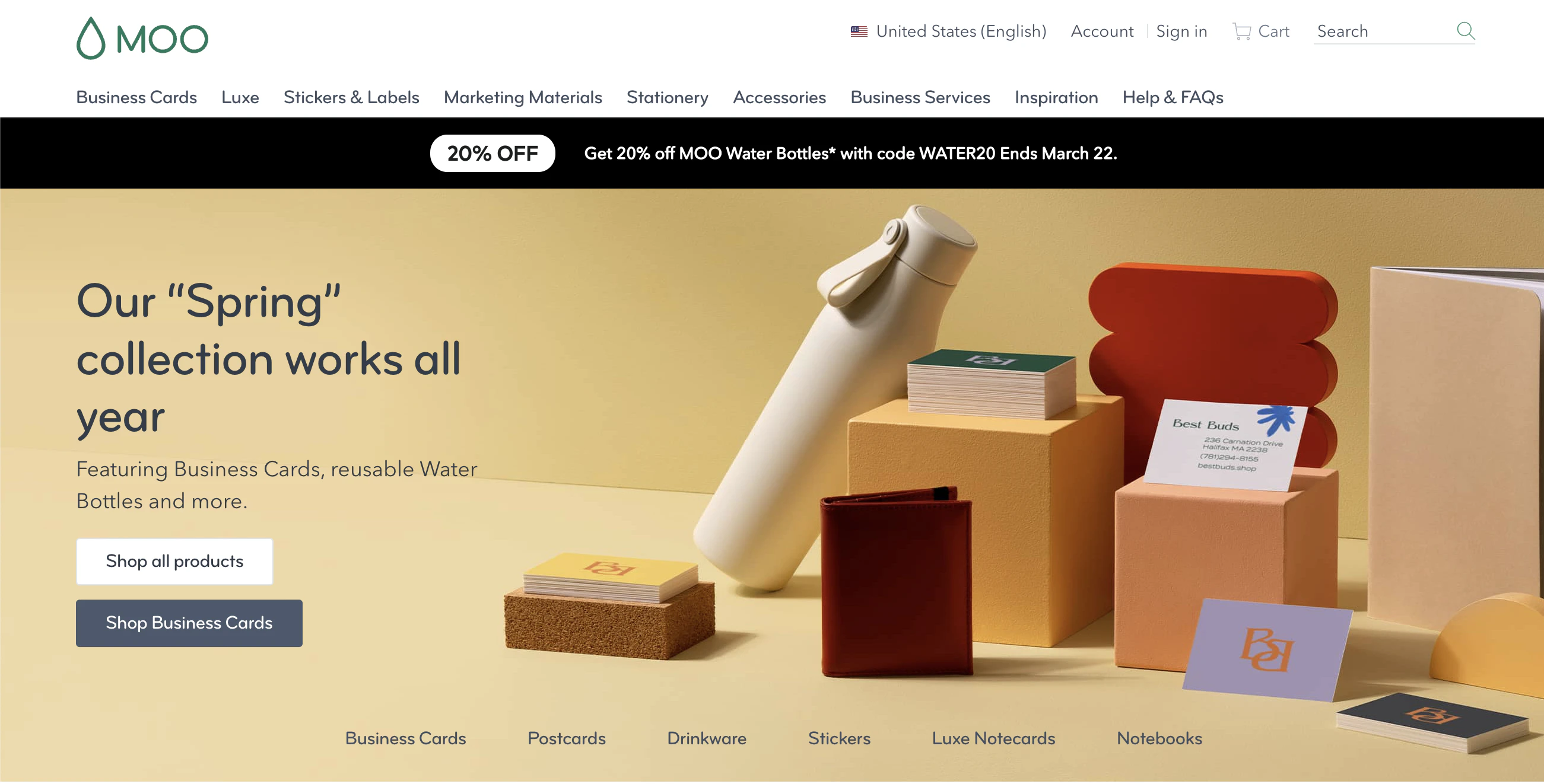
Moo’s “shop all products” CTA is further refined by all the product links along the bottom.
This gives readers the option to browse everything or go straight to the product they are looking for easily.
50. Simple Pin Media


The use of “FREE” in the CTA adds low-risk for the visitor if you are looking for a Pinterest marketing planner the offer is brilliant.
51. Fairwinds

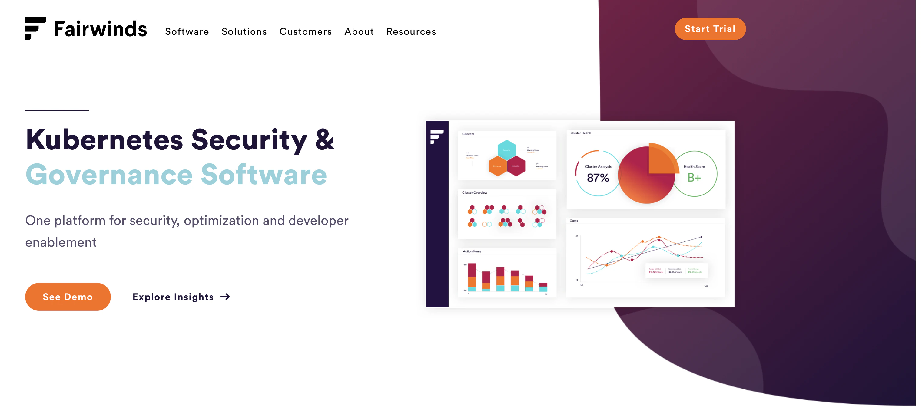
Both of the CTAs used here by Fairwinds encourage the reader to interact with the product.
A demo or exploring insights on your own lets you decide how you feel more comfortable learning about the product—two CTAs with the same goal.
52. World Wildlife Fund

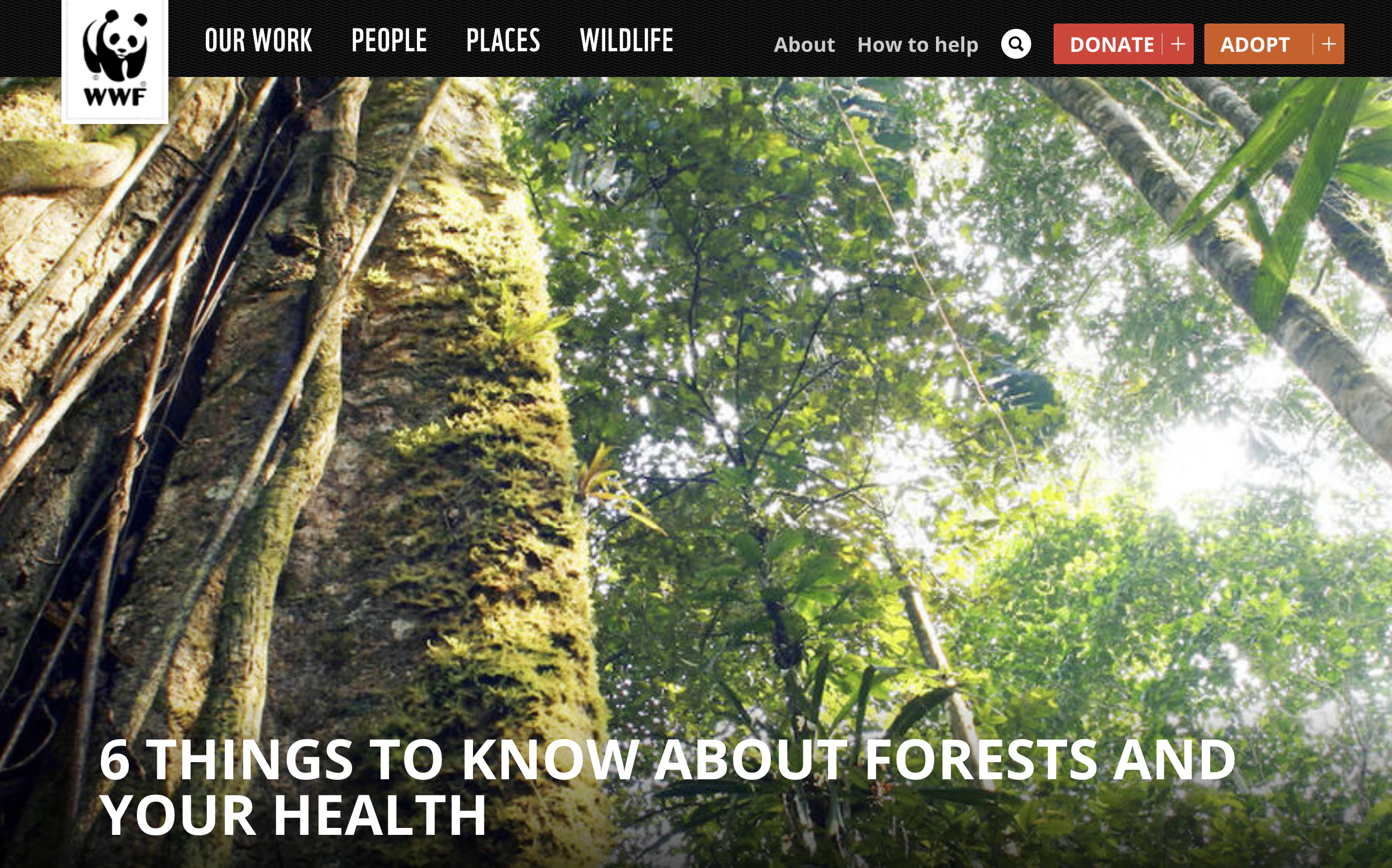
WWF gives you two ways to support wildlife at the top of the page. Then they use their header and other pieces of the page to get at your emotions.
This setup allows the reader to feel like they decided to take action on their own.
53. Care.com

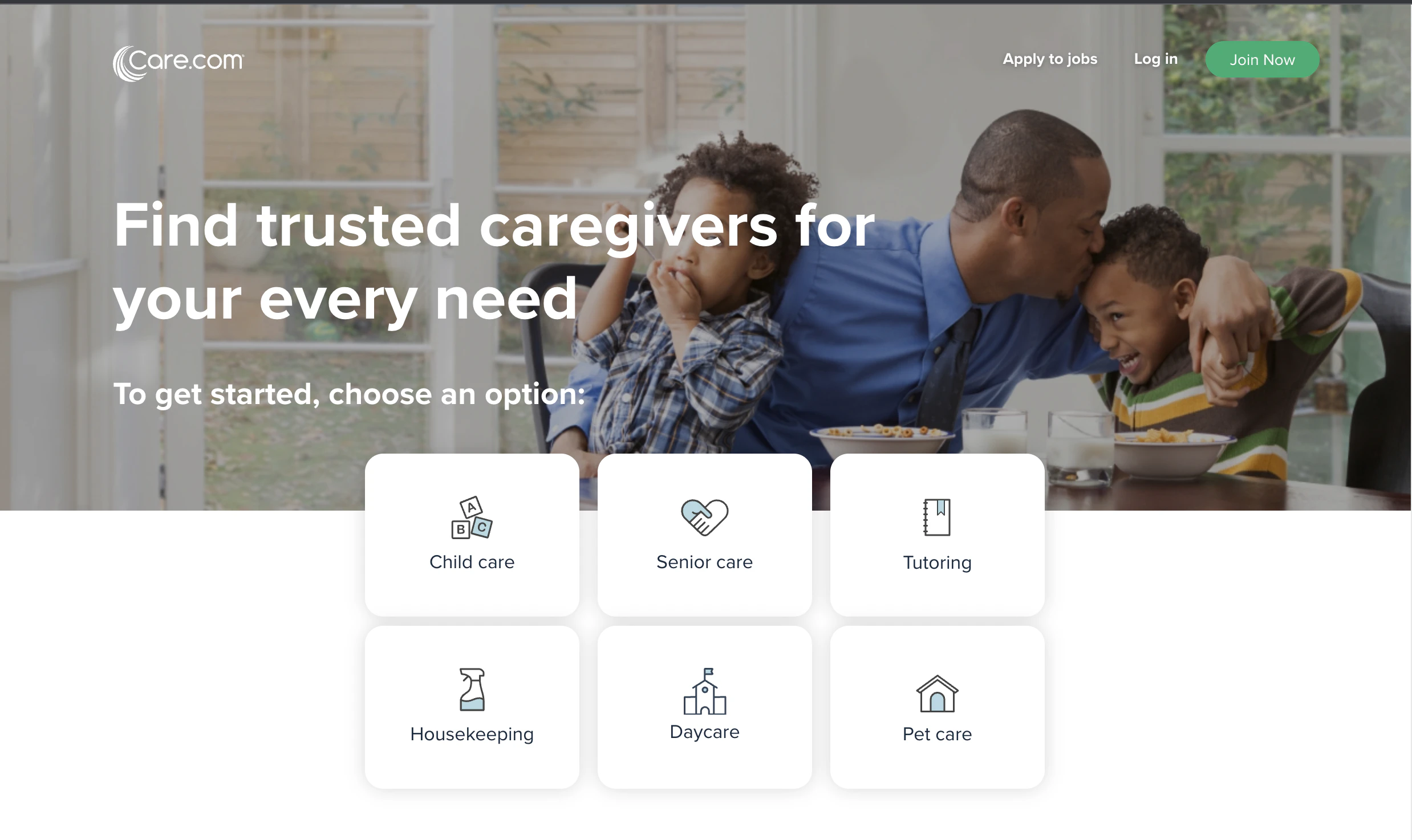
Care.com continues the trend of giving the reader options to select what they need under one CTA.
You can’t fully use the site without signing up, but the first CTA is getting you started.
54. Dropbox

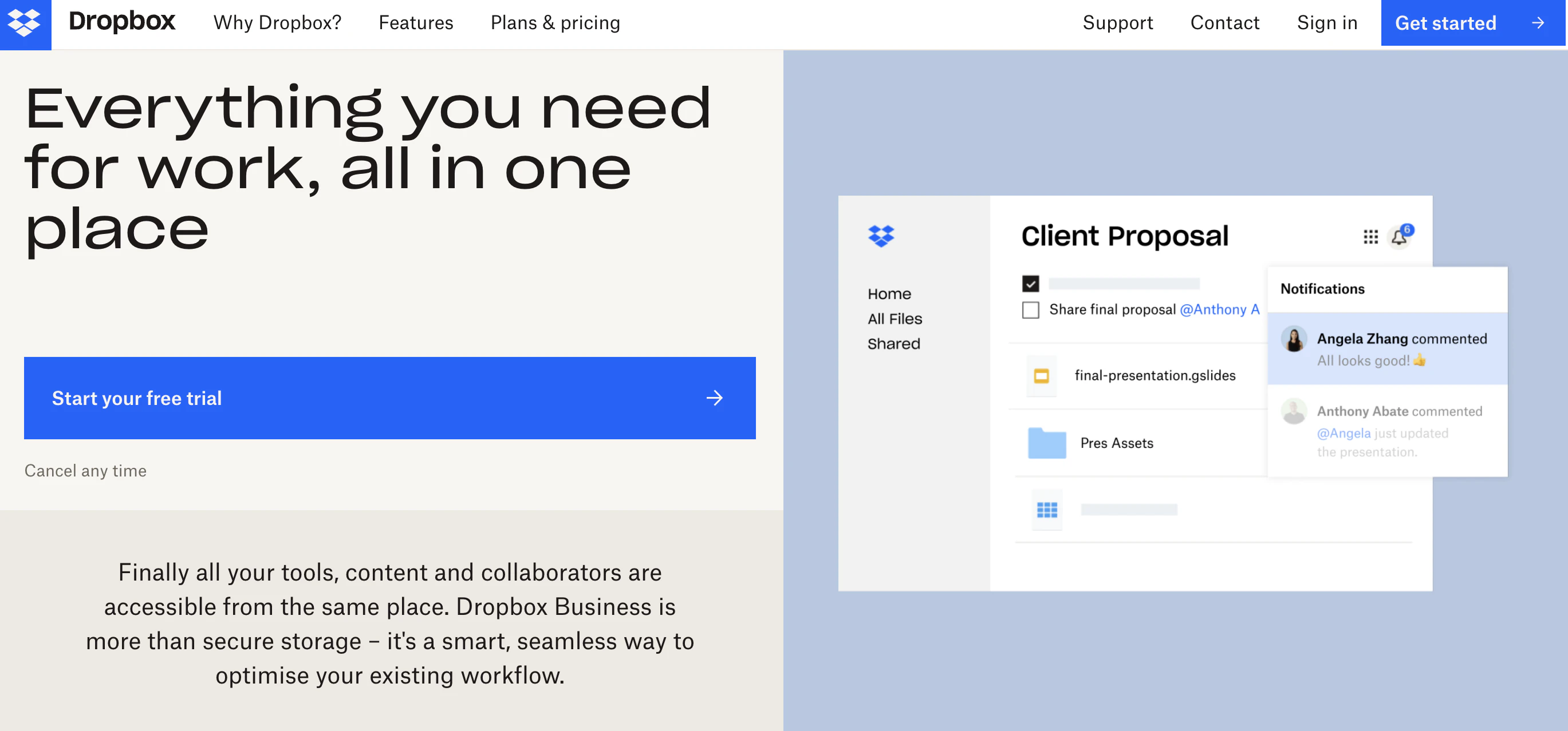
Dropbox knows that not everyone needs the same storage options.
Their CTA demonstrates that they are here to serve your specific needs. You get to find what you need. The CTA gives the reader control.
55. Trello

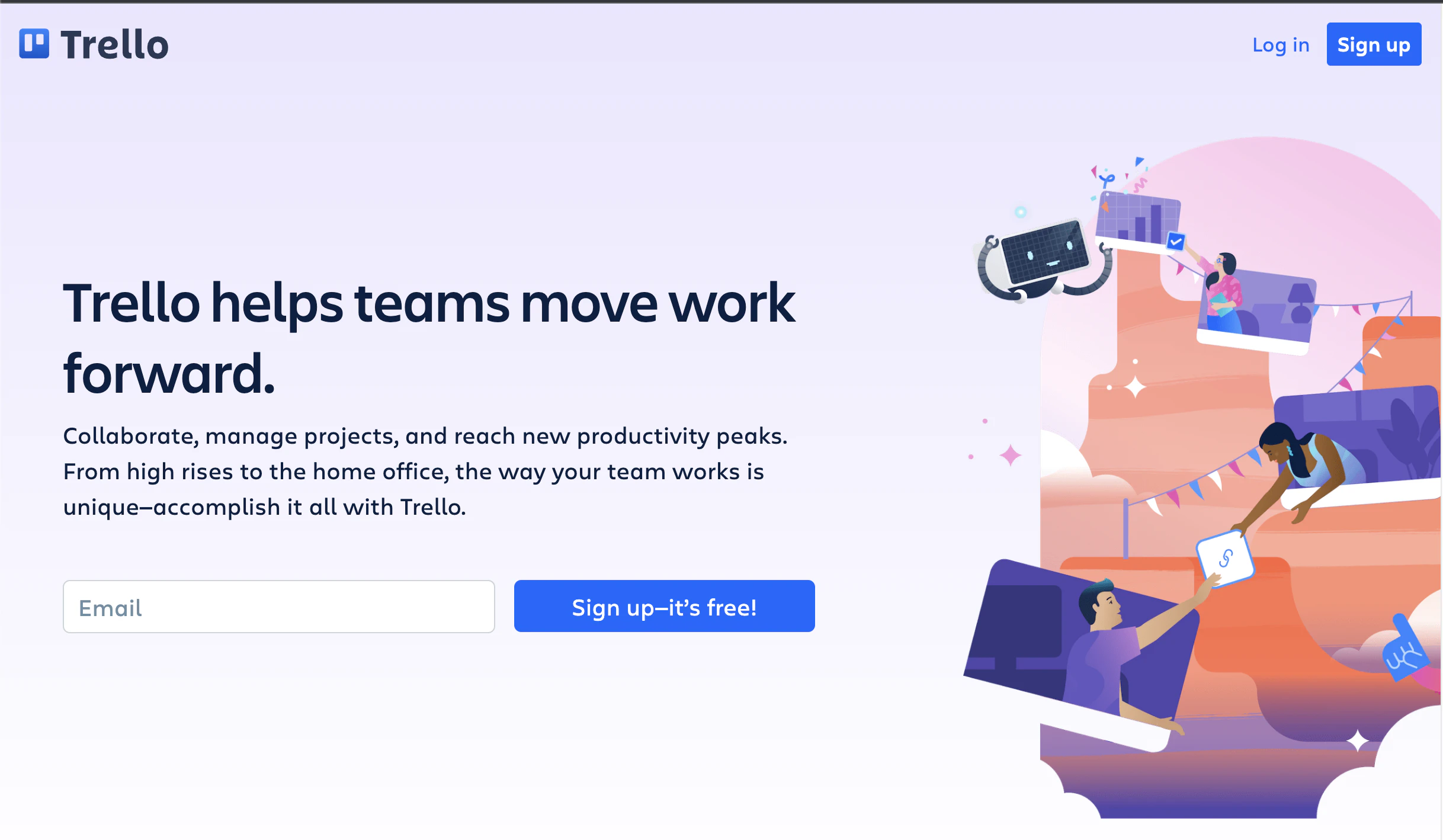
This example from Trello shows that sometimes it’s not what you say but how you say it.
Trello’s phrasing makes its CTA more friendly and inviting.
56. Evernote

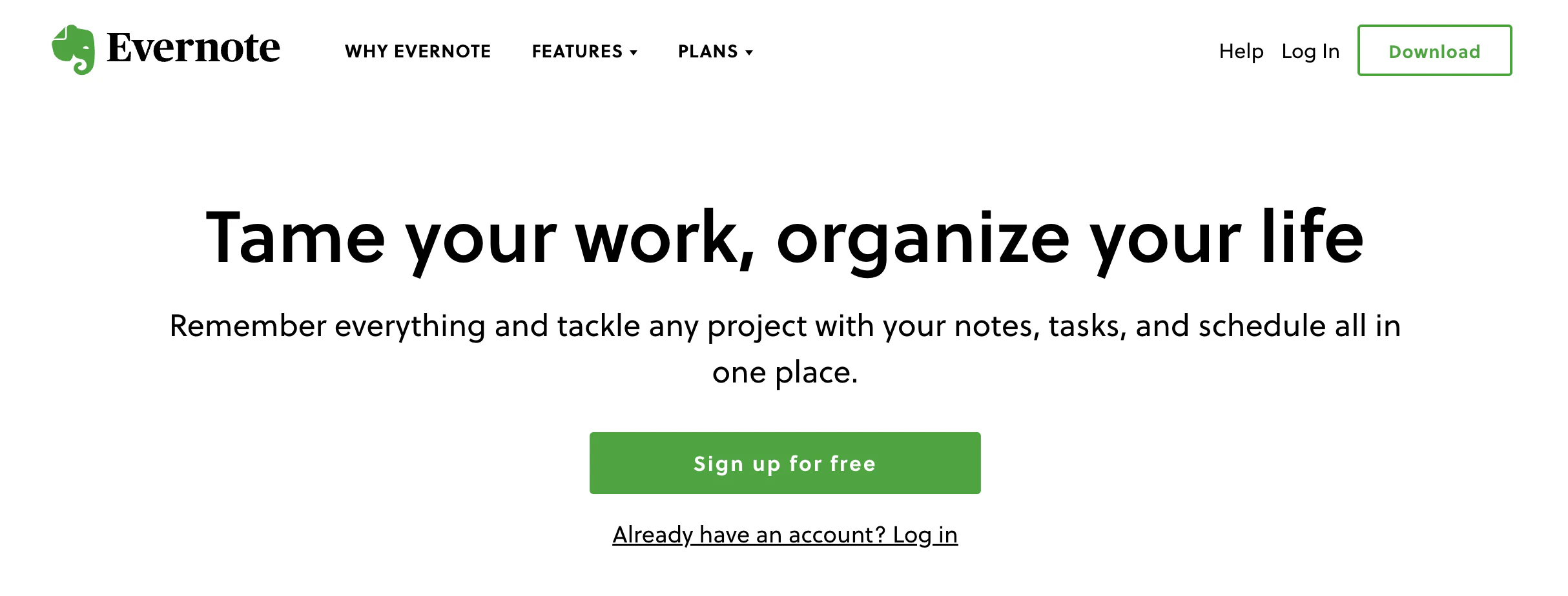
Evernote makes getting your ideas down easy and the entire design around this CTA feels simple and easy to use. The standard CTA copy plays on the overall simplicity.
57. OfficeVibe

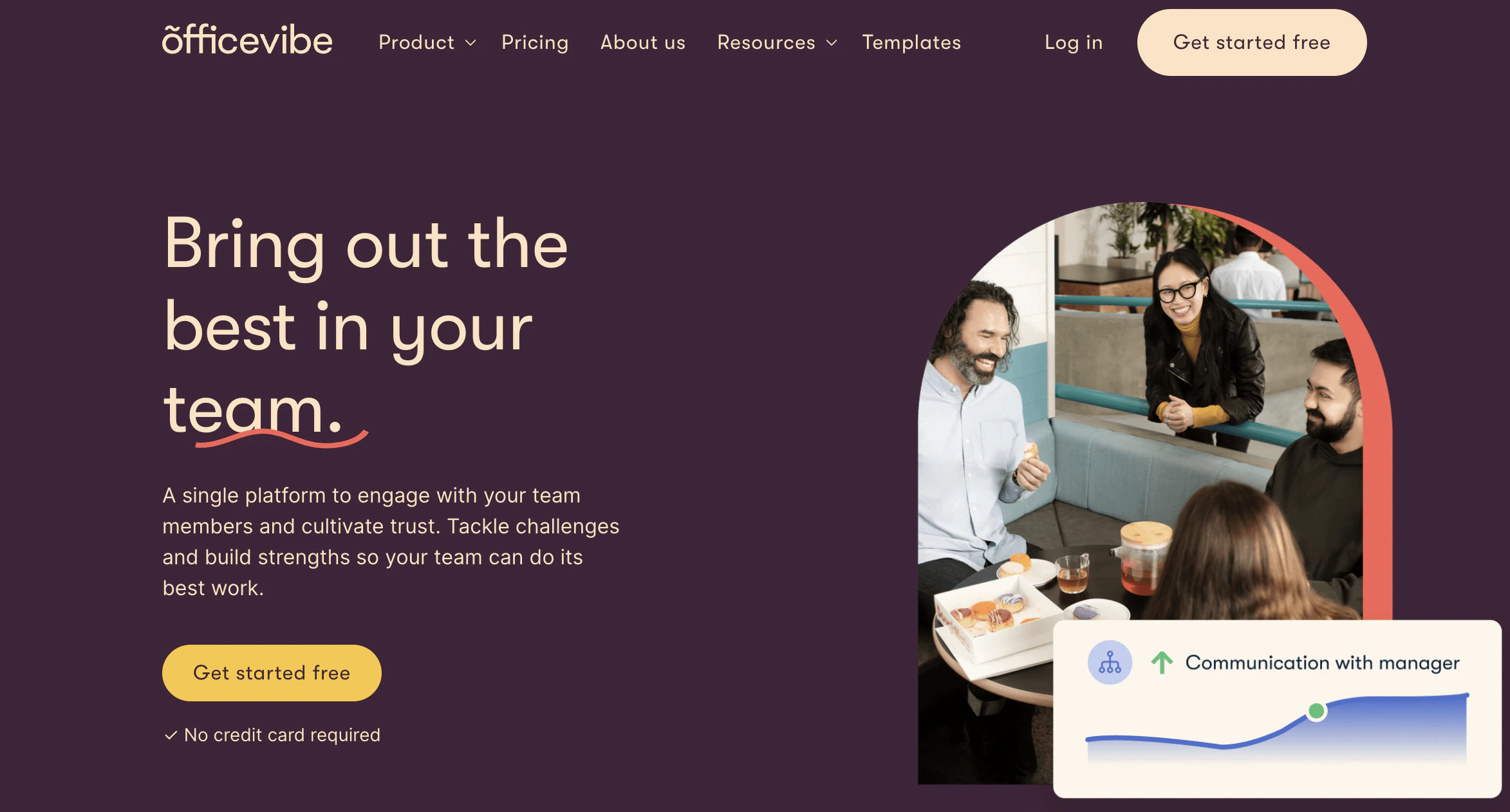
The CTA used by OfficeVibe is a commonly used option, but where they step it up is the copy under the CTA.
They know readers have been tricked by “free” before and they reduce the anxiety of it happening again by calling out that no credit card is needed to sign up.
58. Prezi

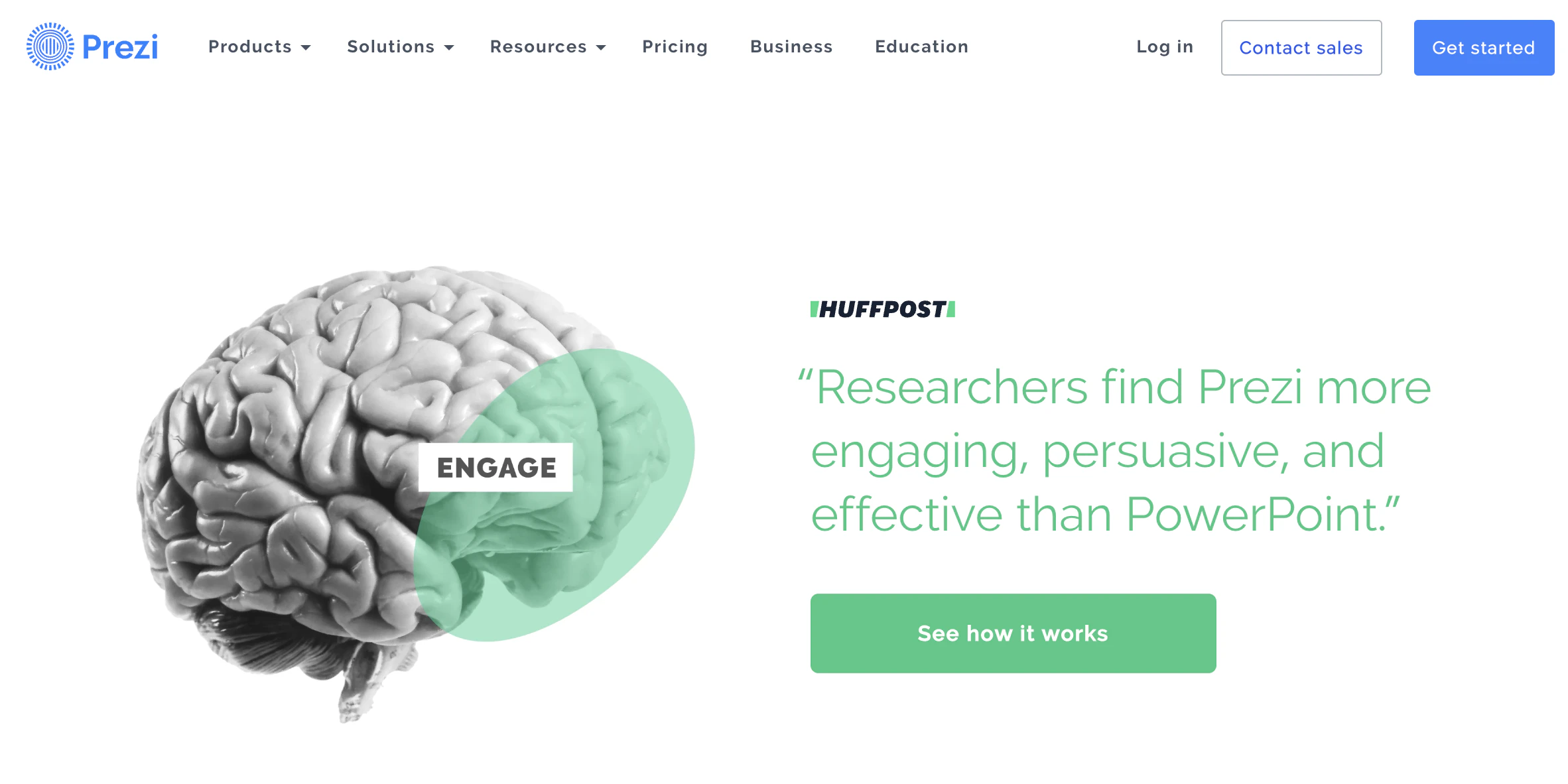
Both of Prezi’s CTAs are for new customers. Ready to sign up? Great, there’s an option for that! Need to see how it works? There’s an option for that too!
By pairing the two, it tells the reader where to go to sign up after the demo.
59. Epic!
Both of the CTAs used by Epic! are top-notch. They pinpoint what’s important to each group of customers and do an excellent job of making them visually different.
60. QuickSprout

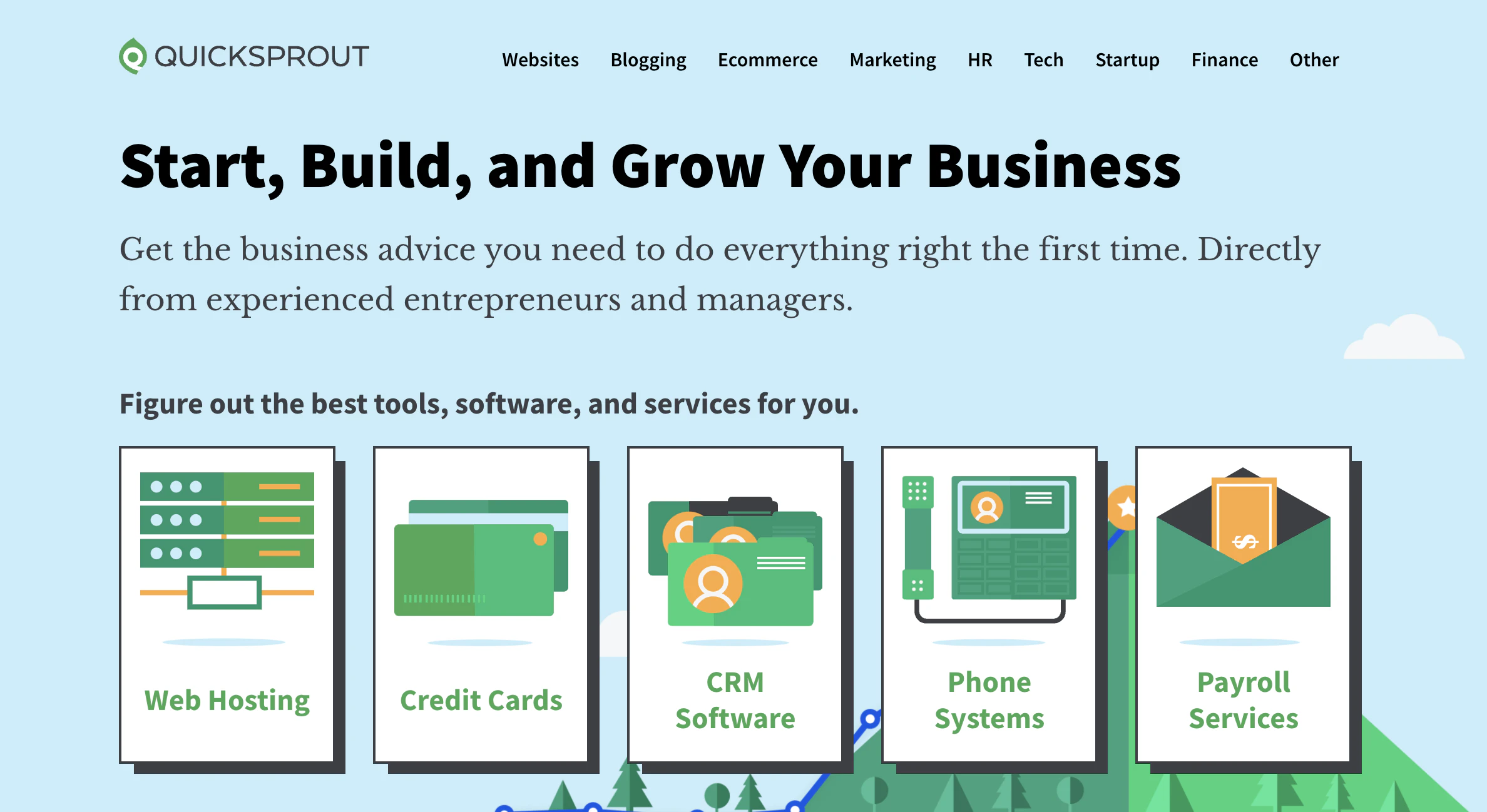
The CTAs provided by QuickSprout are labeled as the software they offer.
This approach works if the reader needs only one of the options. Otherwise, it can get confusing.
61. Grey Goose

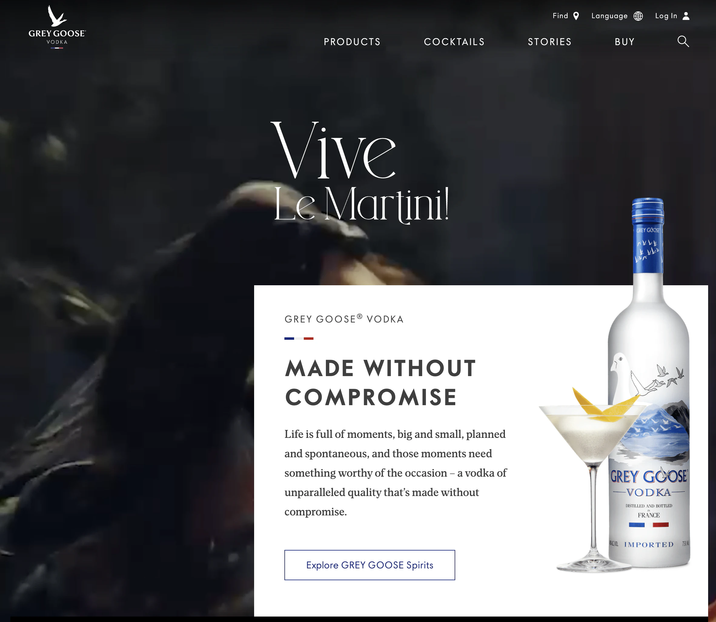
Grey Goose’s use of “discover now” as their CTA feels like an afterthought. It doesn’t match the product or what the reader wants to do. Maybe if it connected to recipes for using the product, it might work, but otherwise, “introducing” might be a better fit.
62. Treehouse

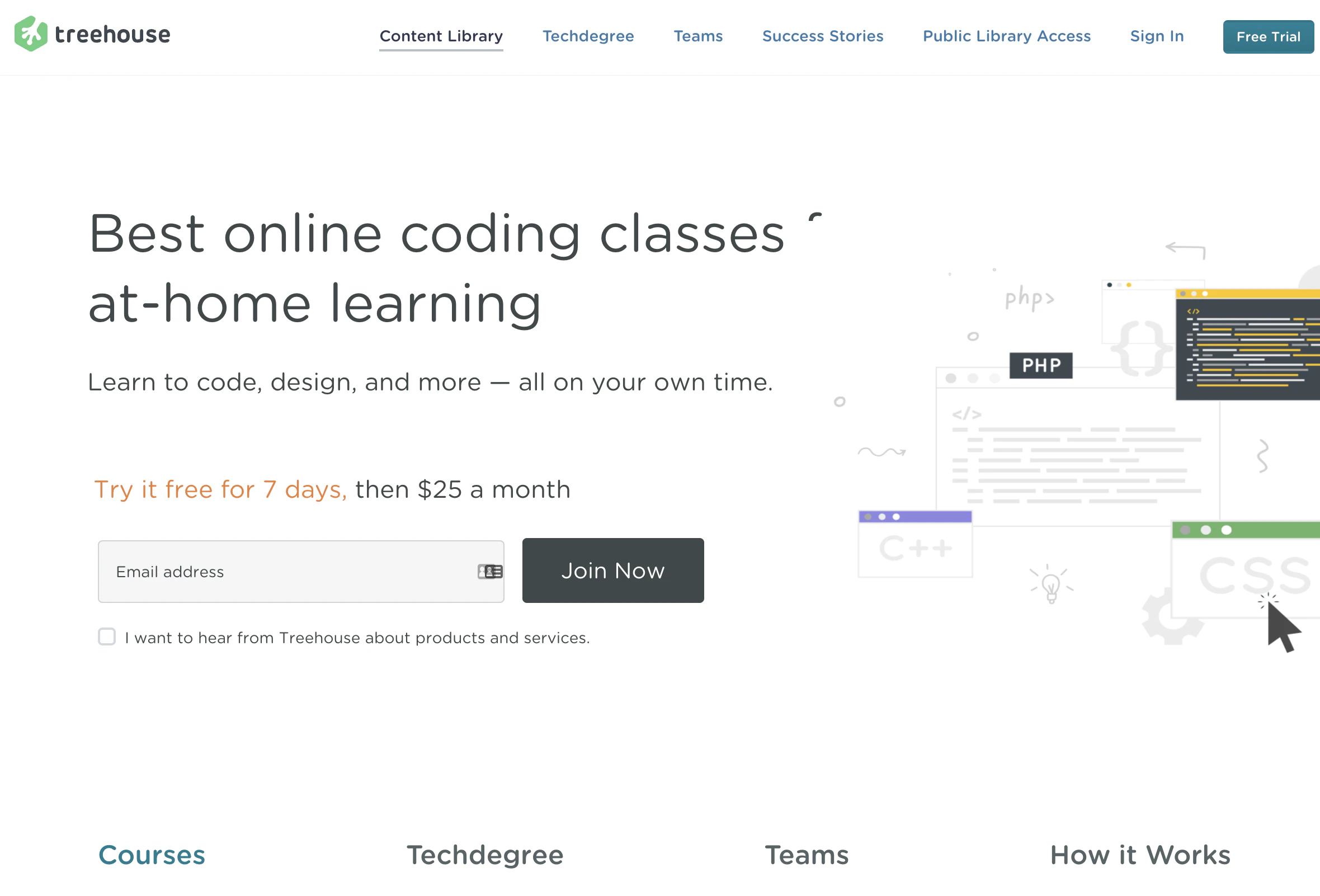
I’m not sure why Treehouse chose not to finish their button copy. Maybe it’s an inside joke. But since their audience is people trying to teach themselves coding, it doesn’t work well.
63. OKCupid

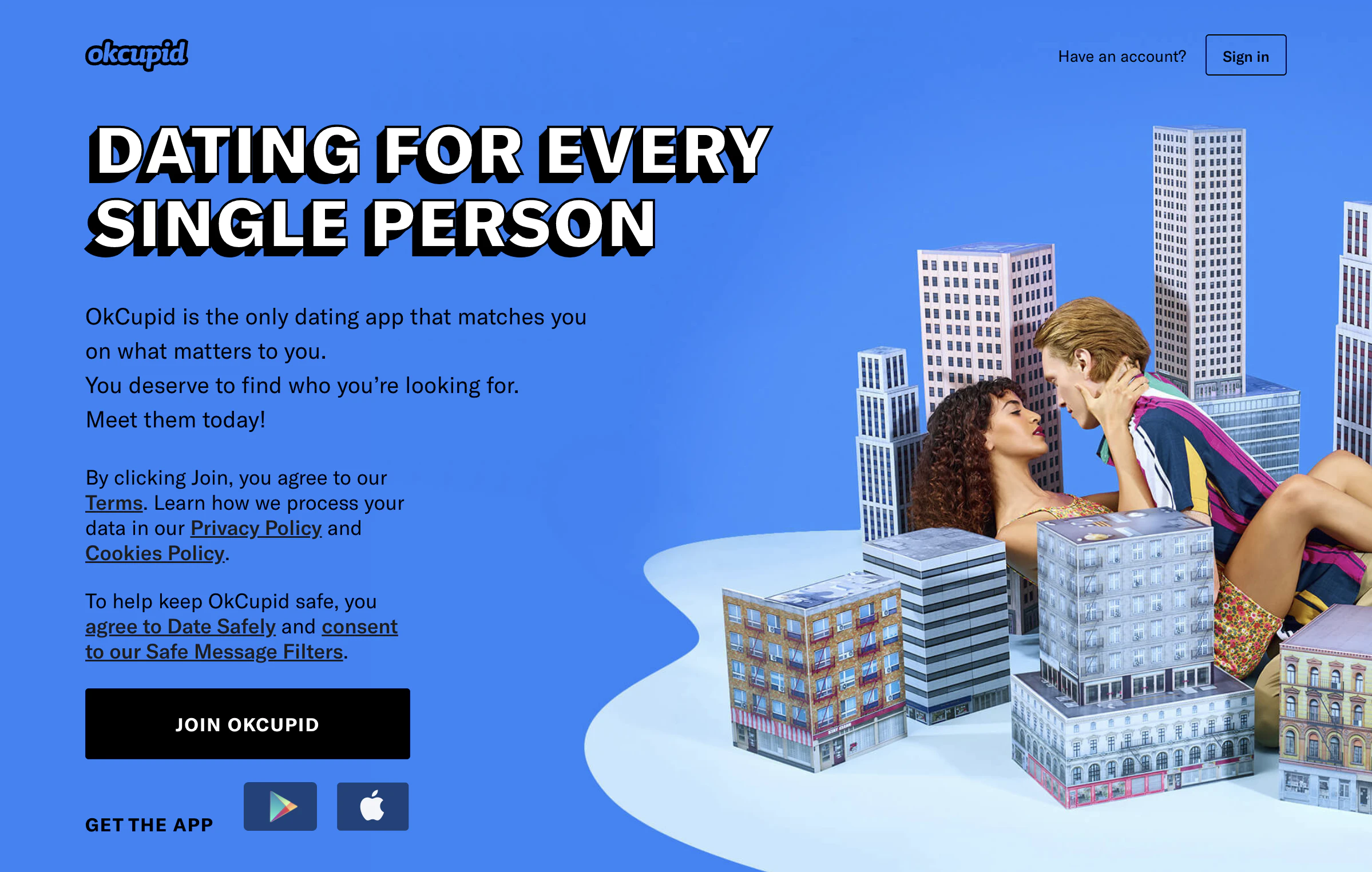
“Join OkCupid” is kind of a letdown as a CTA from a dating site, especially with the great build-up copy before it.
People signing up for dating sites aren’t excited about joining another platform.
64. Blogging.org

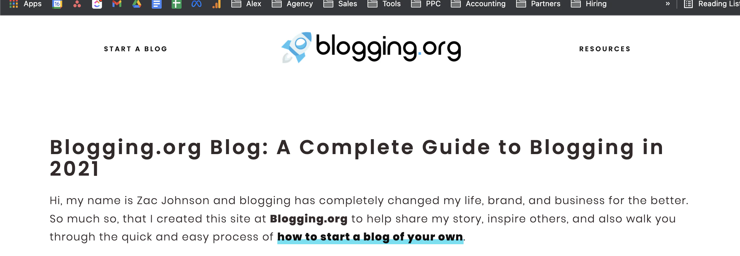
Blogging.org puts their CTA in their copy instead of as a separate button. Links are commonly used in content, so the format fits the audience well.
65. IMPACT Branding and Design

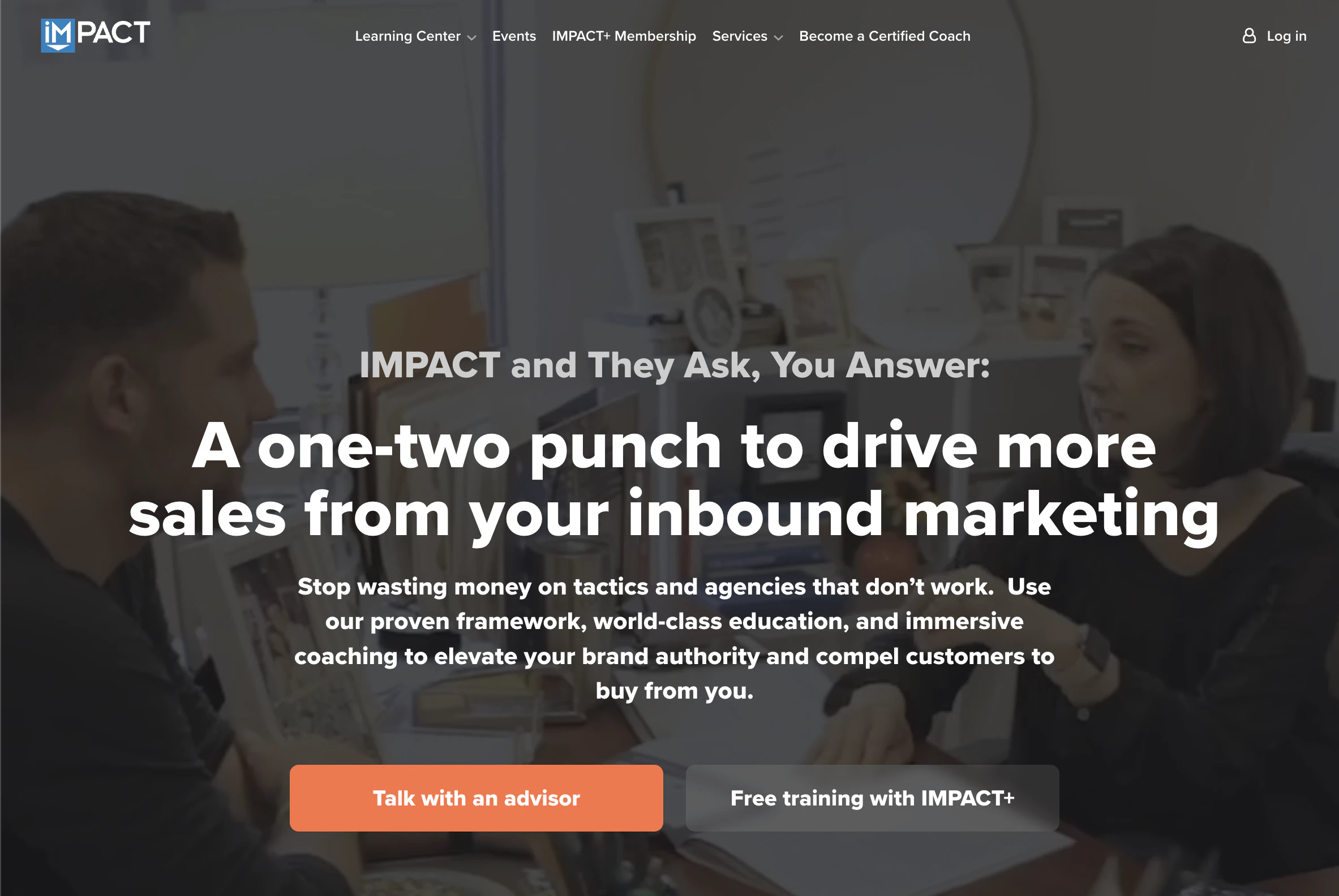
The “sign up for free” prioritized by IMPACT is typical, but the “take a peek” secondary option may be the better CTA to acquire new users.
If acquiring new customers isn’t the goal, moving it elsewhere to let the sign-up stand alone would be wise.
66. Huemor

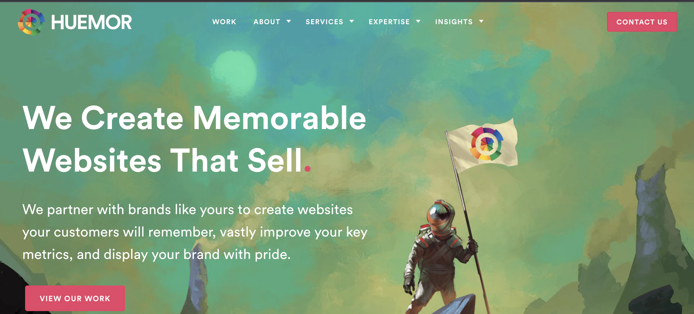
Huemor tries to use similar CTA phrases across different areas of their site. While consistency is important, you want to optimize your CTAs before using them everywhere. “Learn about” is likely copy that has been chosen without proper testing.
67. Brooks Running

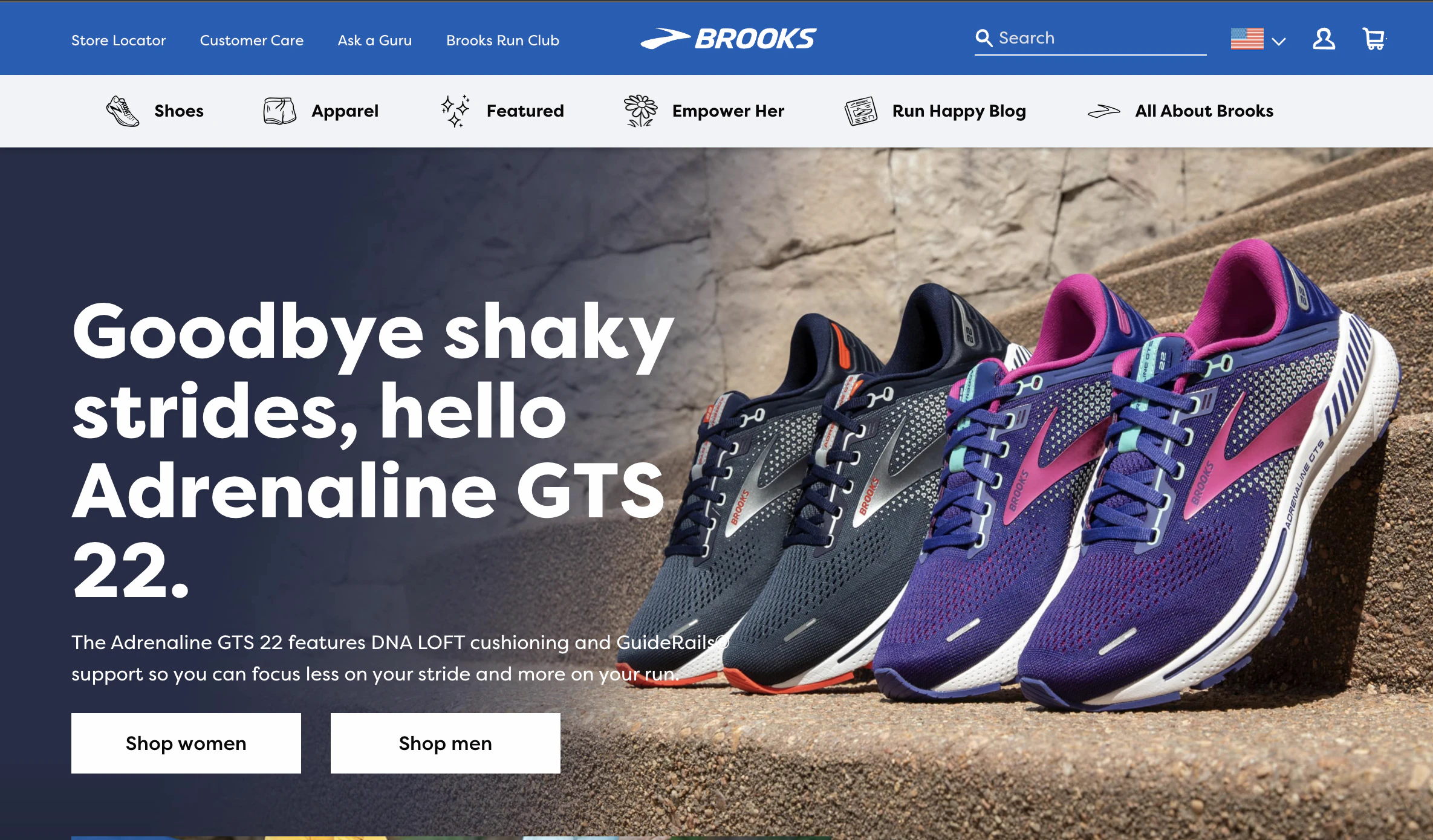
Brooks Running shows that ecommerce sites should use CTAs to guide their customers to the right products. Every CTA helps to move the customer to the next best step.
68. Uber

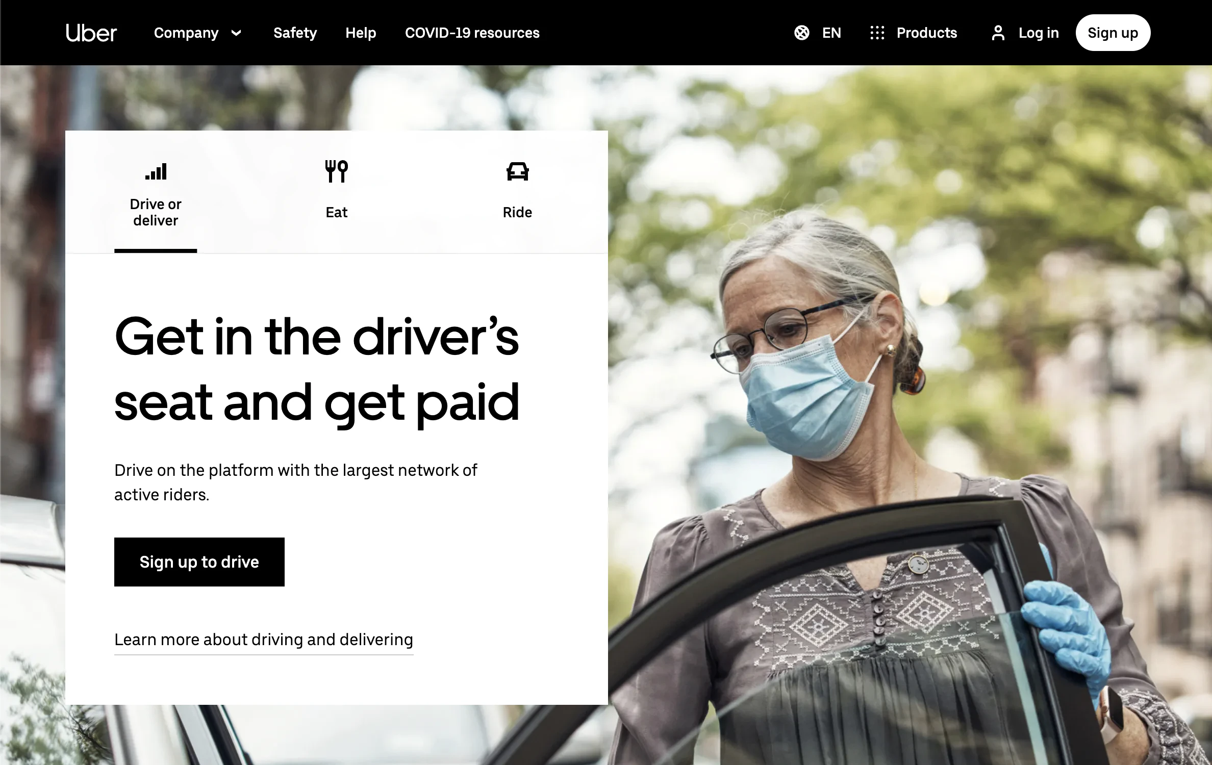
Uber decided that instead of placing three separate CTAs together for drivers, riders, and Uber eats users, they would create separate tabs instead. This way, they can optimize one CTA across each hero section.
69. Ugmonk

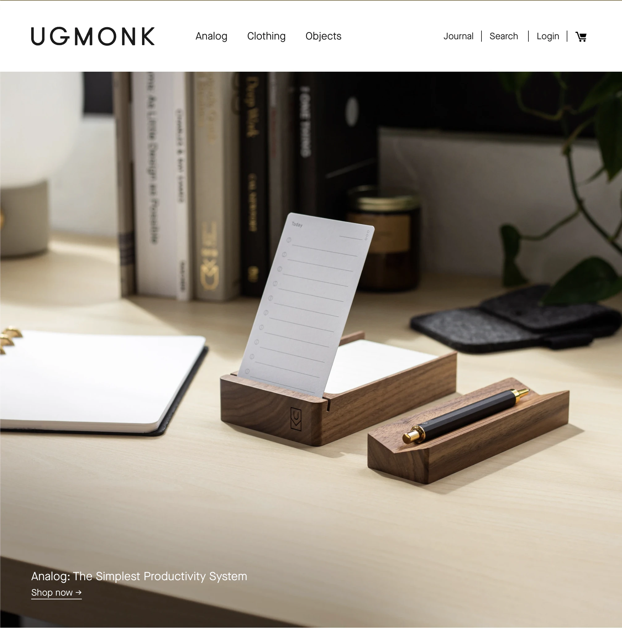
The secondary CTA used by Ugmonk of “show me how it works” is the better CTA. Now available isn’t much of a CTA at all.
70. Pinterest

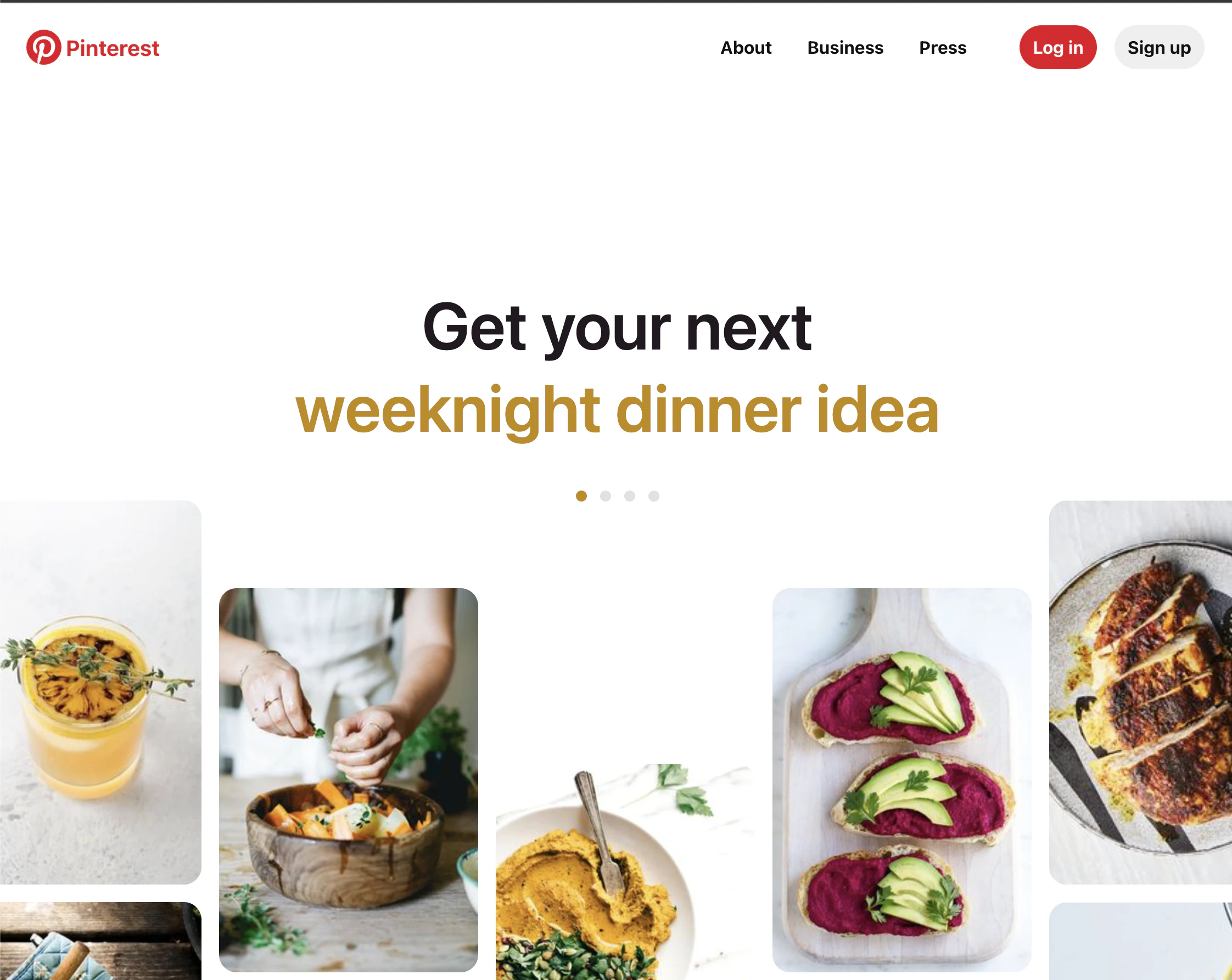
Pinterest uses a CTA that you don’t know is a CTA. When you scroll down with the green arrow, it prompts you to create an account.
The scroll creatively mimics how you would interact with the site if you did sign up like a preview of sorts.
71. Madewell

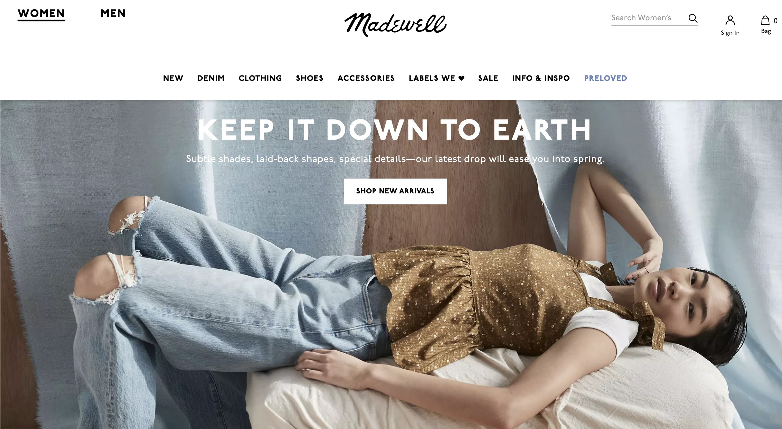
“Shop new arrivals” is a CTA used by many ecommerce stores. The CTA works as long as most of your visitors are returning visitors, and they already know what you have to offer.
72. Barkbox

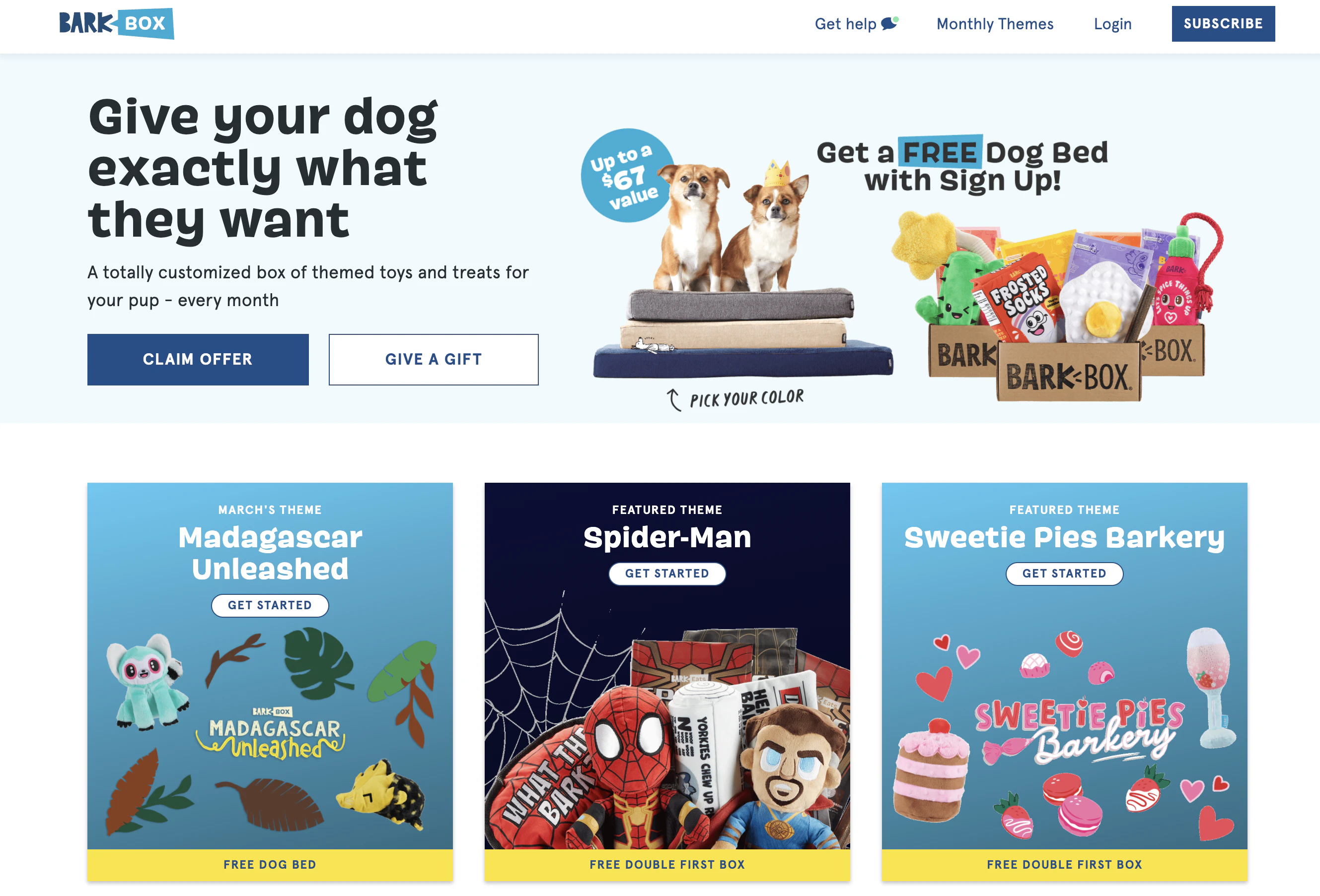
Barkbox has CTAs that give their readers choices. I think the CTA “give a gift” is likely targeted at current customers that they want to spend more, but it isn’t clear. “Claim offer” also isn’t clear. An offer for what?
Having just one more obvious CTA with the “offer” included might be the better choice.
73. General Assembly

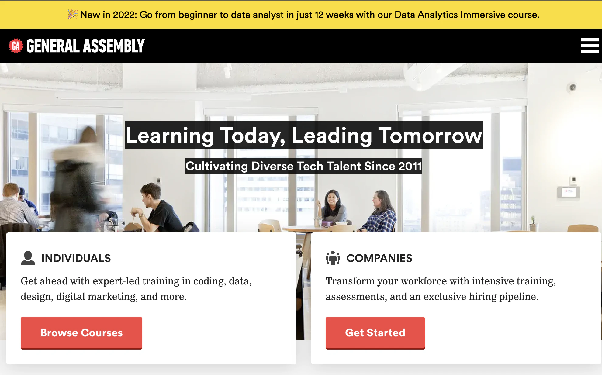
General Assembly is trying to give different CTAs to each of their audiences, but in this case, the CTAs they choose aren’t ideal.
Companies may want to browse just as much as individuals and vice versa.
74. Convert Kit

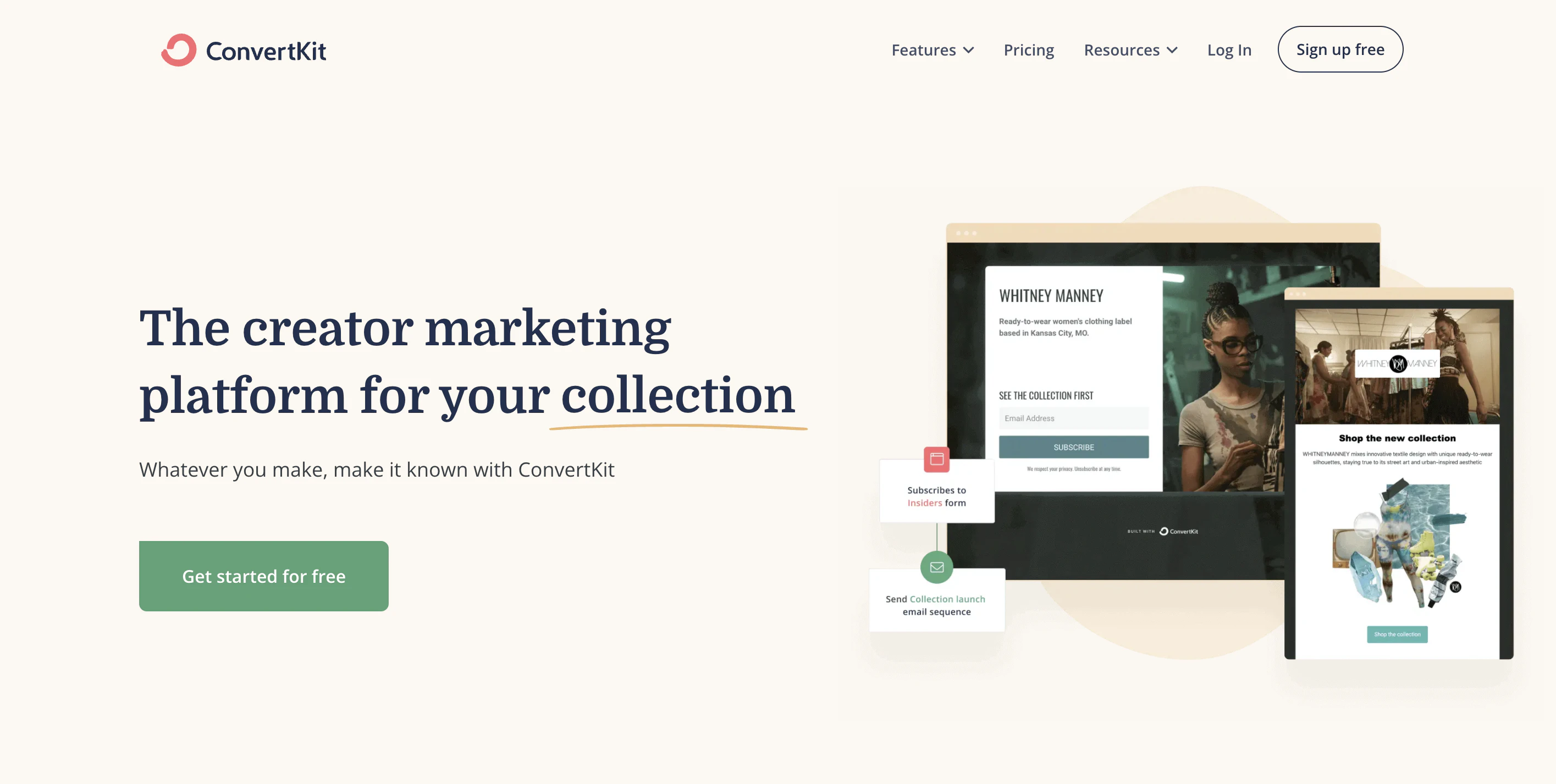
The CTA “donate monthly” is supported by the copy underneath reminding the reader of the benefit of their donation.
If you have to use words like “donate” or “buy,” add some feel-good copy around it. It’s easier to give up money when you feel good.
75. TeuxDeux

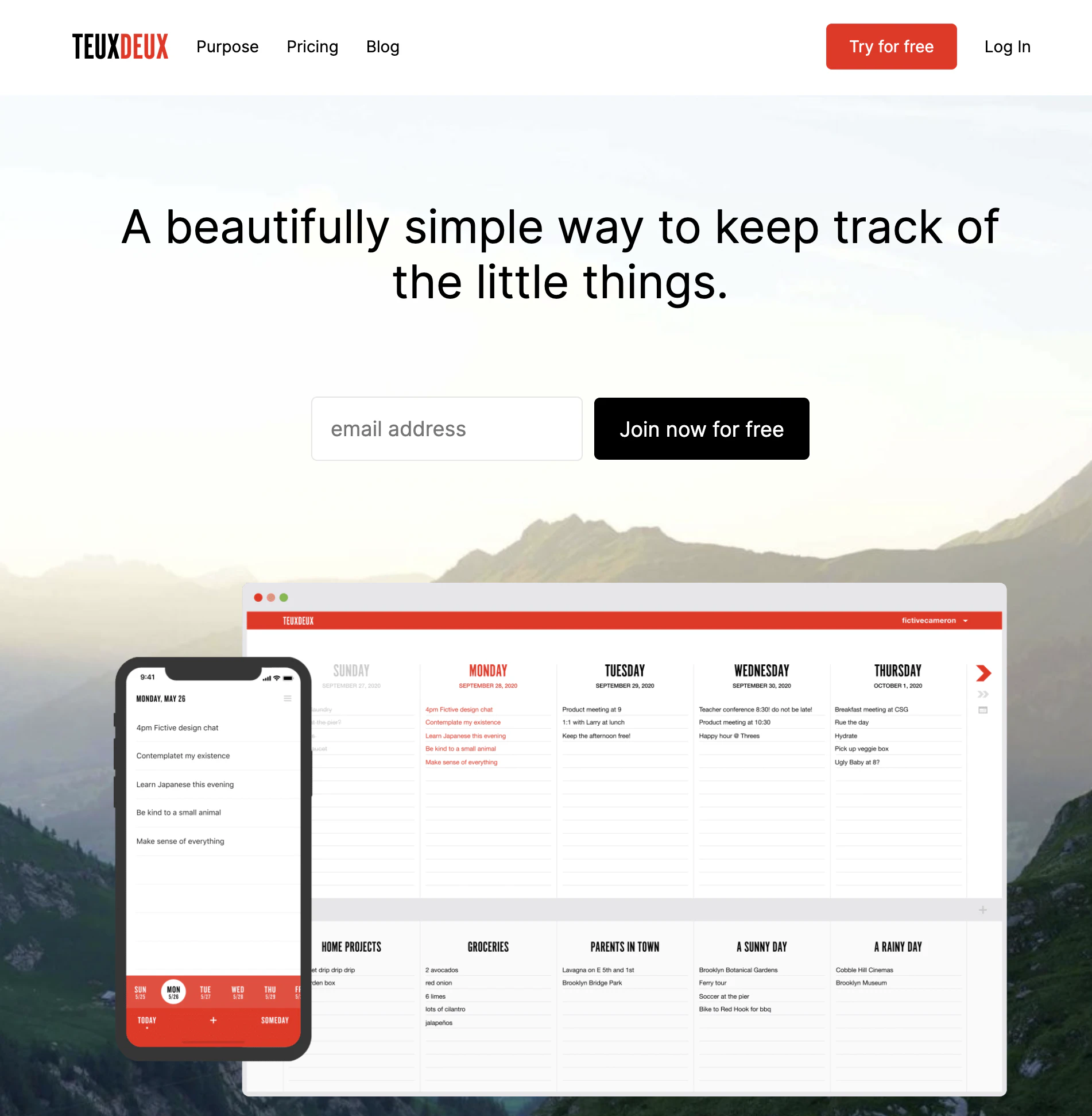
The simplicity of “join now for free” almost makes a person want to sign up for anything, but some supporting explainer copy would help take the CTA further.
76. Betabrand

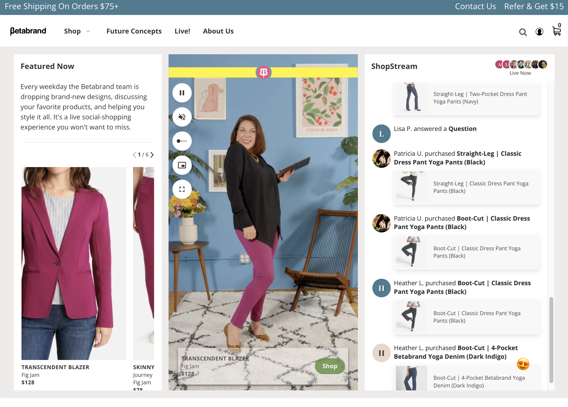
Betabrand calls readers to “notify me” for their product drops.
By not making all of their products immediately available and limiting the quantity, they give the reader incentives to sign up for notifications.
77. Fabletics

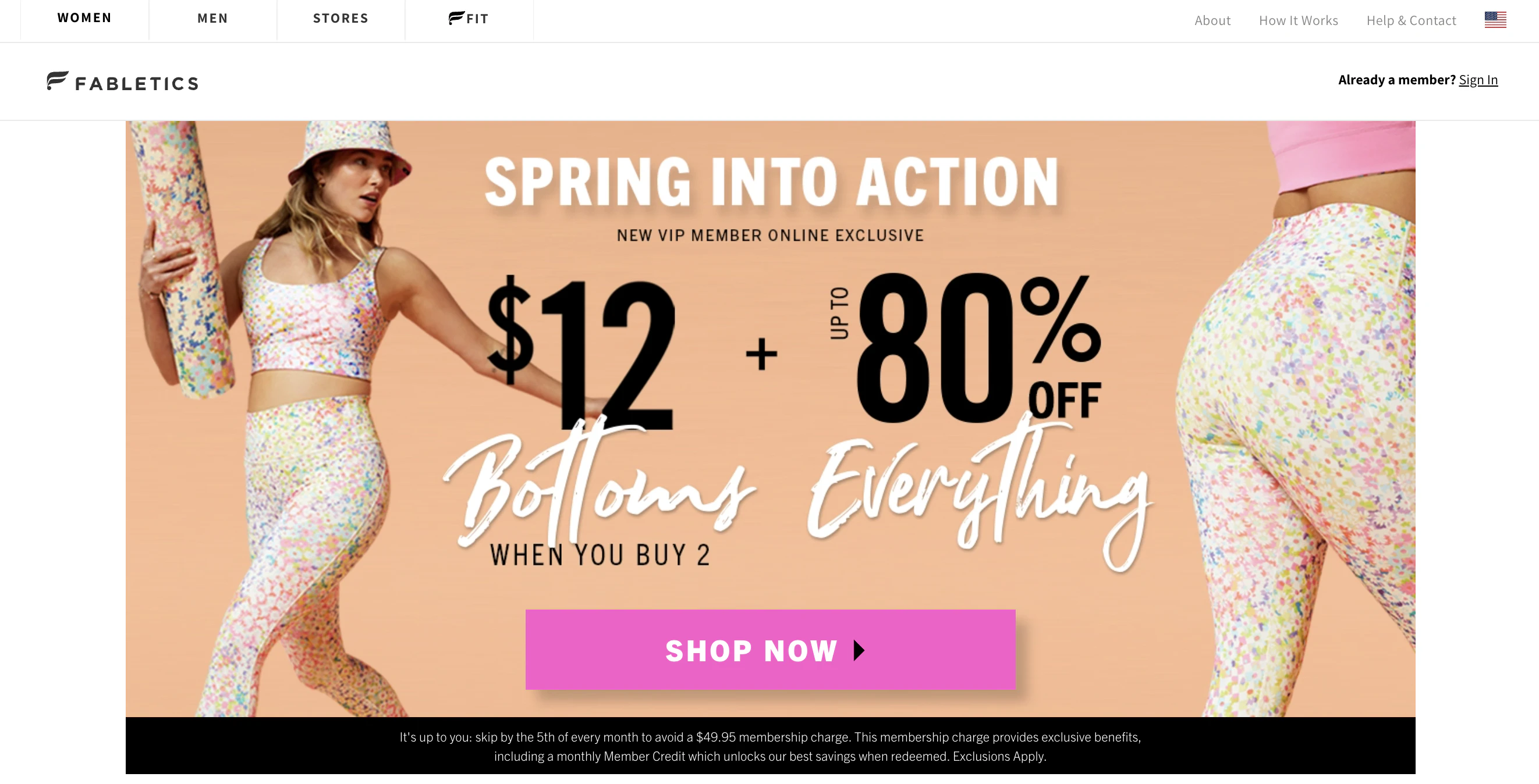
Fabletics baits readers with a hefty discount and a timer in their CTA. The CTA “unlock offer” makes you feel like you are missing out on a major deal if you don’t act. Everything about the setup and CTA pushes the reader toward the goal.
78. Ashley Stewart

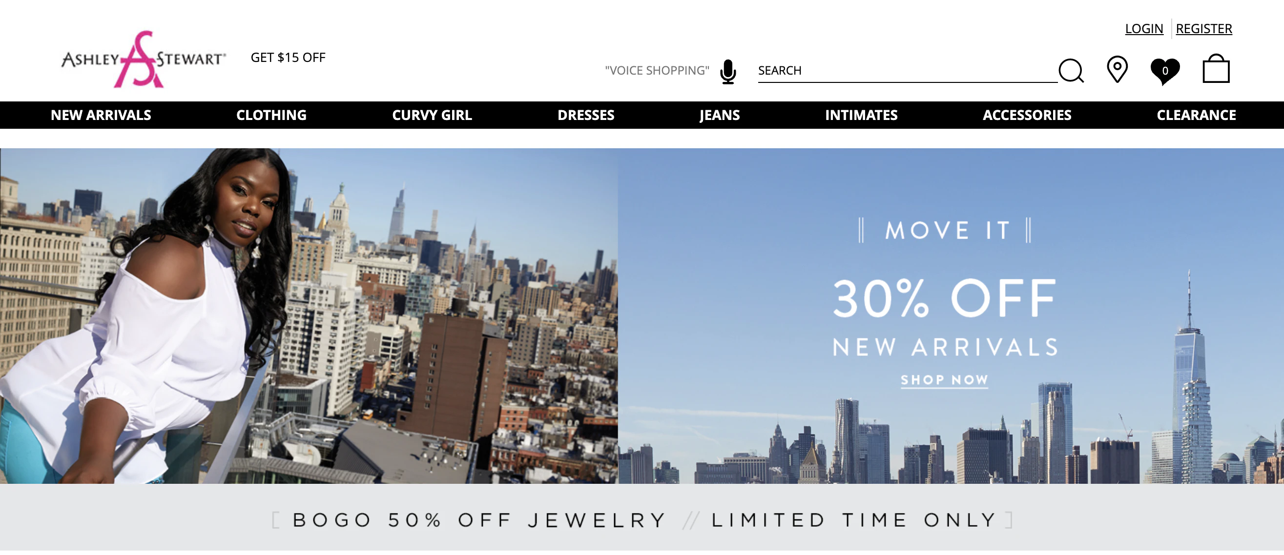
In this example of Ashley Stewart’s homepage hero section, the CTAs are simply the deals being offered.
If you are an ecommerce site running a sale, sometimes letting the numbers speak for themselves is all you need to do.
79. Amazon

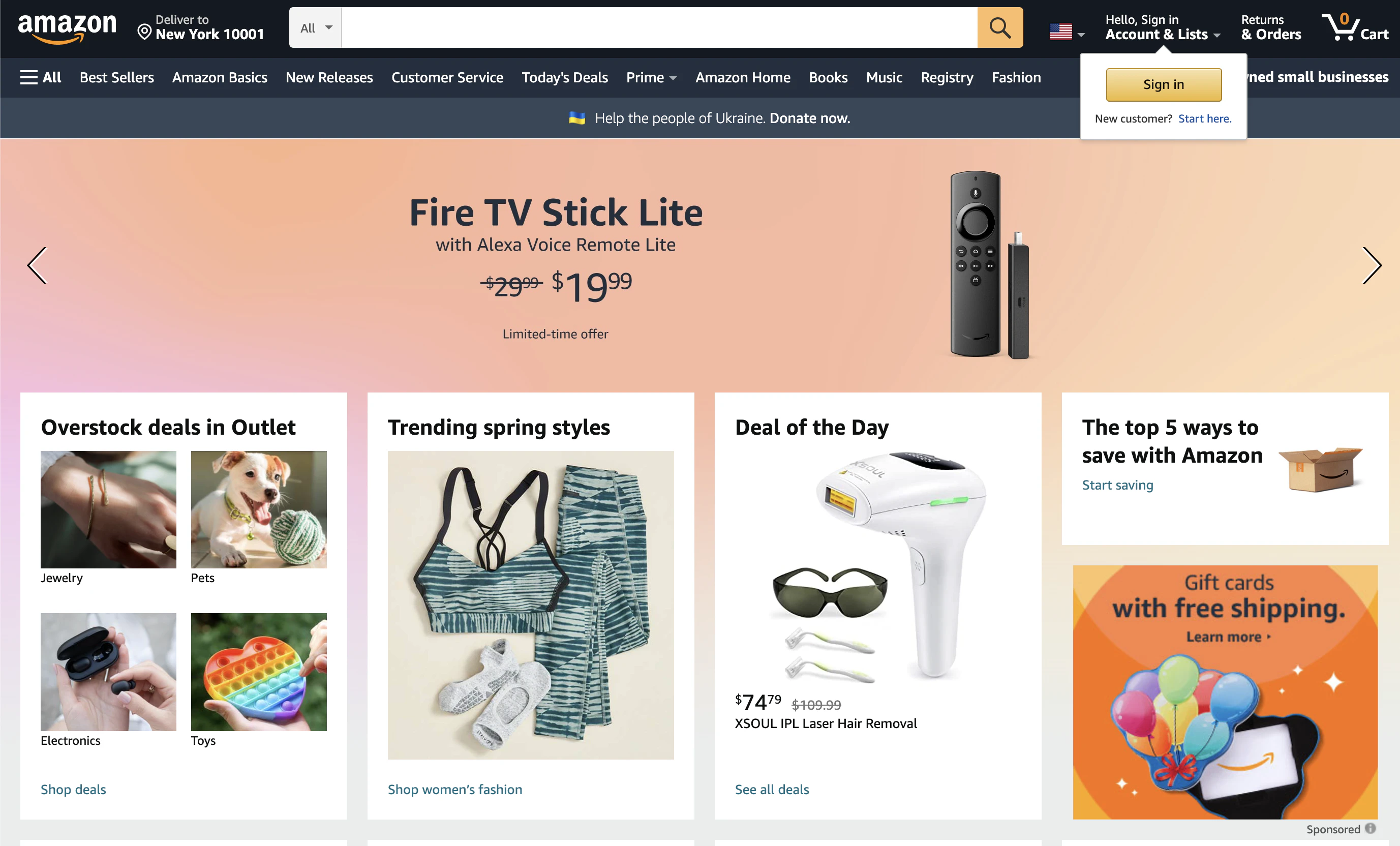
Amazon’s CTA in this image promotes the exclusivity of being a Prime member. Prime day deals encourage people to buy things they weren’t actively looking for. Making the deals feel exclusive is one of the key ways Amazon has made it such a success.
80. Barnes and Noble

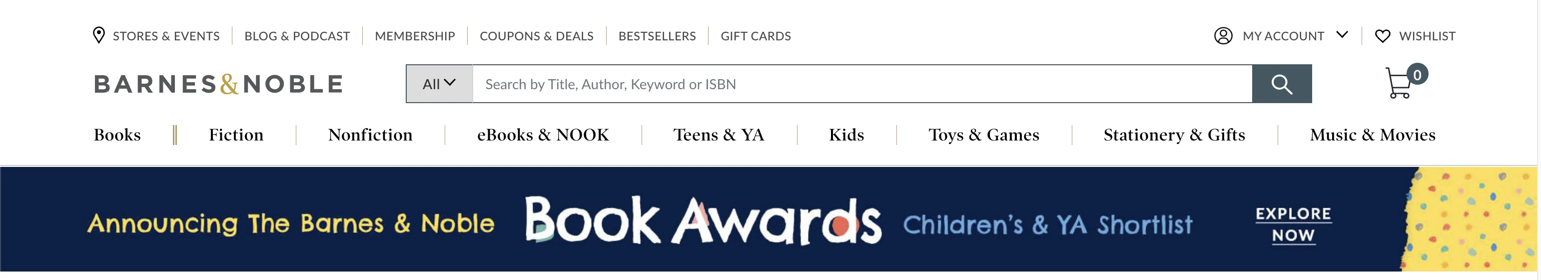
Barnes and Noble uses the popular verb “explore” in their CTA. But for books, I’d agree that’s a very fitting verb and reflects the reader’s desire.
81. Slack

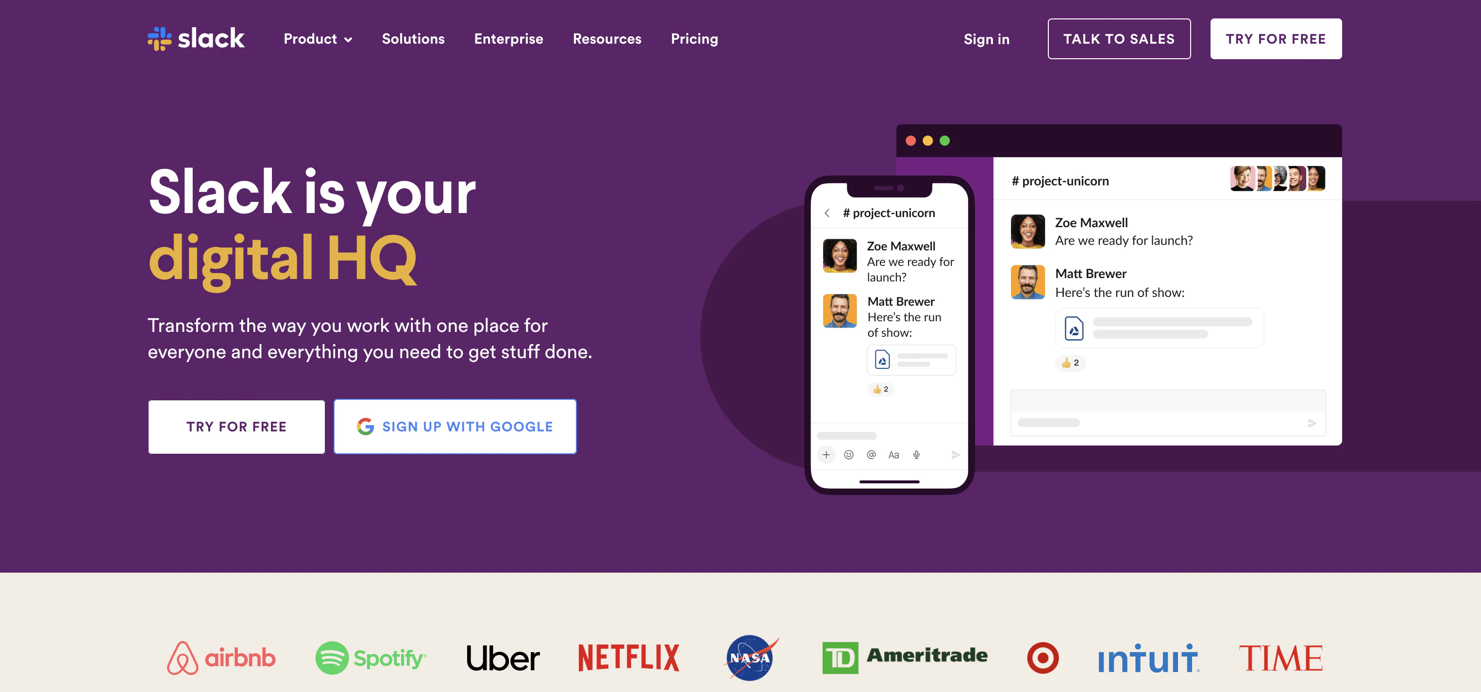
Slack gives readers three CTAs above the fold. Two of them are sign-up options, and one is to find out more about the product.
Multiple CTAs work here because two effectively do the same thing, and the other is different enough that it isn’t conflicting.
82. Nintendo

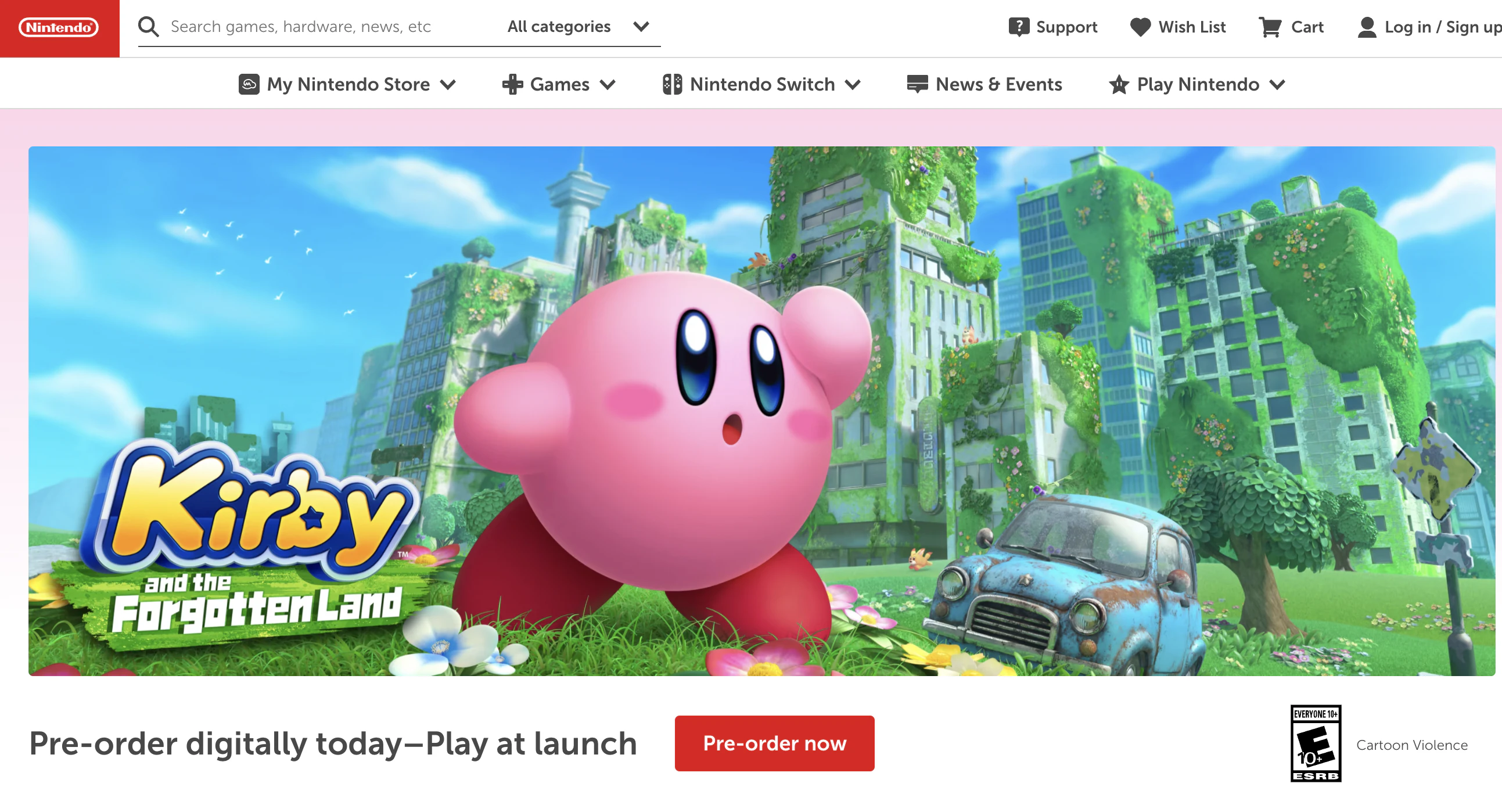
Nintendo makes an interesting choice with one of the CTAs on their homepage. They call out the starting price of one of their products, which by itself isn’t that noteworthy, but since that starting price is almost $200 for a non-necessity item, it becomes intriguing.
Ordinarily, price is something that’s only highlighted in CTAs if it’s low.
If you think you want to use a price point in your CTAs, test it against another option that isn’t connected to price first.
How Do You Know If Your CTA Is Working Well?
There are two steps to testing the performance of your CTA – user testing and split testing.
User testing will allow you to watch your readers interact with your CTA and all the elements around it. It will provide you with qualitative data that can help you adjust your actual copy.
Split testing different CTAs will provide you quantitative data. It will help you understand what CTAs appeal to your audience.
You will need a mix of both over time to optimize your CTAs fully.
Learning how to gather the right data to improve your CTAs can be difficult. It takes a deep understanding of strategy.
If you are looking to improve your conversion rates not just through CTA optimization but across the board, check out our CRO services.
Final Thoughts
Though CTA copy is generally short, it's powerful. Your CTA is the gateway to the next phase of your funnel.
Taking the time to develop a CTA that converts is time well spent.